


Timothy Pledger
Posts
0
Likes
0
Liked Posts
6
Given Feedback
3
Feedback
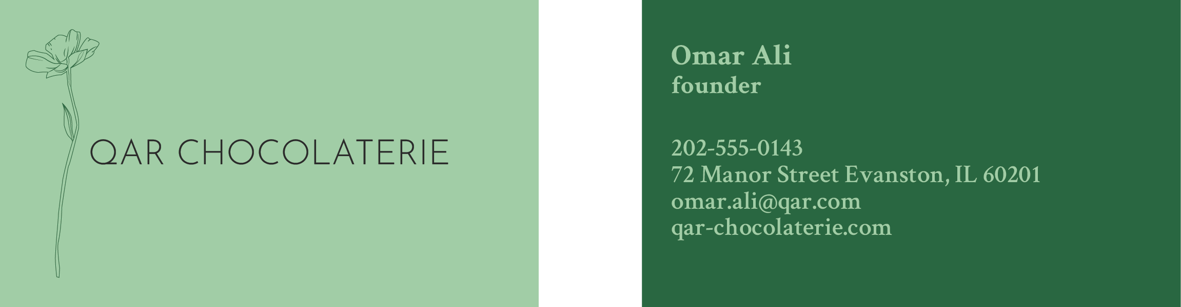
Looks nice, but I quite understand why there's a flower on the front when the business is a chocolaterie. A cocoa bean plant or something involving chocolate would make far more sense. Also the font on the front isn't cohesive with the font on the back. I like the naturalistic idea you had, but its the execution that I can't quite get behind.
4 years ago by Timothy Pledger
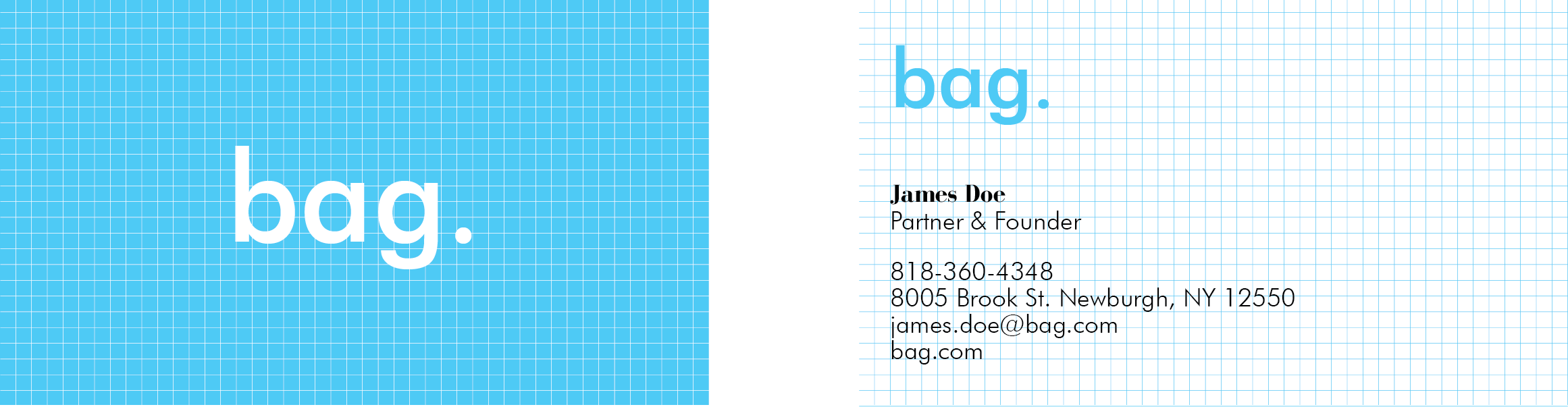
Creative idea. I really like the grid lines and the font you used for the logo, its very simple and neat. The contrast that you've made between the logo and the background looks neat as well. The problem that I do see is that there's nothing on the card to indicate what kind of company it is besides the grid lines. I think that it would be nice if there were to be text that said "architectural firm" or "architecture" somewhere.
4 years ago by Timothy Pledger
I think it looks nice, but could be mistaken for an art studio rather than an architecture studio. Has more of a playful look than professional look, especially do to the colors.

4 years ago by Timothy Pledger