modhu
Posts
5
Likes
7
Liked Posts
23
Given Feedback
12
Feedback
the colour doesn't stand out and blends with the background a little bit
1 month ago by modhu
maybe bold and enlarge the 75% and also increase the text size for the heading.

1 month ago by modhu
i don't really see the cloud element ..
1 month ago by modhu
that looks really cool!! but the yellow 75 looks kinda off
1 month ago by modhu
i thought of that too , but couldn't really find a font that suited well.. thanks for letting me know!

2 months ago by modhu
hmm.. i really thought the background goes with the party theme... :( ..
2 months ago by modhu
alr noted that ! <3

2 months ago by modhu
that's a great start! but it's better if the logo has less details as it is something that should be easy to remember.. but anyways that's a really good start.. i hope you improve as you learn!
2 months ago by modhu
looks really cutr , but ig i'd like it more if the colours were brighter
2 months ago by modhu
thank you so much !<3

2 months ago by modhu
the colour combination is just soo attractive!!
2 months ago by modhu
i really like the colors , though i cannot read the text well...

2 months ago by modhu
Posts
for some reason the colour looks different when i save it as a png , jpeg compared to a pdf..the pdf shows the correct colors..can anyone explain why?
- Report
modhu • 1 month ago
Hey There,
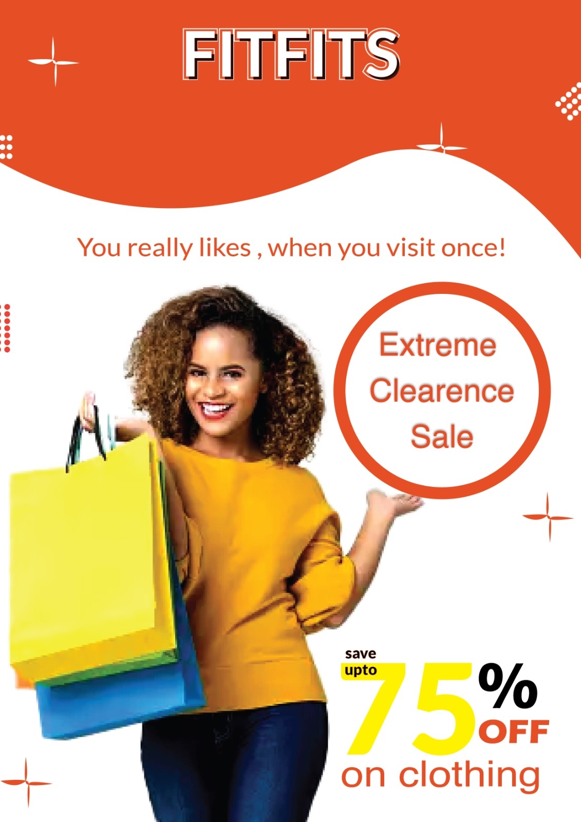
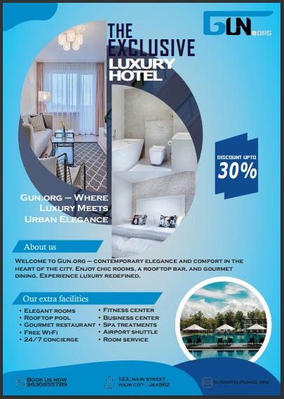
I'm Adele, I just founded a new business called gun.org. For a while now, I've been looking for a good designer for my hotel. I would like a simple flyer for an event. We primarily use the color blue (#007fff). We would love to work with you!
I'm Adele, I just founded a new business called gun.org. For a while now, I've been looking for a good designer for my hotel. I would like a simple flyer for an event. We primarily use the color blue (#007fff). We would love to work with you!
 Like
Like


The PDF was probably set in CMYK colors and when you export it it converts to RGB and will look different
1 month ago by Amir - Reply
design is good but text are not that much visible
1 month ago by Ritik Raunak - Reply
# 4 tell me what you think!
- Report
modhu • 2 months ago
again the original file is 189 mb-
couldn't post that. :(
couldn't post that. :(
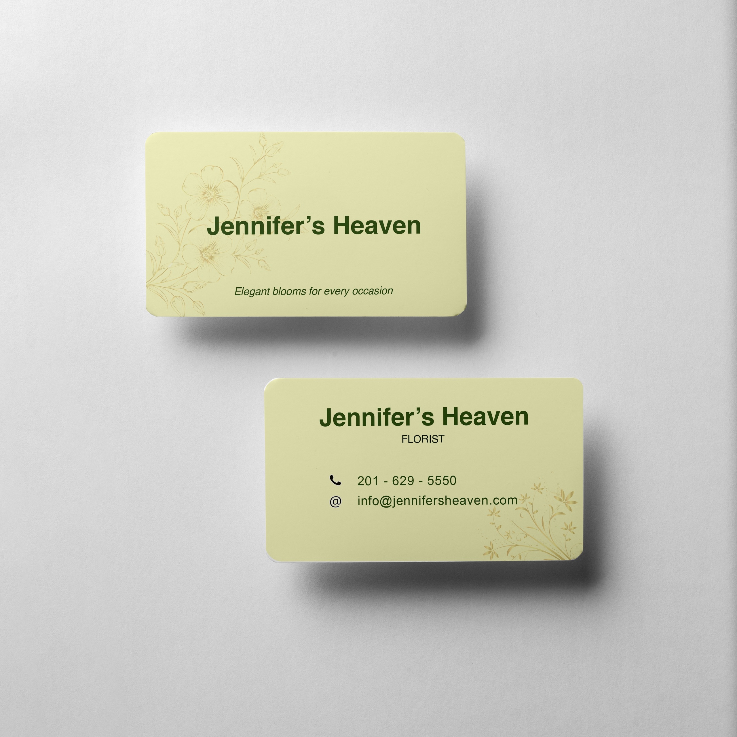
Hey,
I am Yan, owner of Yan's Jewelry. For a while now, I've been looking for a good designer for my business. I would like a simple flyer for an event. Can you help me out?
I am Yan, owner of Yan's Jewelry. For a while now, I've been looking for a good designer for my business. I would like a simple flyer for an event. Can you help me out?

It's a little hard to read, I think keeping the information section and the paragraph section in one easy-to-read font would help. Otherwise, it looks great! Very celebratory
2 months ago by Ariel - Reply
i thought of that too , but couldn't really find a font that suited well.. thanks for letting me know!
2 months ago by modhu - Reply
awesome
2 months ago by saswati - Reply
i couldn't attach the real image so this is a screenshot..the file is too large :(
- Report
modhu • 2 months ago
i have no idea how to design for an event without any details of the event.. so this is what i did
Hello,
I'm Pam, founder of Xavo. I'm looking for someone that can design something for my hotel. I would like a simple flyer for an event. Can you do that?
I'm Pam, founder of Xavo. I'm looking for someone that can design something for my hotel. I would like a simple flyer for an event. Can you do that?

I think this is great! it has a nice flow. I would consider a new font for 'Hotel and Resort' the font you have now doesn't seem to go with the upscale feeling of it being a nice hotel
2 months ago by Jessie - Reply
alr noted that ! <3
2 months ago by modhu - Reply
Great
2 months ago by AbiodunSegun - Reply
#2 i tried to make it better than the last time.. please let me know what you think about it!
- Report
modhu • 2 months ago
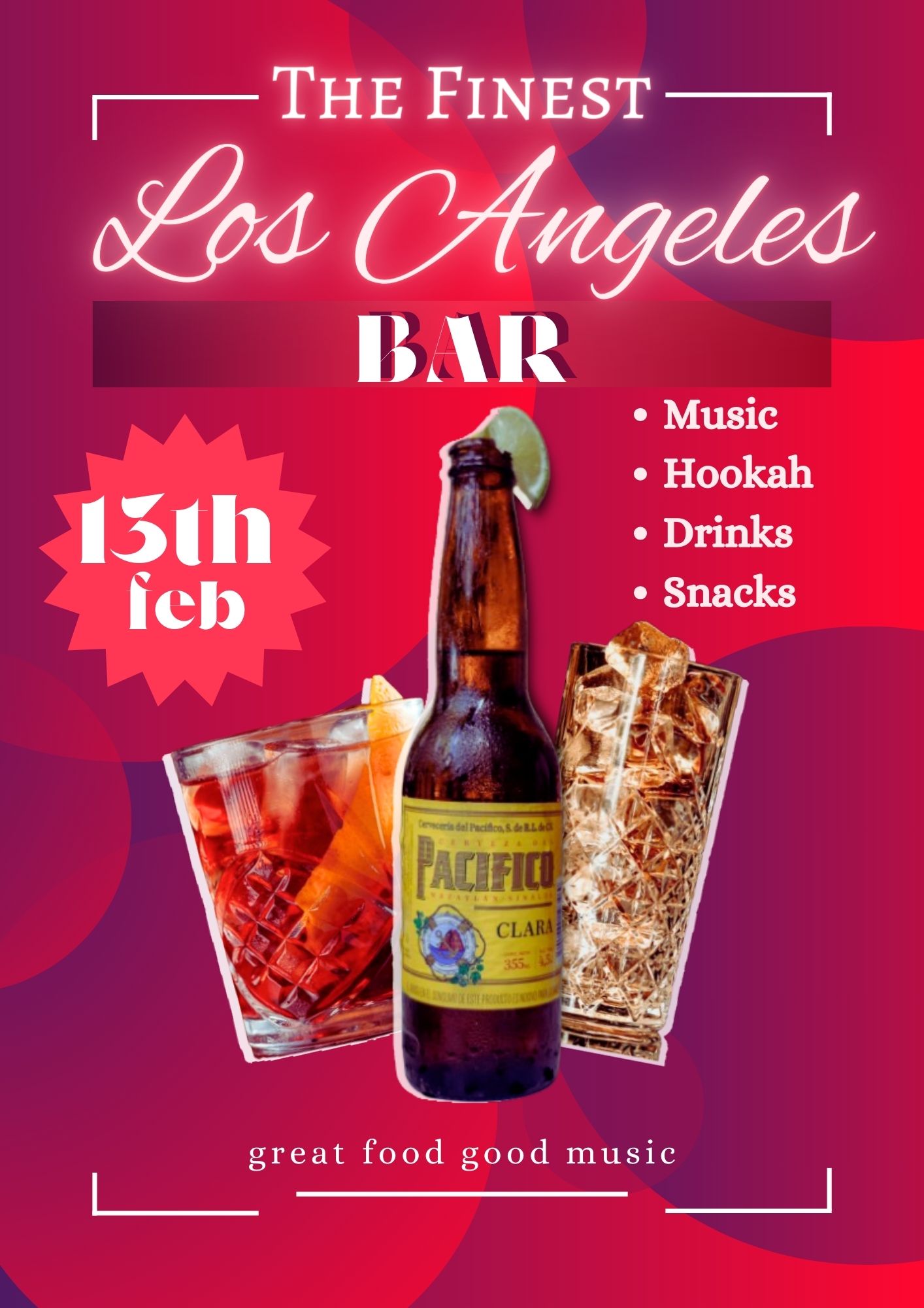
Hi,
I am Angela, I just founded a new business called The Finest Los Angeles Bar. I'm looking for someone that can design something for my Bar. I would like a simple flyer for an event. Can you help us out?
I am Angela, I just founded a new business called The Finest Los Angeles Bar. I'm looking for someone that can design something for my Bar. I would like a simple flyer for an event. Can you help us out?

I really like the neon effect on the 'Los Angeles' part, I think it works really well with the name. I would maybe just simplify the background a bit, so that it doesn't distract from the info you want to get across :)
2 months ago by Thea-Lise Ridge - Reply
hmm.. i really thought the background goes with the party theme... :( ..
2 months ago by modhu - Reply
