Esther
Posts
1
Likes
3
Liked Posts
0
Given Feedback
0
Posts
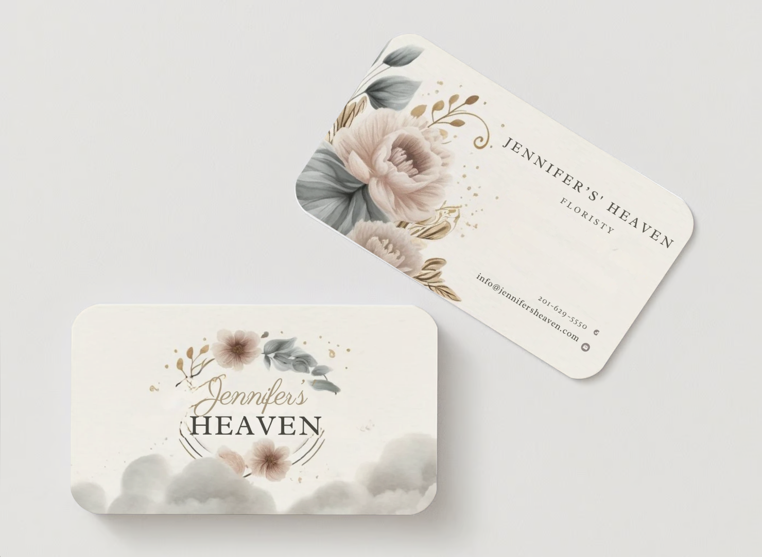
Jennifers Heaven Businesscard
- Report
1 week ago by Esther
Final design I made for Jennifer's Heaven.
Help me by giving your feedback, I would love to hear it from you ☺️
Help me by giving your feedback, I would love to hear it from you ☺️
Jennifer's Heavengraphic
 3 Likes
 4
4
I like this
1 week ago by Alejandro G. Rumbos - Reply
The design looks very appealing and comfortable for the eyes. However, adjusting the cloud letter slightly in the logo would enhance its visibility and clarity on the business card, ensuring it's easily readable for the readers.
Other than that, everything looks well-placed and nice.
1 week ago by Shimaa Saad - Reply
Looks good and clean. It's very distinguishable that it's a florist's business card. Personally, I would change the spacing for the information and add a CTA; probably put the alignment to middle to match the "Floristy." Also, would like to arrange the Floristy to be aligned with the brand name.
1 week ago by Jam - Reply