NJ
Posts
0
Likes
0
Liked Posts
12
Given Feedback
6
Feedback
Looks interesting, I it would've been more helpful ifI could your right process too

3 months ago by NJ
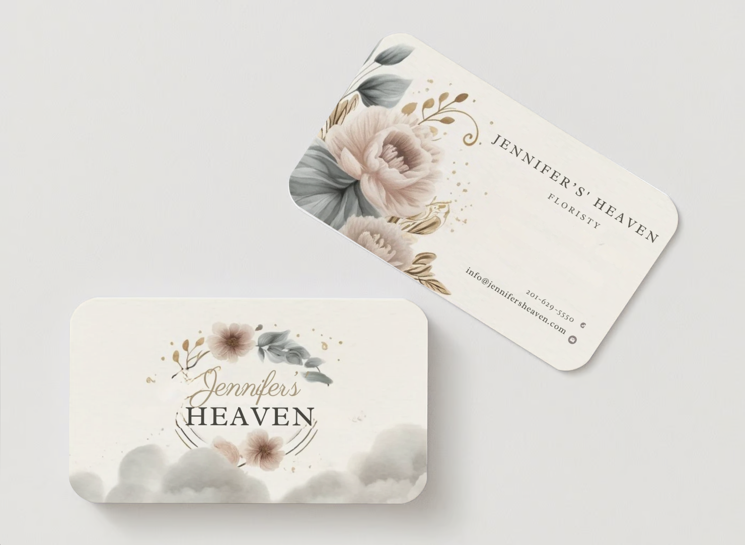
Typo:
1. Jennifer's' - the apostrophe after S
2. Floristy/Florist?
3 months ago by NJ
It's cute, here is a little remark of my own: I couldn't really tell that's its a 'florist's' nor that it's a business card at first sight. And this is part of what the customer really stressed about in the brief. So I think that's too what you stupid focus on
3 months ago by NJ
It's really creative! But a little fixing would be great too - kerning before the 'E', another is, the 'e' which is above 'T' had this weird white... removing that will look better

3 months ago by NJ
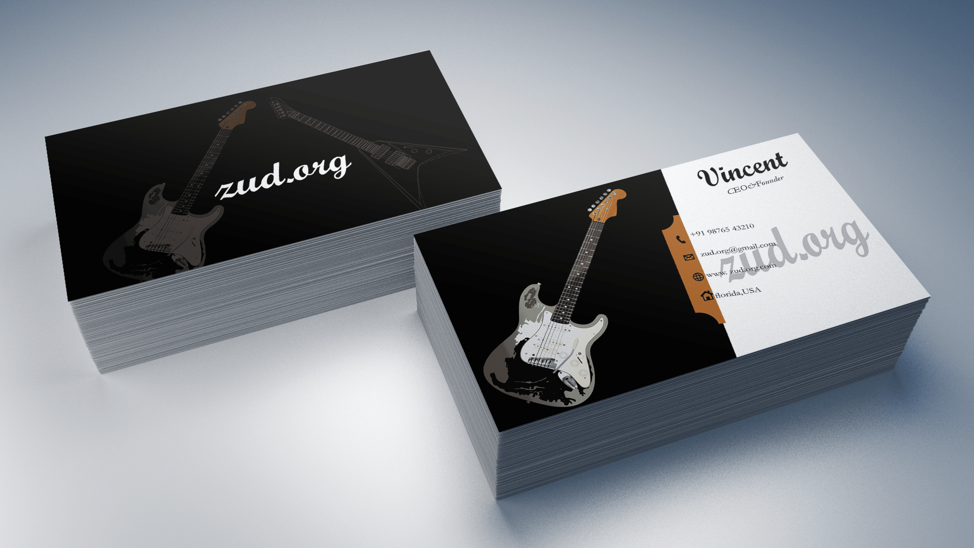
Idea is cool, but don't you think, the tilted alignment for the contact info makes it difficult to read? Like, those lines would be better horizontally parallel to the card, while aligning with the orange slope🧡
3 months ago by NJ
The font used for FitFits seems like it's falling off, and I think 75% here should be the centre of attraction here really, not 'clearance'

3 months ago by NJ