Shimaa Saad
I switched my career from Computer Science to Digital Marketing and Design after seven years of college studies. Now, I've spent more than three years as a Senior 3D service and Graphic Designer.
Posts
2
Likes
2
Liked Posts
4
Given Feedback
16
Feedback
Nice Works
3 months ago by Shimaa Saad
good job
3 months ago by Shimaa Saad
Nice work on the design! However, I recommend playing with the font styles, colors, and sizes to ensure that the text under the logo is easily readable for viewers.
3 months ago by Shimaa Saad
Nice work on the design style and image orientation. However, I recommend playing with the font styles and sizes to make the design clearer and easier to read for viewers. Additionally, the blank spaces contribute to its comfort and should be preserved.

3 months ago by Shimaa Saad
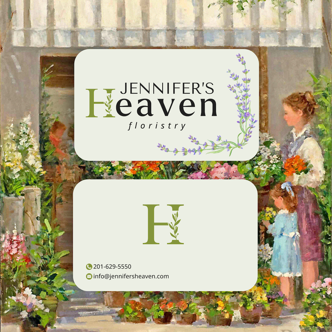
The colors and styles are amazing; keep up the great work! However, I recommend replacing the background on page 02 with a different one to make the text more visible. Alternatively, you could adjust the background's contrast to be slightly darker.
3 months ago by Shimaa Saad
yes
3 months ago by Shimaa Saad
It looks good and clean, which makes it comfortable for my eyes. Good Job.
3 months ago by Shimaa Saad
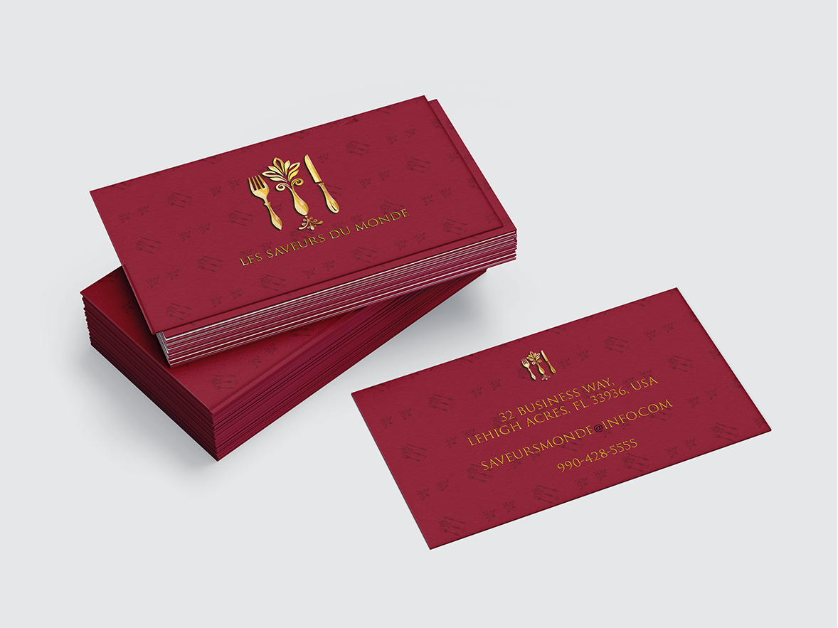
The logo and color selection are amazing! However, I suggest replacing the background with something different to make it cleaner and more eye-catching.
3 months ago by Shimaa Saad
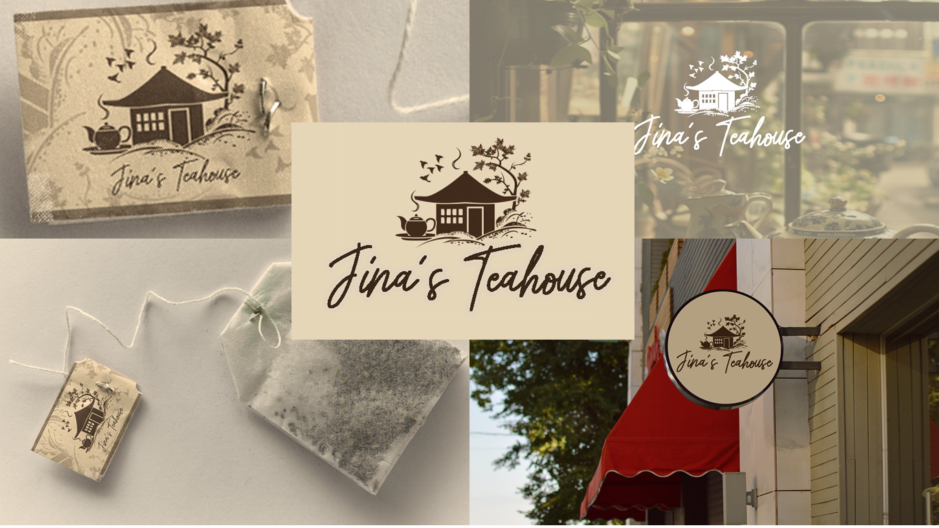
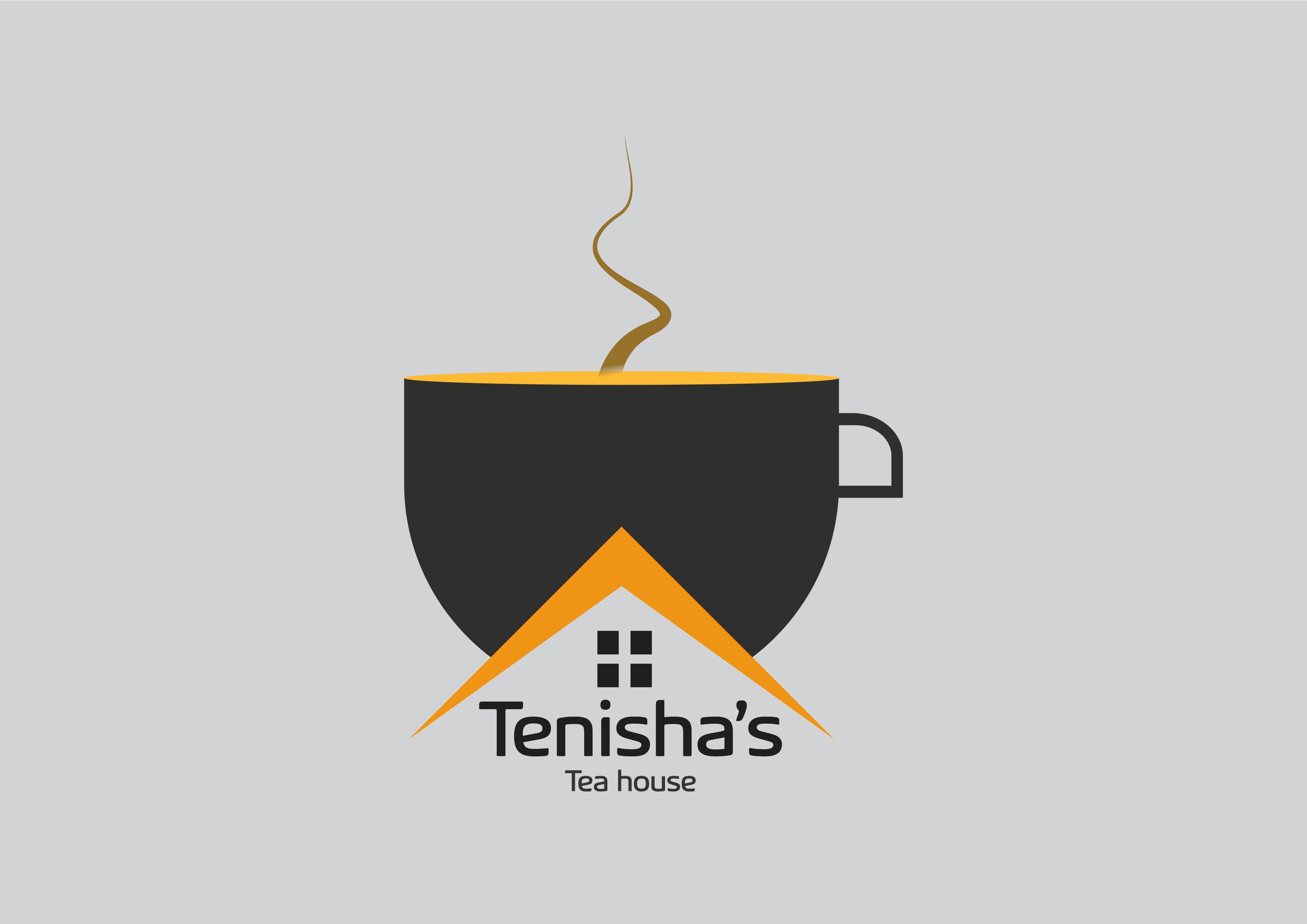
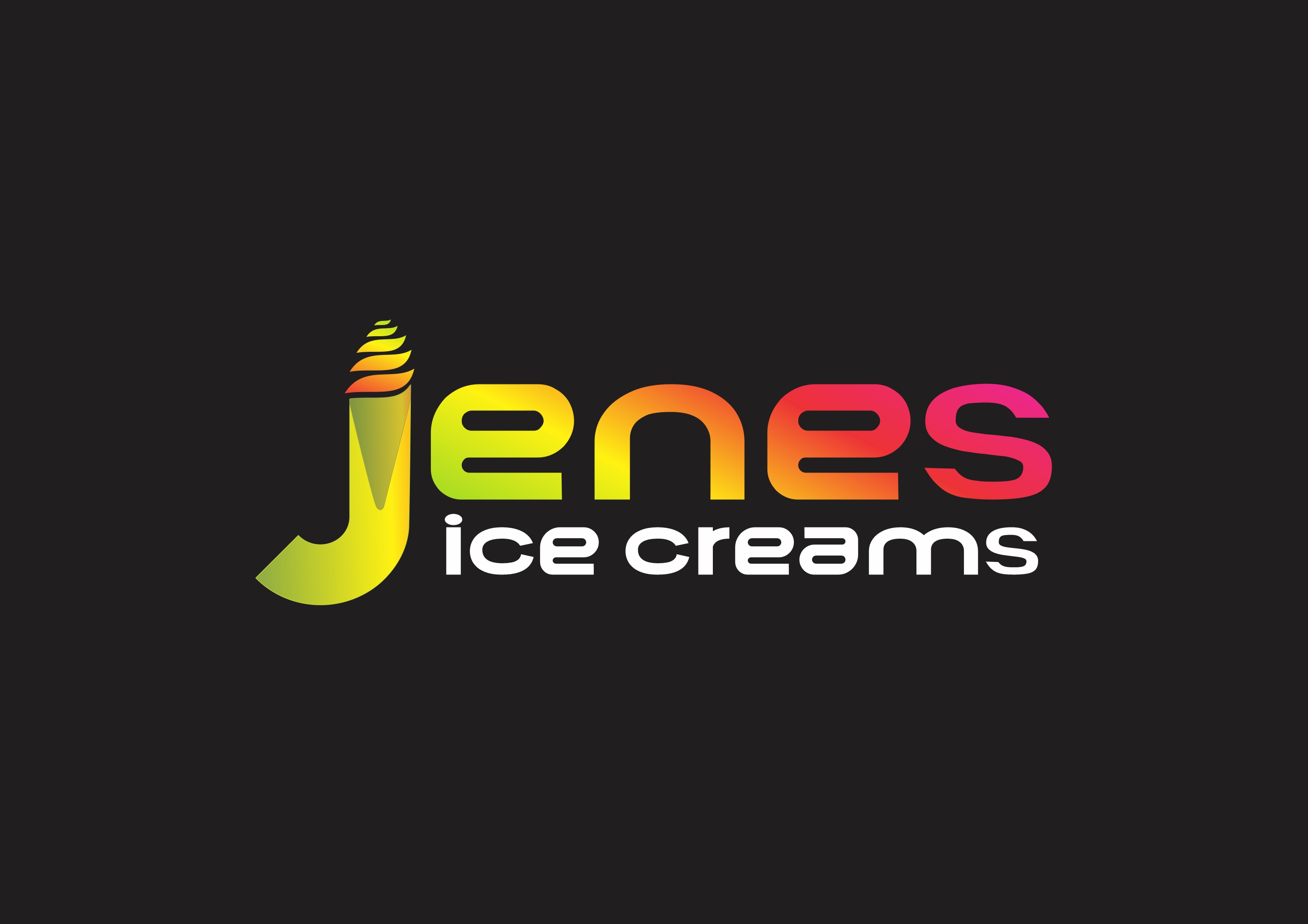
The design is great overall. However, there are too many details under the cup, which makes me as a viewer feel uncomfortable and confused when trying to read the logo."
3 months ago by Shimaa Saad
Nice Works
3 months ago by Shimaa Saad
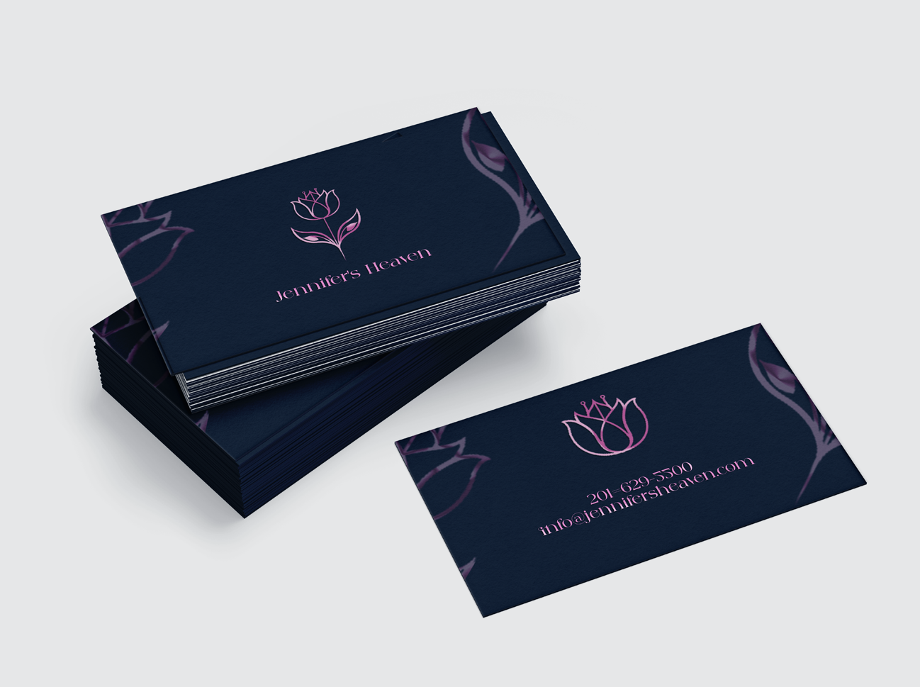
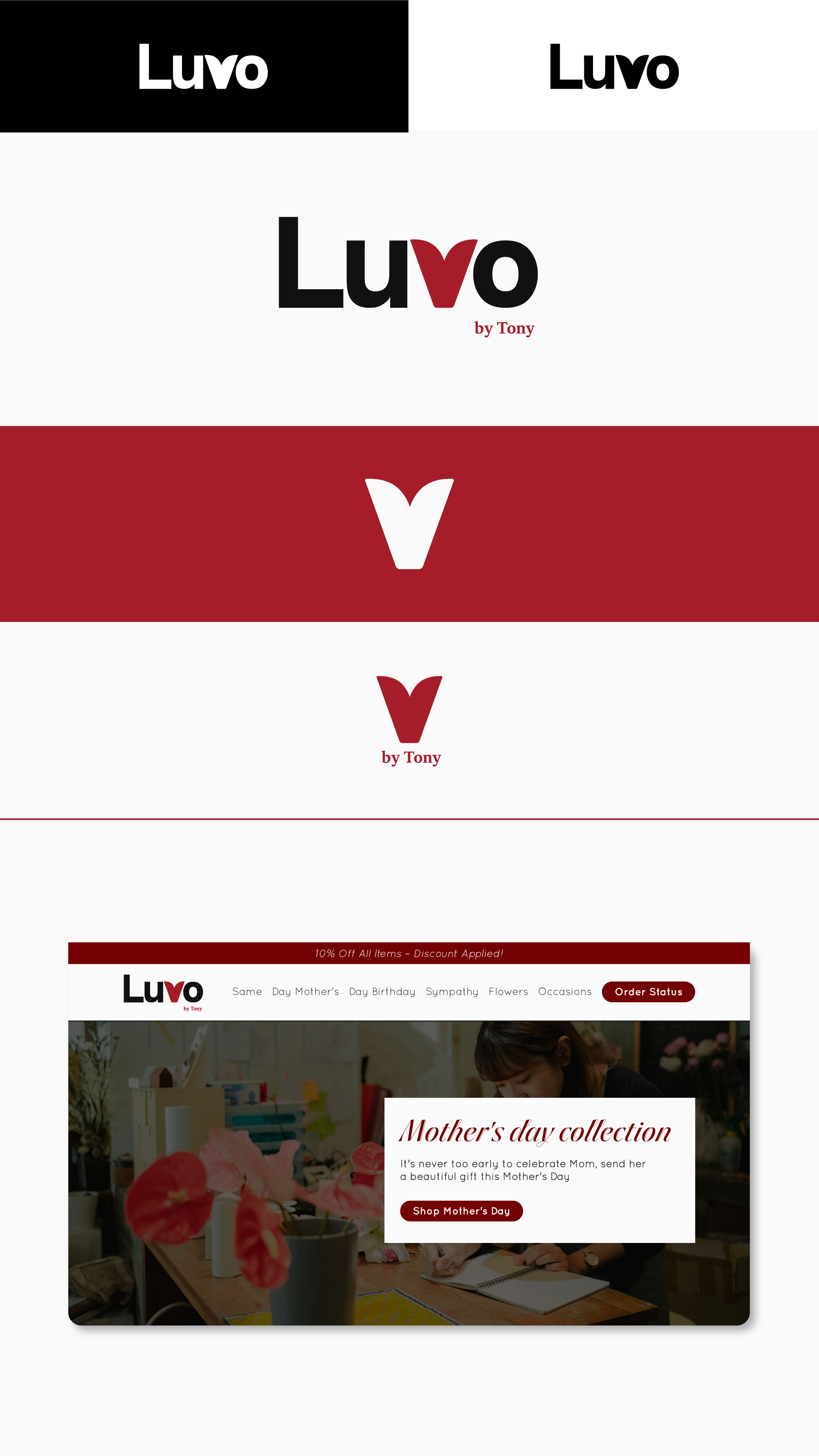
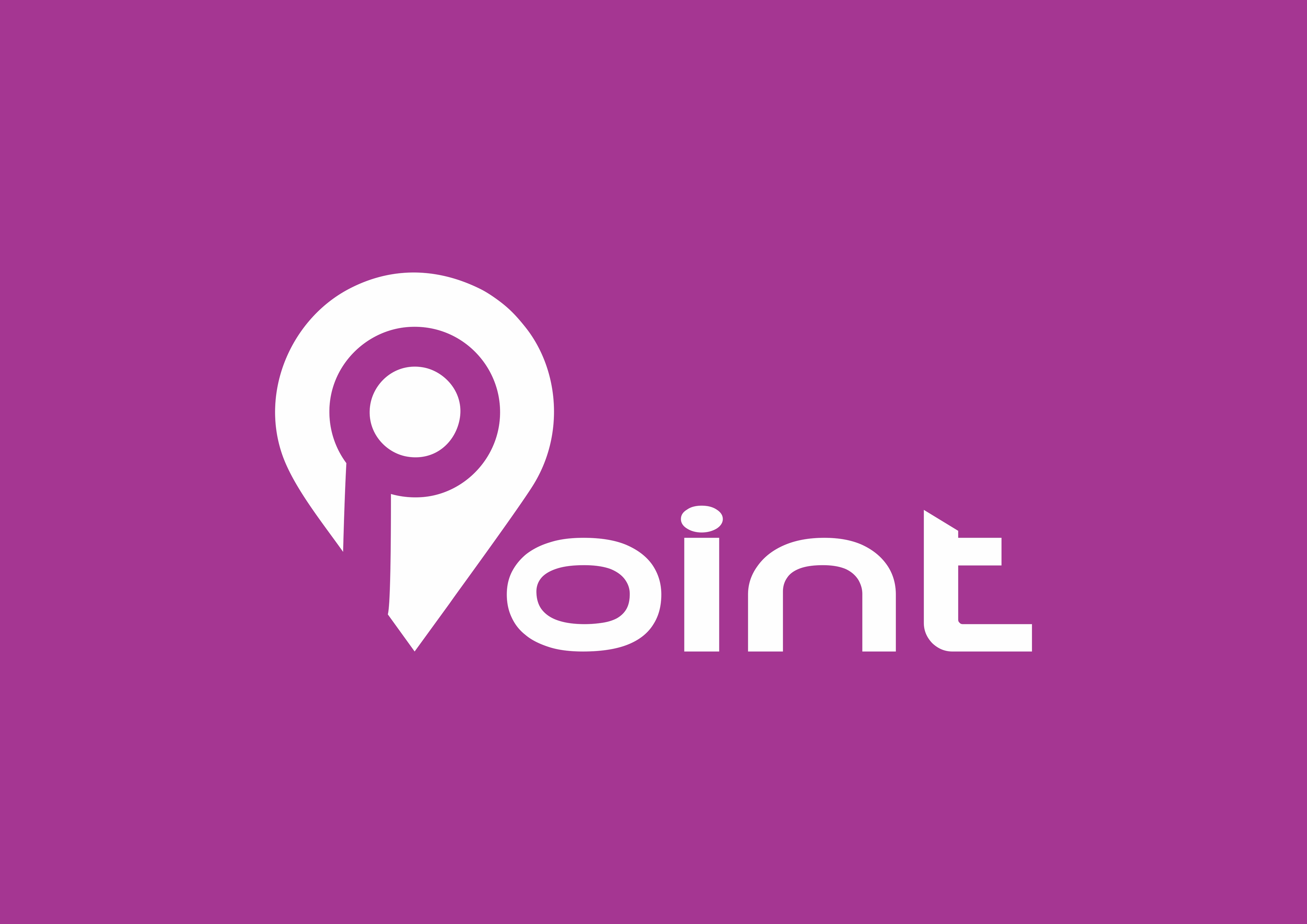
The poster looks great overall. However, when I first viewed it, the logo felt a bit subdued. Using just one color for the text may not be enough to draw the viewer in and encourage them to read the design.
3 months ago by Shimaa Saad
Nice works :)
3 months ago by Shimaa Saad
looks great!
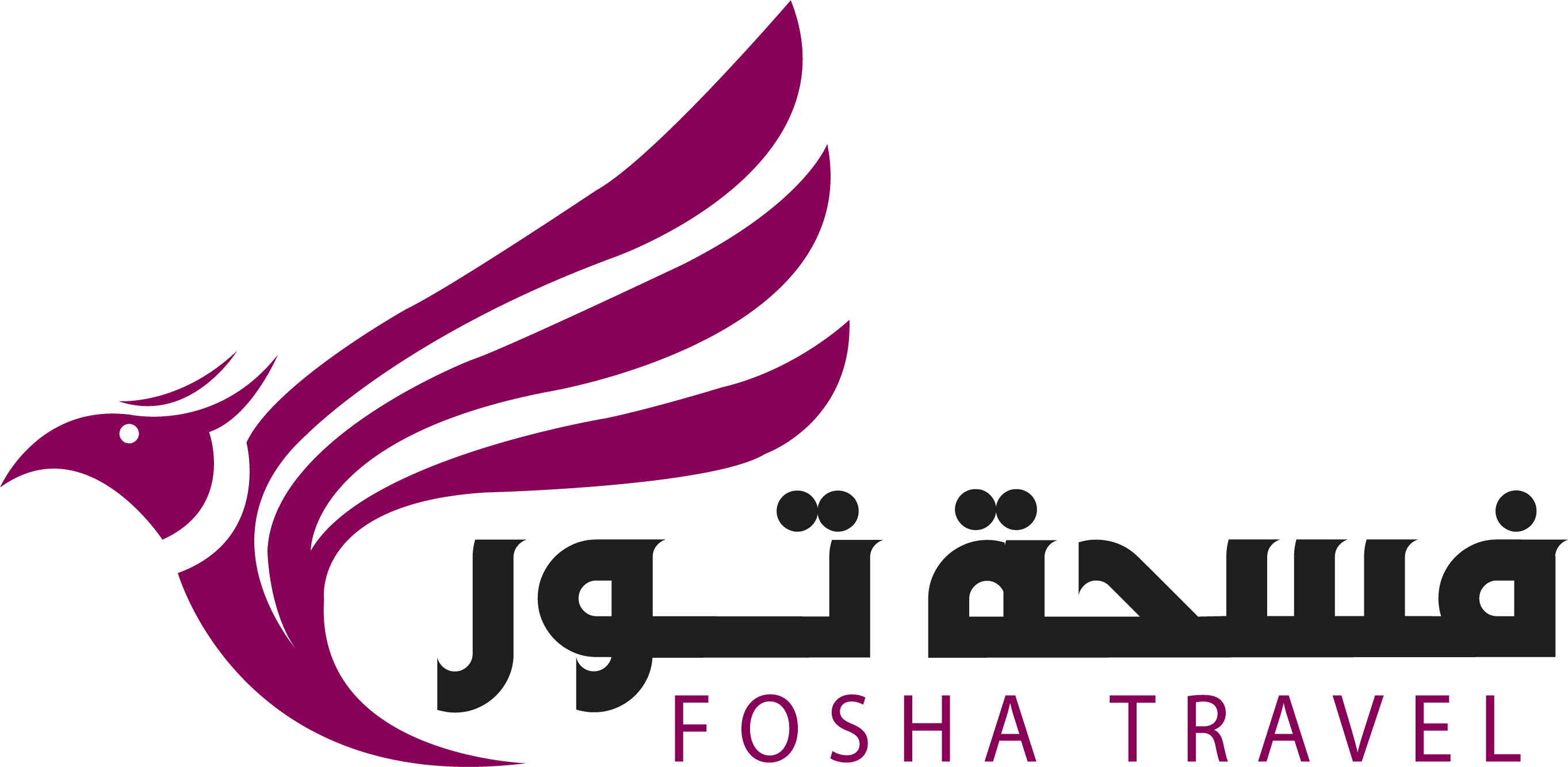
I suggest keeping the text below the icon and reducing the size or changing the font style of the Arabic text. The different texts and fonts in the design are a bit confusing for me as a viewer."
3 months ago by Shimaa Saad
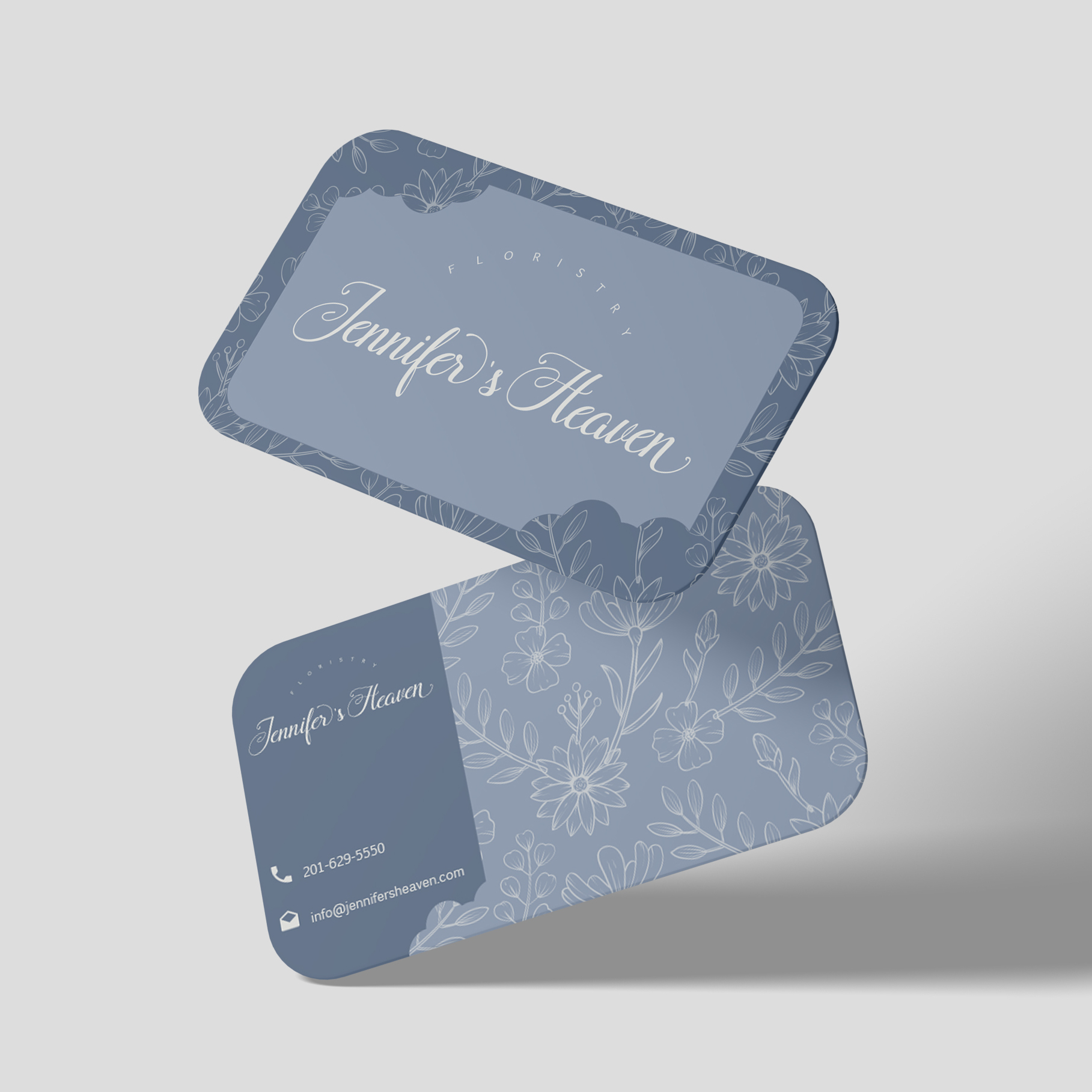
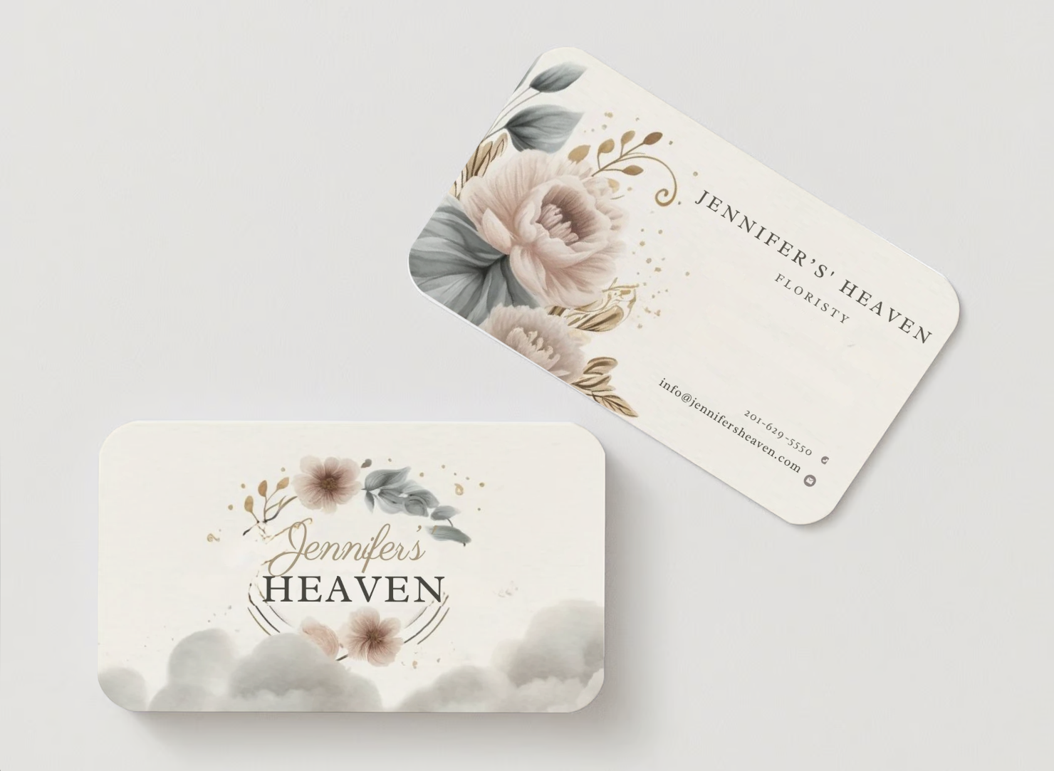
The design looks very appealing and comfortable for the eyes. However, adjusting the cloud letter slightly in the logo would enhance its visibility and clarity on the business card, ensuring it's easily readable for the readers.
Other than that, everything looks well-placed and nice.
3 months ago by Shimaa Saad
The logo looks great, but replacing the font with a clearer one would be an improvement. I really like the colorful text. My main suggestion is to focus on the font type
3 months ago by Shimaa Saad
"I've created a logo for the cafeteria. I'm excited to share it and eager to hear your feedback!"
3 months ago by Shimaa Saad
Posts
VALGO Logo design and Mockup
- Report
Shimaa Saad • 3 months ago
My name is Nona Parks. I am the marketing director at Valgo and we require a new company logo for mobile products, which are located in Melbourne. we think a combination mark would be a good fit for our brand. We have got the primary color to be aqua. We would create a mockup of the company logo so we could get an idea of what it would look like.
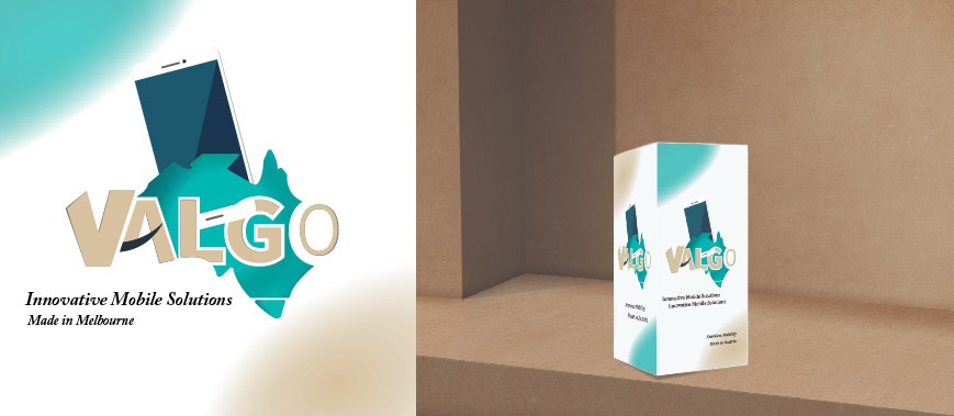


very nice work and good 💡
3 months ago by Sarah - Reply
The design is aesthetic isn't an eyesore. When you look at it it will bring ease at your eyes.
3 months ago by Avril Anne Bernal - Reply
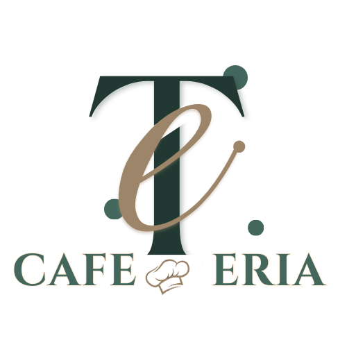
Logo Design for TB Cafeteria
- Report
Shimaa Saad • 3 months ago
Hey!
I am Lilliam, creator of TE Cafeteria. For a while now, I've been looking for a good logo for my Cafeteria. I think a combination mark will fit best with the business. We would love to work with you!
I am Lilliam, creator of TE Cafeteria. For a while now, I've been looking for a good logo for my Cafeteria. I think a combination mark will fit best with the business. We would love to work with you!

It's really creative! But a little fixing would be great too - kerning before the 'E', another is, the 'e' which is above 'T' had this weird white... removing that will look better
3 months ago by NJ - Reply
it looks beautiful
3 months ago by TAMARA - Reply
"I've created a logo for the cafeteria. I'm excited to share it and eager to hear your feedback!"
3 months ago by Shimaa Saad - Reply