Jam
Posts
0
Likes
0
Liked Posts
1
Given Feedback
2
Feedback
I like this one so much better than the other one!
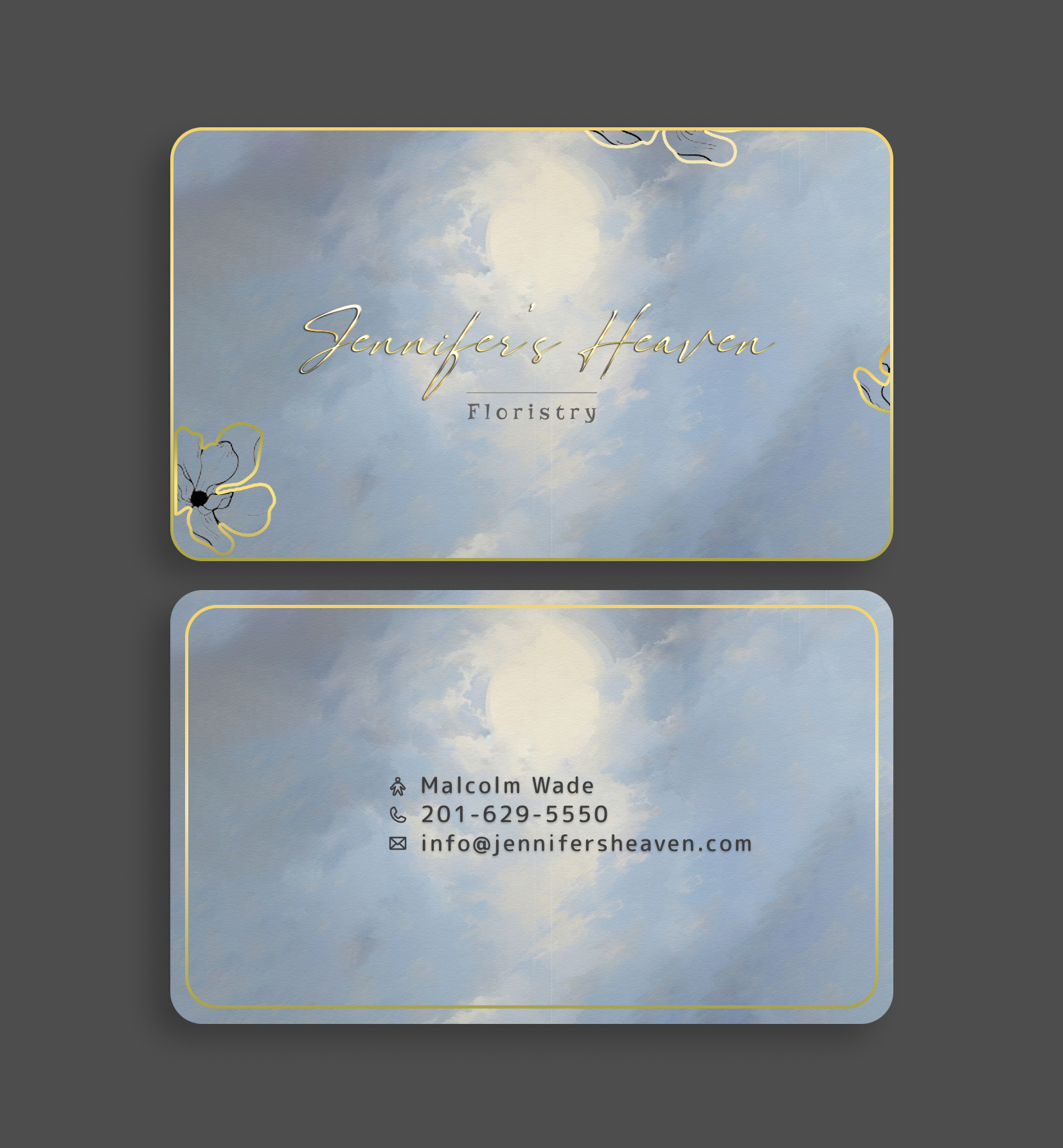
1 week ago by Jam
Looks good and clean. It's very distinguishable that it's a florist's business card. Personally, I would change the spacing for the information and add a CTA; probably put the alignment to middle to match the "Floristy." Also, would like to arrange the Floristy to be aligned with the brand name.
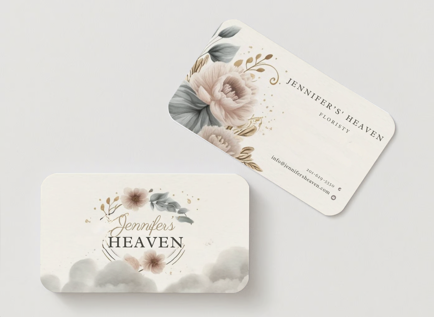
1 week ago by Jam