Anu
Posts
2
Likes
8
Liked Posts
1
Given Feedback
6
Feedback
its okay. nothing wow or great.

1 week ago by Anu
Looks Good! Here are few remarks that if i was a client would make for this design.
1. The text color is not readable, try a shade that is contrasting to the background color. ( suggestion to try black or white )
2.The overall ambience does not read as 'heavenly' enough. (color ambience is okay, but too much is happening, what would you think of when you hear the word 'heavenly' try that)
3.Too much happening on the background and because of that the card is not standing out but rather camouflaging.
1 week ago by Anu
Thanks! will keep that aspect in mind for next time!
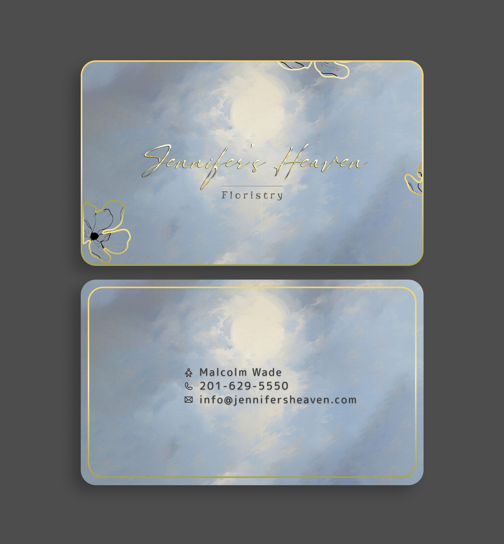
1 week ago by Anu
Thanks!
1 week ago by Anu
The place holder text is not readable, and the inactive state of the CTA is not recognizable or more or less it is blending with the background. Poor use of colors imo.
2 weeks ago by Anu
The contrast between the primary blue used with respect to the text color is very low. hence its not readable. The grey used for the sub text is also very close to the white BG color used, poor readability.
2 weeks ago by Anu
Posts
FitFits - Flyer Design
- Report
1 week ago by Anu
FitFitsgraphic
 2 Likes
 1
1
The font used for FitFits seems like it's falling off, and I think 75% here should be the centre of attraction here really, not 'clearance'

1 week ago by NJ - Reply