lilac
Posts
6
Likes
5
Liked Posts
5
Given Feedback
12
Feedback
Thank you!
1 month ago by lilac
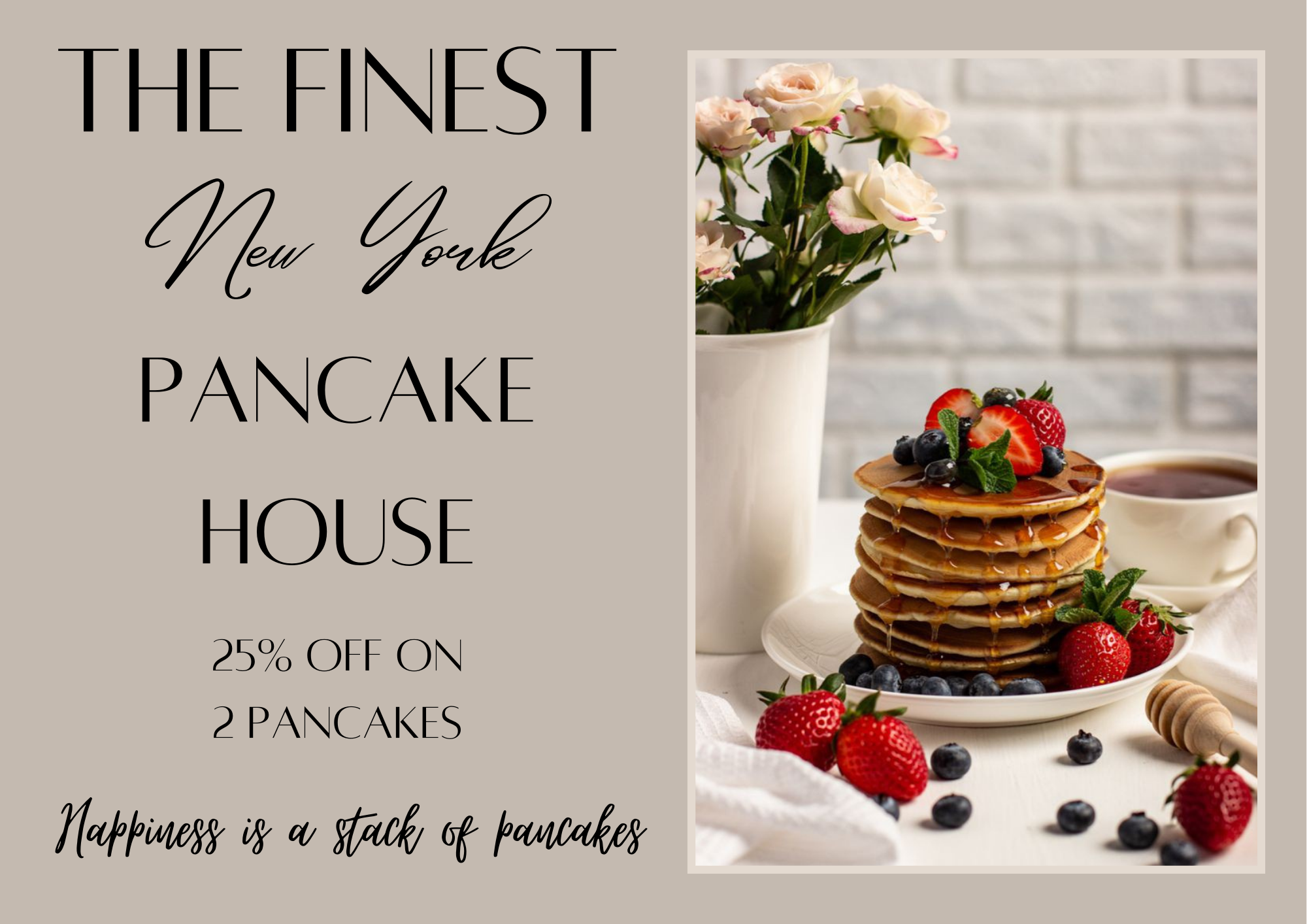
This looks good! I have some suggestions: the text "CS PANCAKE HOUSE" could be placed somewhere else, or just change the color since it won't be very clear if someone were to see it from a distance, the name is the most important part. Also, I'd recommend using the empty spaces near the "august 25". I really love the layout!
1 month ago by lilac
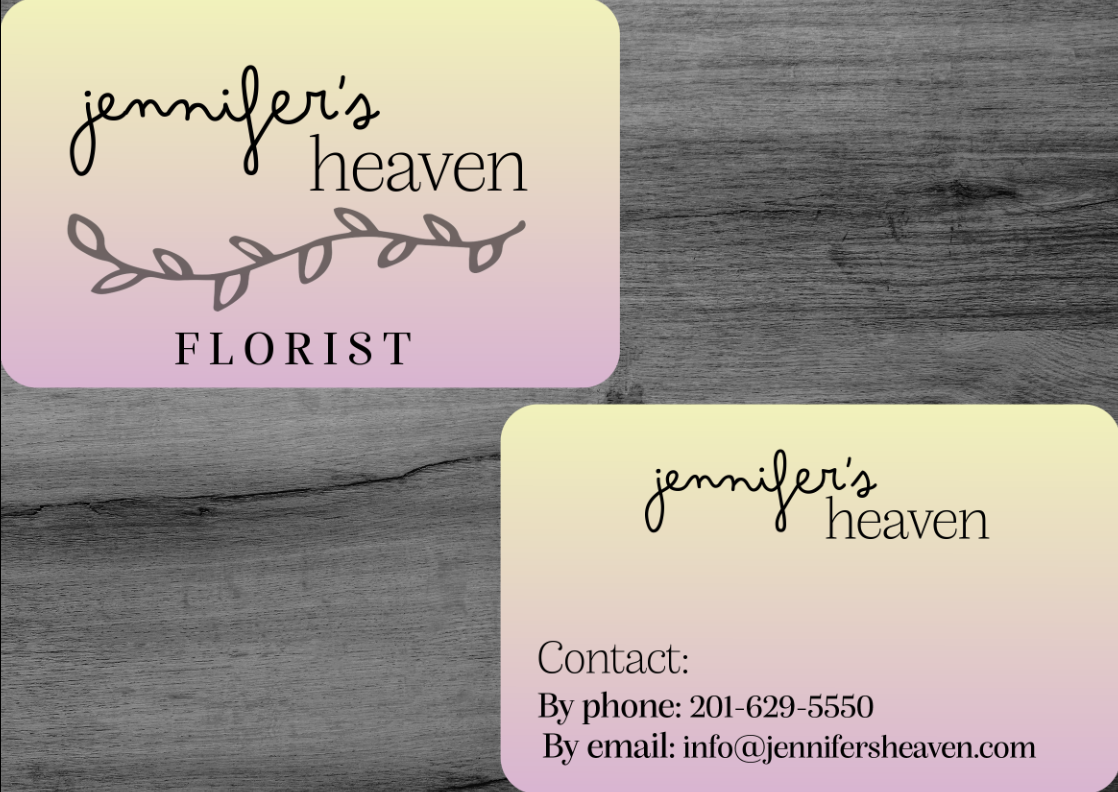
of course I get your pov! I think I'd prefer if the "Jennifer's" font was changed to, maybe something more smooth, for the lack of a better word. I'm no pro and I'm still learning too, so my advise may not be on point but this is what I felt as a viewer :)
1 month ago by lilac
Thank you so much for taking the time to give feedback! I understand your point, in the previous version, I had made the text (Vincent's restaurant) in glowy (if that's the word) font, you don't have to but I'd be grateful if you could see it once and let me know if that was better? Either way, thanks a lot! :)
1 month ago by lilac
Looks good! Maybe you can try using other fonts that look more professional?
1 month ago by lilac
This looks so professional!
1 month ago by lilac
looks great!

1 month ago by lilac
This looks really good!
1 month ago by lilac
Thank you, I really appreciate it! :)
1 month ago by lilac
Thank you for the feedback! I'll make some changes and keep this in mind!
1 month ago by lilac
I really like this! The way you used the color theory is great, overall it looks modern and clean!

1 month ago by lilac
maybe aligning the text in a proper manner would make it better!
1 month ago by lilac
Posts
Business advertisement poster - please give constructive criticism! :)
- Report
1 month ago by lilac
Hi!
I'm Elaina, owner of The Finest New York Pancake house. I'm looking for someone that can design something for my Pancake house. We will need a poster to advertise our business. Can you help us out?
I'm Elaina, owner of The Finest New York Pancake house. I'm looking for someone that can design something for my Pancake house. We will need a poster to advertise our business. Can you help us out?
 2 Likes
 2
2
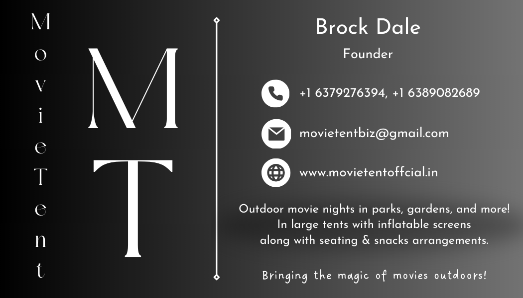
My first time making a business card, please give constructive criticism/feedback :)
- Report
1 month ago by lilac
Hey There,
I'm Brock, I recently started a new business called MovieTent. I'm looking for someone that can design something for my business. I want to have a business card for myself. Can you help us out?
I'm Brock, I recently started a new business called MovieTent. I'm looking for someone that can design something for my business. I want to have a business card for myself. Can you help us out?
 Like
1
Like
1
Good work. I would consider reducing some of the information on the front though, and make use of white space.
1 month ago by Mercy Mwangi - Reply
Please give feedback! :)
- Report
1 month ago by lilac
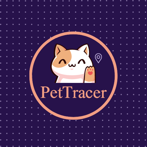
Hey,
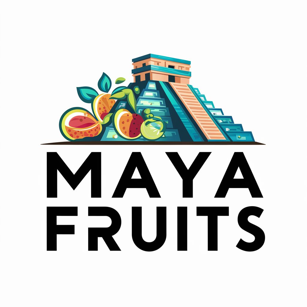
I am Van, I recently started a new business called PetTrace. I'm looking for someone that can make a good logo for my business. I think a combination mark will fit best with the business. Can you help us out?
I am Van, I recently started a new business called PetTrace. I'm looking for someone that can make a good logo for my business. I think a combination mark will fit best with the business. Can you help us out?
 3 Likes
1
3 Likes
1
Nice design
1 month ago by Mercy Mwangi - Reply
Wordmark logo
- Report
1 month ago by lilac
Please give constructive criticism :)
Hello,
I am Kai, owner of hali.com. For a while now, I've been looking for a good logo for my business. I think a wordmark would look cool. Can you do that?
I am Kai, owner of hali.com. For a while now, I've been looking for a good logo for my business. I think a wordmark would look cool. Can you do that?
 Like
1
Like
1
Nice
1 month ago by Mercy Mwangi - Reply
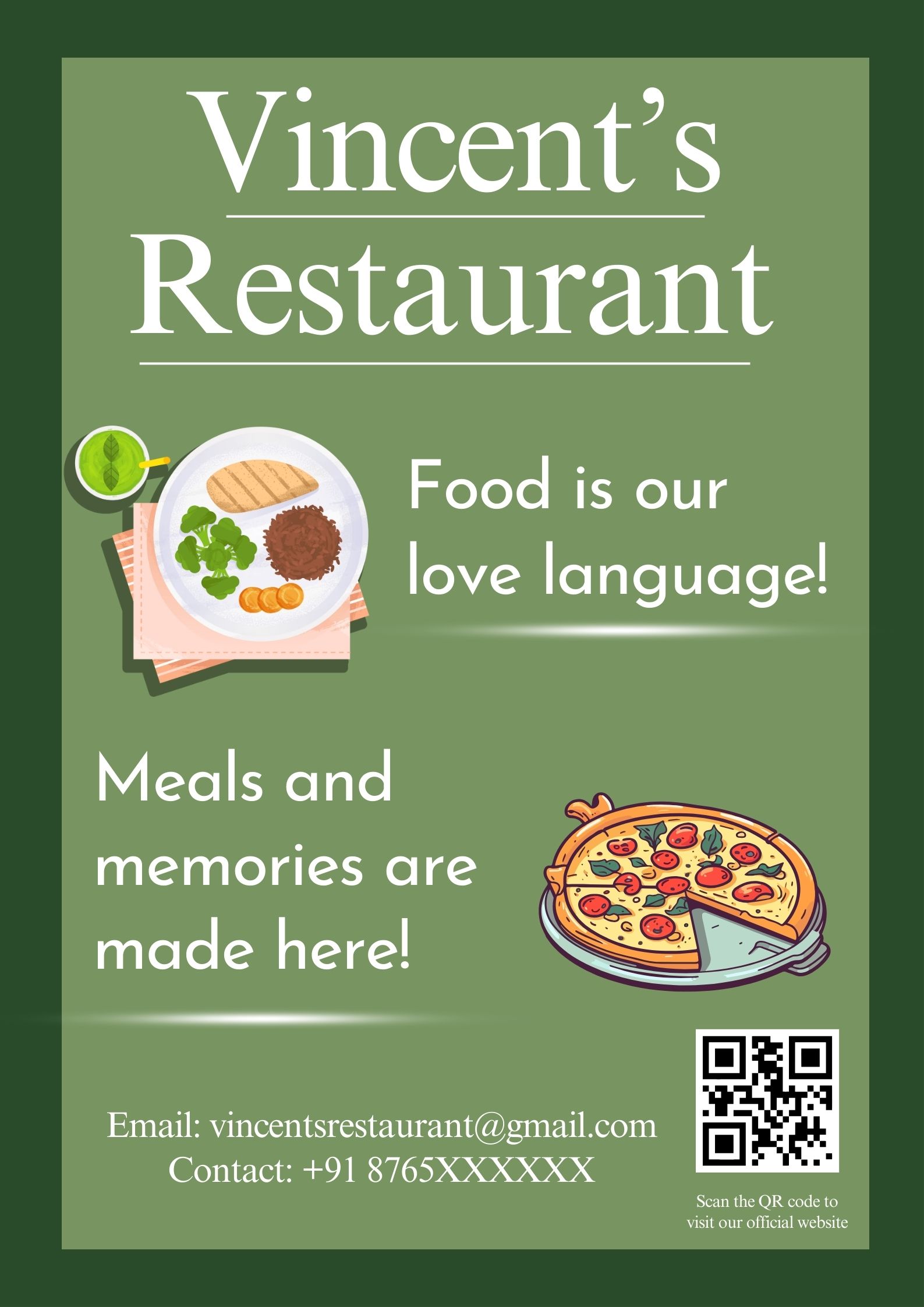
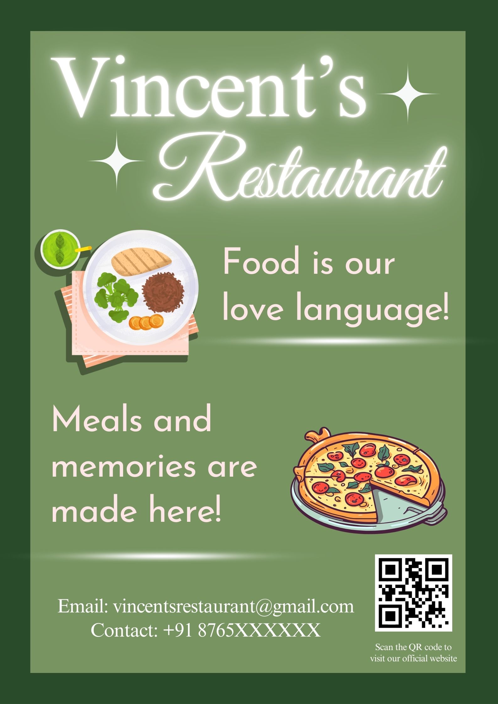
Restaurant poster- improved version
- Report
1 month ago by lilac
Hi!
I am Vincent, owner of Vincent's Restaurant. For a while now, I've been looking for a good designer for my business. We will need a poster to advertise our business. Can you help us out?
I am Vincent, owner of Vincent's Restaurant. For a while now, I've been looking for a good designer for my business. We will need a poster to advertise our business. Can you help us out?
Like
4
I like this. It's clean, fresh, and simple and the text is legible.
My only advice is to make sure you focus your attention on what it is that you want to be seen first. In this instance, my eye is drawn directly to the plate of food and then Food is our love language, as opposed to Vincent's Restaurant first.
(Please understand, that everyone views things differently! Just pointing out something to keep in mind for future designs.)
Otherwise, great job! Great choice of images and colours! :)
1 month ago by Kelly - Reply
Thank you so much for taking the time to give feedback! I understand your point, in the previous version, I had made the text (Vincent's restaurant) in glowy (if that's the word) font, you don't have to but I'd be grateful if you could see it once and let me know if that was better? Either way, thanks a lot! :)
1 month ago by lilac - Reply
Oke
1 month ago by 66degress - Reply
Nice
1 month ago by Bilal - Reply