Kelly
Posts
1
Likes
6
Liked Posts
1
Given Feedback
3
Feedback
Hi Lilac!
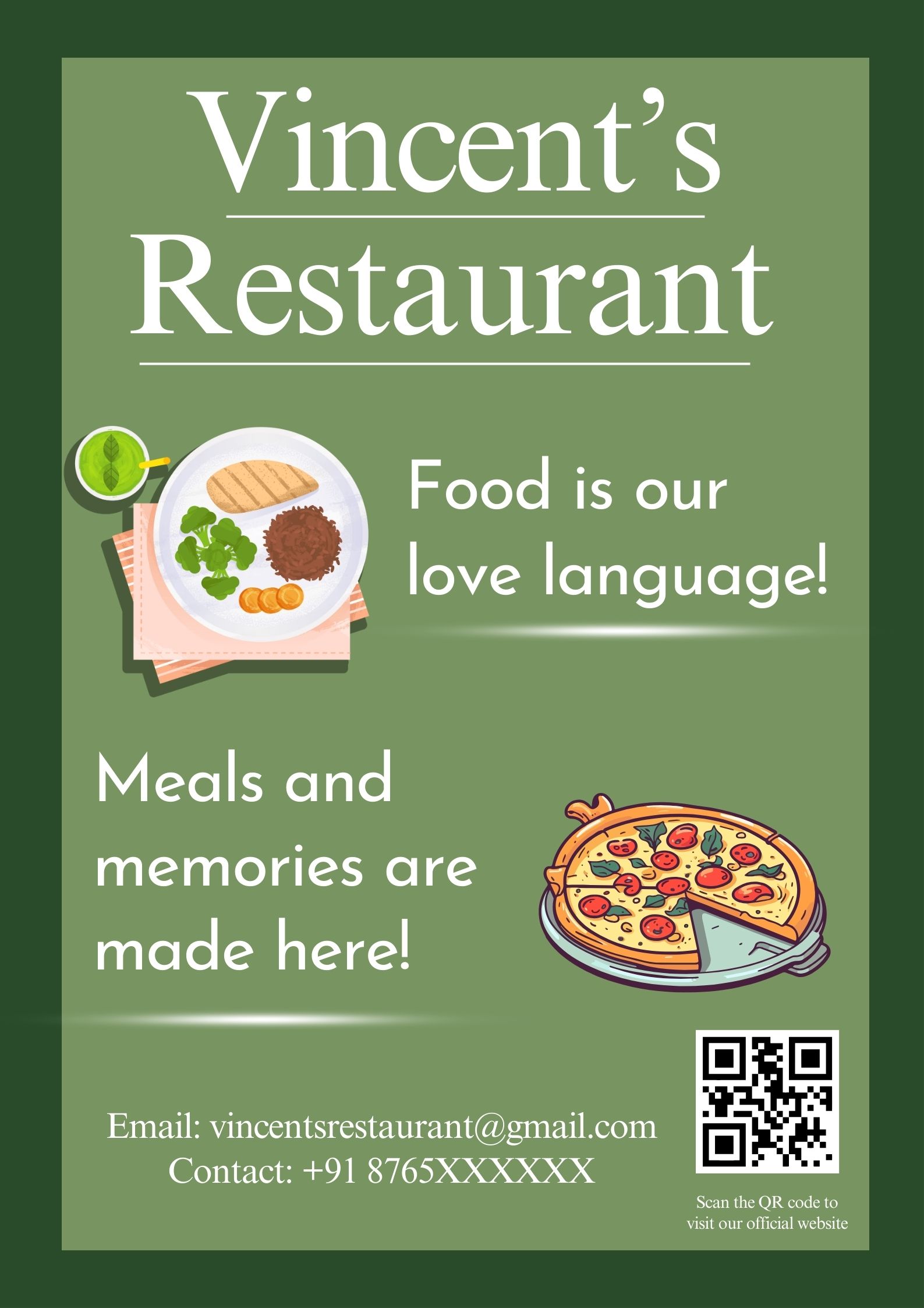
After looking at your other design and this one, I feel that the heading is easier to read and more eye-catching on this one. I do agree that the font is too glowy though.
I tend to find that fonts that are Slab-Serif work better for flyers.
There is a great article on tutsplus. com that explains this in further detail.
The Different Types of Fonts: When to Use Each Font Type and When Not
Hope this helps. x :)
1 month ago by Kelly
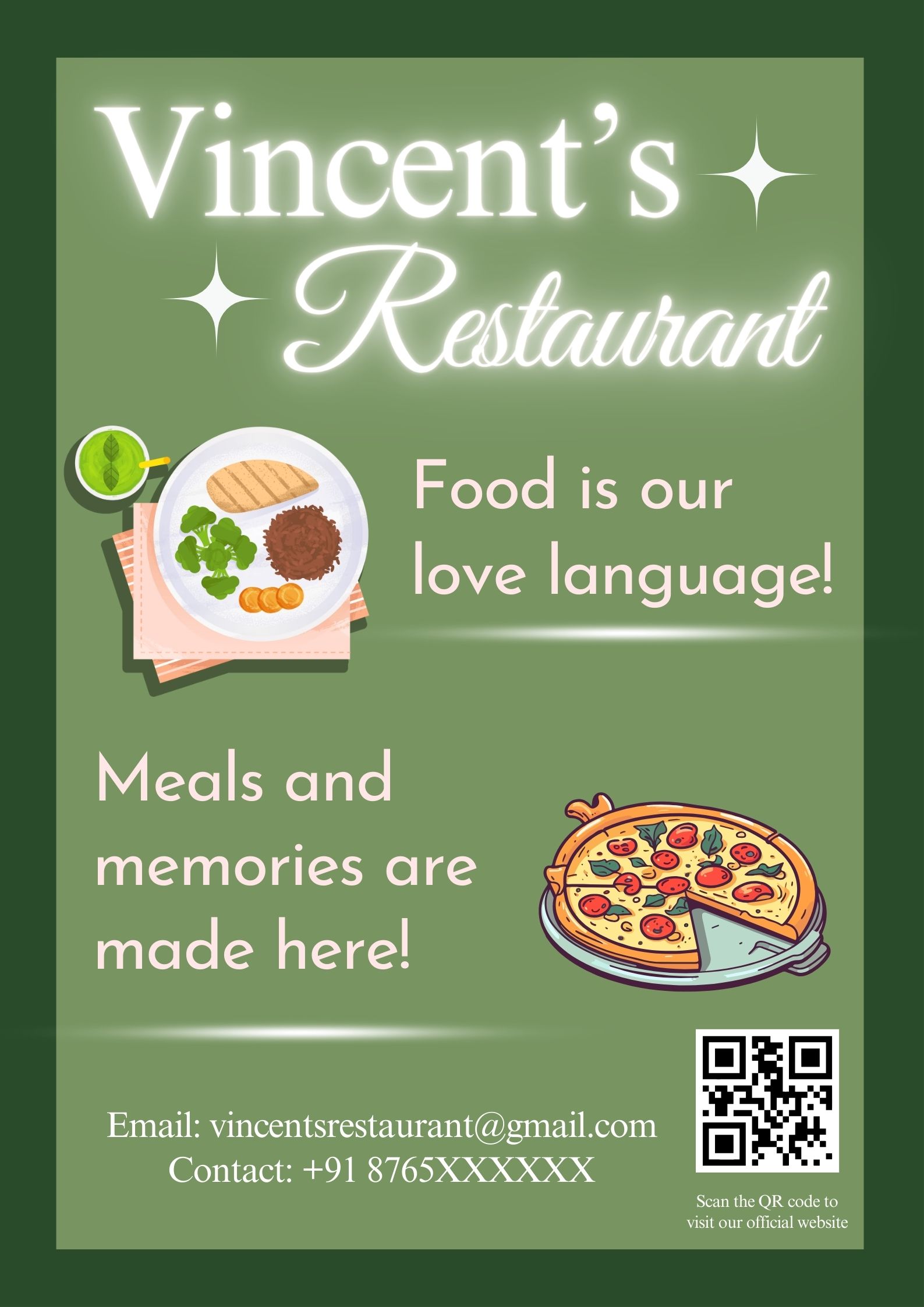
I like this. It's clean, fresh, and simple and the text is legible.
My only advice is to make sure you focus your attention on what it is that you want to be seen first. In this instance, my eye is drawn directly to the plate of food and then Food is our love language, as opposed to Vincent's Restaurant first.
(Please understand, that everyone views things differently! Just pointing out something to keep in mind for future designs.)
Otherwise, great job! Great choice of images and colours! :)
1 month ago by Kelly
Thank you!
1 month ago by Kelly
Posts
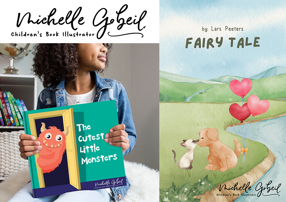
Michelle Gobeil - Children's Book Illustrator - Name Logo Design
- Report
1 month ago by Kelly
Michelle is a Children's book Illustrator and needs a name Logo for her website, social media usage and a logo that can be used on her books.
She would like her name to be displayed like it is handwritten with a pencil or a brush and would highly prefer the logo to be designed without using an actual font as she would like it to be as unique as possible.
She would like her name to be displayed like it is handwritten with a pencil or a brush and would highly prefer the logo to be designed without using an actual font as she would like it to be as unique as possible.
Michelle Gobeillogo
 6 Likes
 2
2