Crystle
Posts
6
Likes
19
Liked Posts
21
Given Feedback
0
Posts
Logo design
- Report
3 years ago by Crystle
Hey,
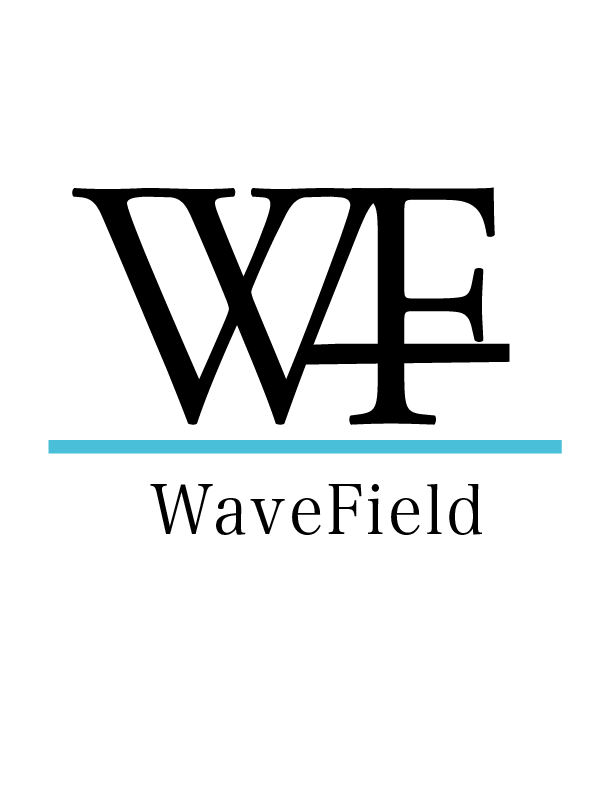
I'm Adele, I just founded a new business called WaveField. We're looking for someone that can create a simple logo for our business. I like pictorial marks. Would you be interested?
I'm Adele, I just founded a new business called WaveField. We're looking for someone that can create a simple logo for our business. I like pictorial marks. Would you be interested?
 Like
Like
 1
1
Hi. I like the blue. I don't understand the 3rd line that goes through the F.
I would end the upward last line of the W where the middle line of the F starts - connect them there and maybe make it a little curvy - to go with the "wave" concept. Or maybe make the blue line wavy (a field wave - not sure)?
Al, the client said she likes pictorial marks - maybe it's something to keep in mind.
3 years ago by Adina Stroe - Reply
Combination Mark
- Report
3 years ago by Crystle
Hello,
I'm Jammie, I recently started a new business called ParkZone. For a while now, I've been looking for a good logo for my business. I think a combination mark will fit best with the business. We would love to work with you!
 Like
1
Like
1
it dont really fit for fhat it is made for
1 month ago by Emka - Reply
Simple Logo
- Report
3 years ago by Crystle
Som-Numlogo
 2 Likes
1
2 Likes
1
first one is good but you should work on color and contrast
1 month ago by dk - Reply
Written Logo design
- Report
3 years ago by Crystle
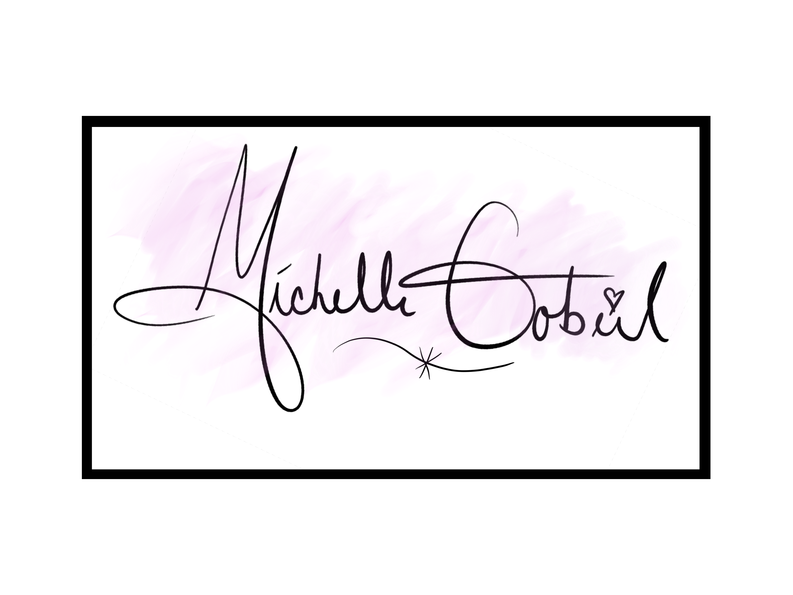
I'm an illustrator and I need a logo of my own name for my website, social media and possibly to be used on my books. What I would like is my name, Michelle Gobeil, displayed like it was written with a pencil or brush or anything like that. It would be perfect if you could create the logo without using a font because I would like it to be unique.
 2 Likes
1
2 Likes
1
nice
1 month ago by dk - Reply
Mocking by Jay
- Report
3 years ago by Crystle
Hi,
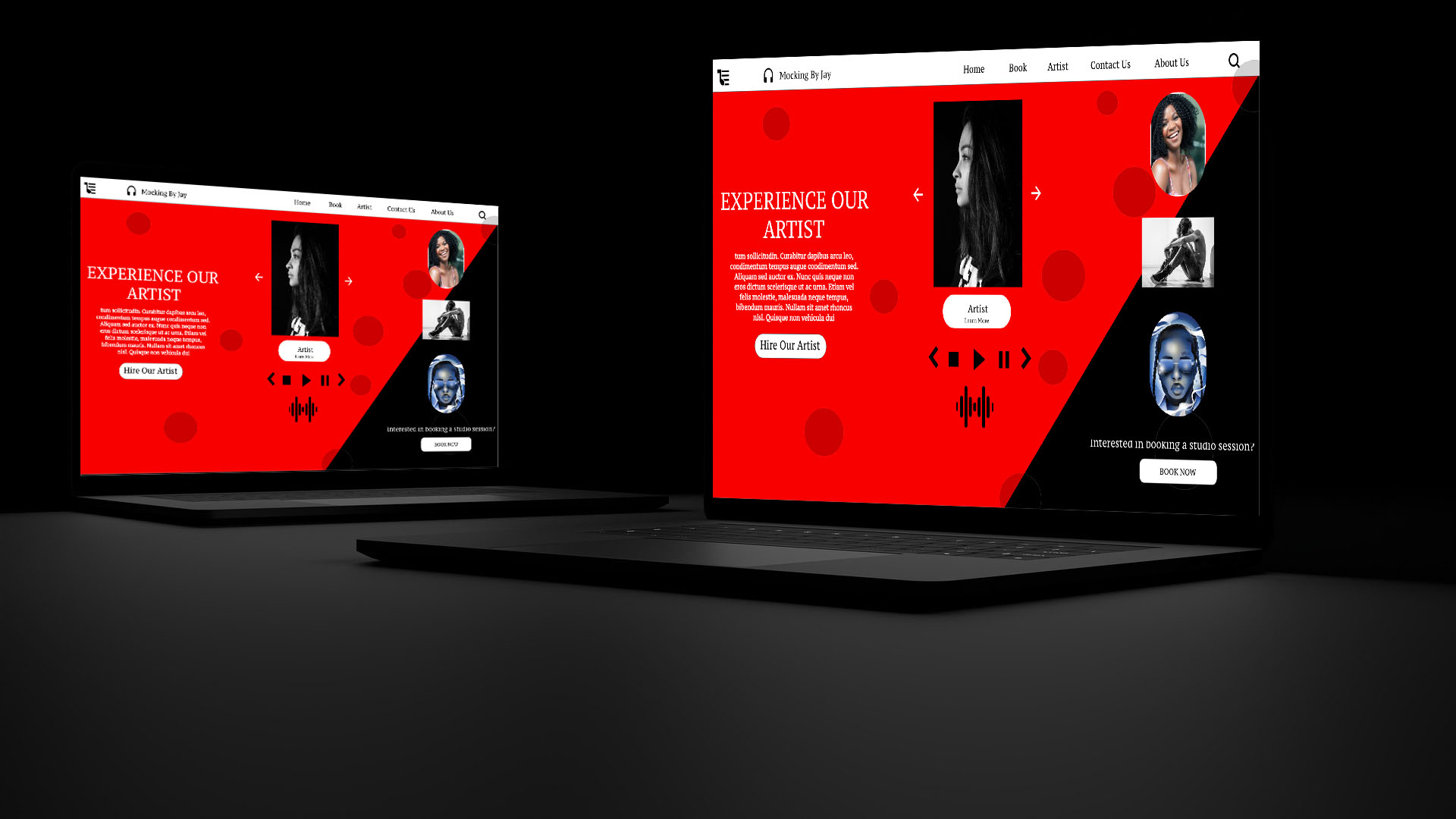
My name is Jay, I am the owner and face behind Mocking by Jay, a major record label that is mostly focussed on rap music. We manage loads of different artists and therefore are quite a large company whose image is changing constantly. Each new artist adds something new to the label and we always try and encourage our musicians to really push forward with whatever makes them stand out. With our constantly changing label's image, often also comes an update within the look of the label's website. Since it has been quite some time since the last time that the Mocking by Jay website has had a redesign, we figured it was about time for one. For that reason, we would like you to design a simple landing page. We want the site to come off as very independent, very urban, and chill. Because that is also how we work here at Mocking by Jay. We always like our stars to be comfortable and proud of the work that they put out. The site will mainly be used for people to book our artists through, so that should be the main focus. Next to that, there should be something you can click if you want to see more about our artists or about the label and somewhere you can go within the site if you want to book a studio session. We want the landing page to be clean though, so do not make it too crowded with buttons and images and such. It would be best is you primarily used the colors red and black. I hope these instructions are clear and I am looking forward to what you come up with.
Best,
 14 Likes
1
14 Likes
1
bro thats amazing
1 month ago by abdul mustafa - Reply