Emka
Posts
1
Likes
1
Liked Posts
2
Given Feedback
35
Feedback
ok

5 months ago by Emka
not this font,not this colour
5 months ago by Emka
contour

5 months ago by Emka
too simple

5 months ago by Emka
try without a contour

5 months ago by Emka
nice
5 months ago by Emka
it dont really fit for fhat it is made for

5 months ago by Emka
nice

5 months ago by Emka
nice

5 months ago by Emka
nice
5 months ago by Emka
try with diffrent-modern font

5 months ago by Emka
trochę nieczytelne

5 months ago by Emka
should be the same thickness

5 months ago by Emka
try with the same thickness

5 months ago by Emka
perfect
5 months ago by Emka
amazing
5 months ago by Emka
nice and simple
5 months ago by Emka
te fonty nie pasują do siebie, daj to na środek

5 months ago by Emka
nice

5 months ago by Emka
mega fajny design
5 months ago by Emka
i really like it

5 months ago by Emka
nice!
5 months ago by Emka
oddal to trochę od krawędzi

5 months ago by Emka
i really like your idea

5 months ago by Emka
,,B" should be in the middle. Slogan should be lower to fit the logo

5 months ago by Emka
it really looks good, i would change colors alternatively

5 months ago by Emka
mniej kwadratów/ obrysów. staraj się nie wyjeżdżać poza obszar roboczy
5 months ago by Emka
OMG you ate that. Amazinggg

5 months ago by Emka
za dużo się tu dzieje, nie ma spójności

5 months ago by Emka
the upper circle a bit up and will be good

5 months ago by Emka
everything fits together nicely, i'm not sure about those squares, but the rest <<chef kiss>>
5 months ago by Emka
i think it would be better if the spaces were the same

5 months ago by Emka
Try a different font. This one is too thin and doesn't match the rest.

5 months ago by Emka
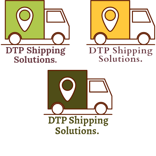
i really like the idea of wings mixed as it is part of the truck. Overall this project is brilliant
5 months ago by Emka
try to change the arrow, it doesn't look very professional
5 months ago by Emka
Posts
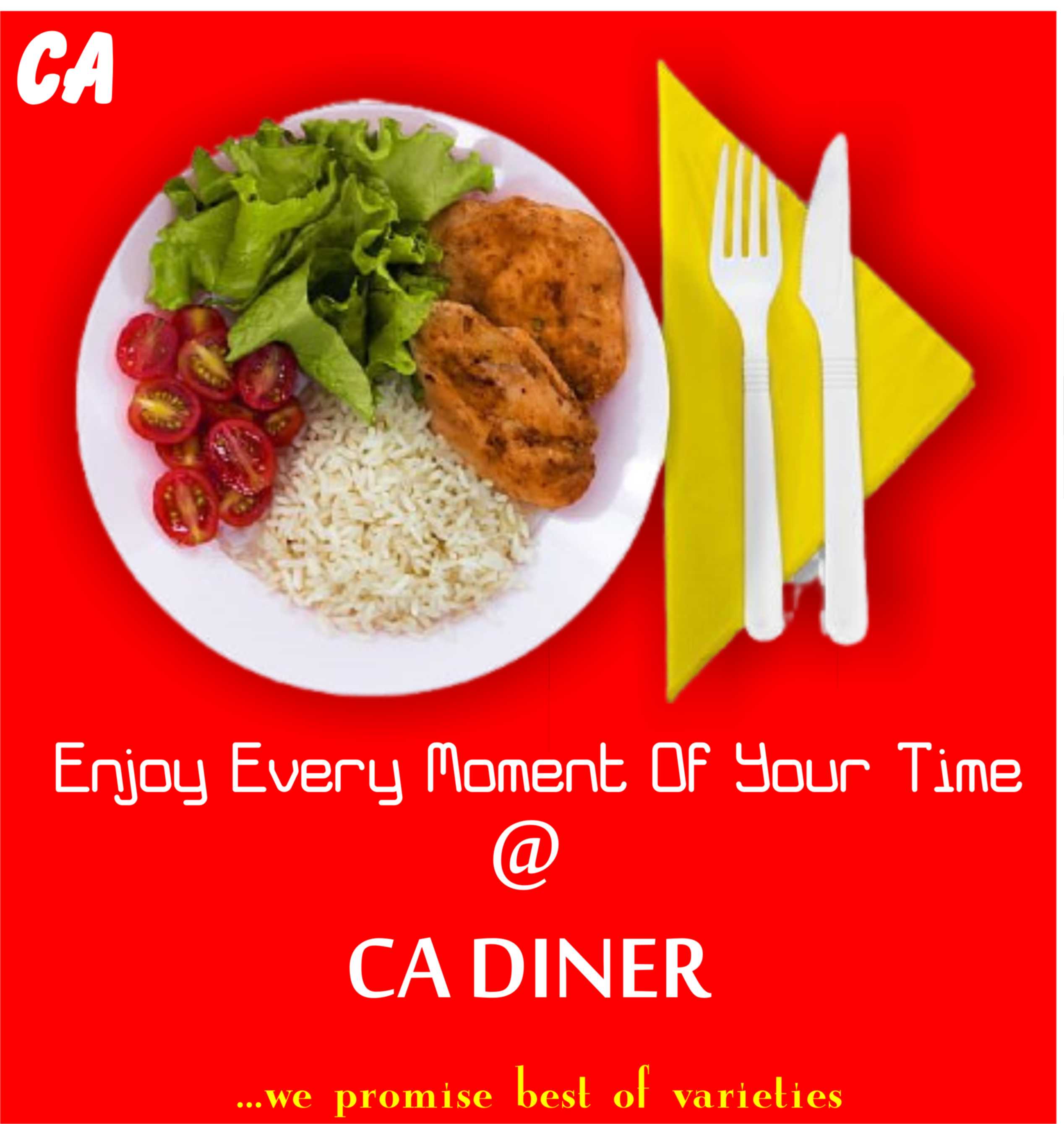
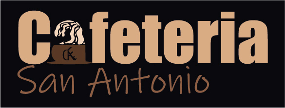
logo for cafeteria
- Report
Emka • 5 months ago
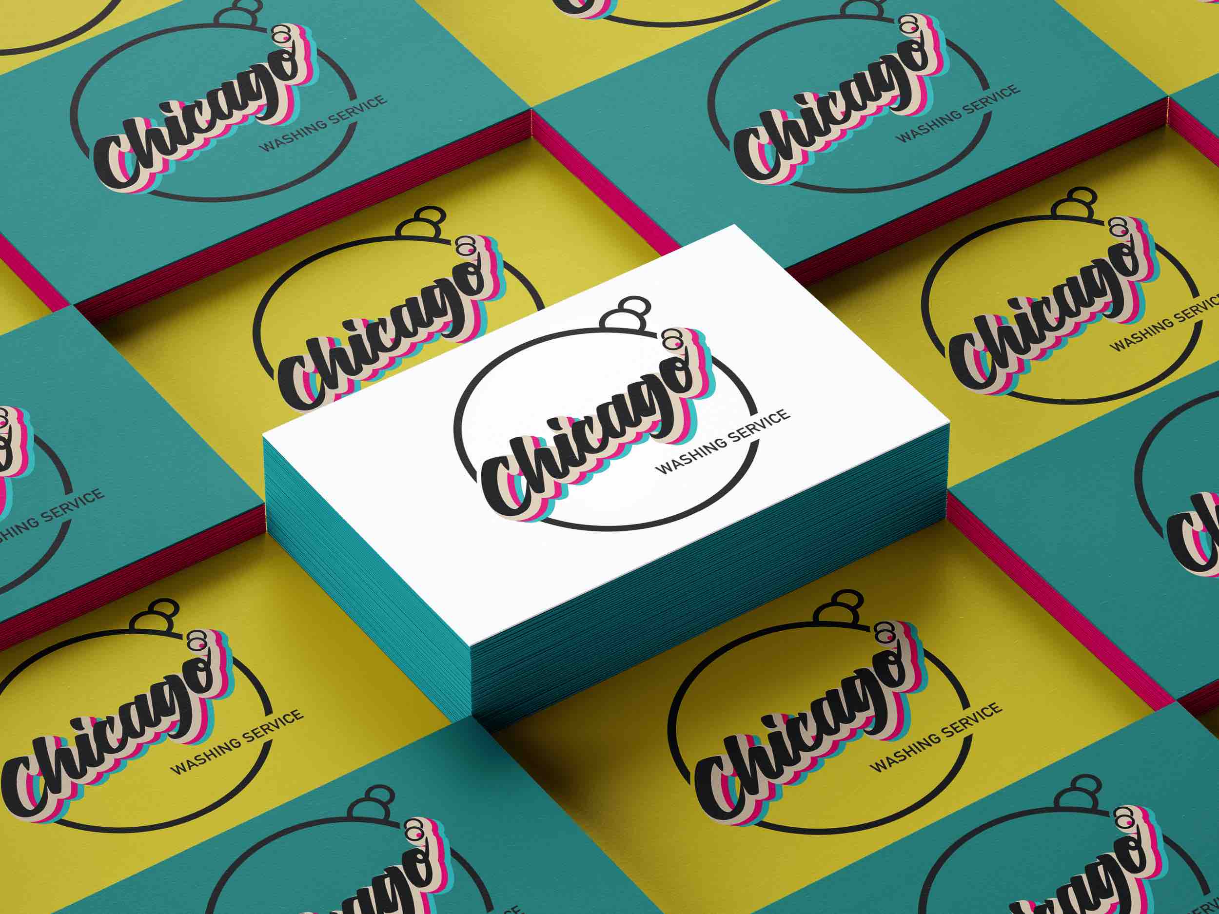
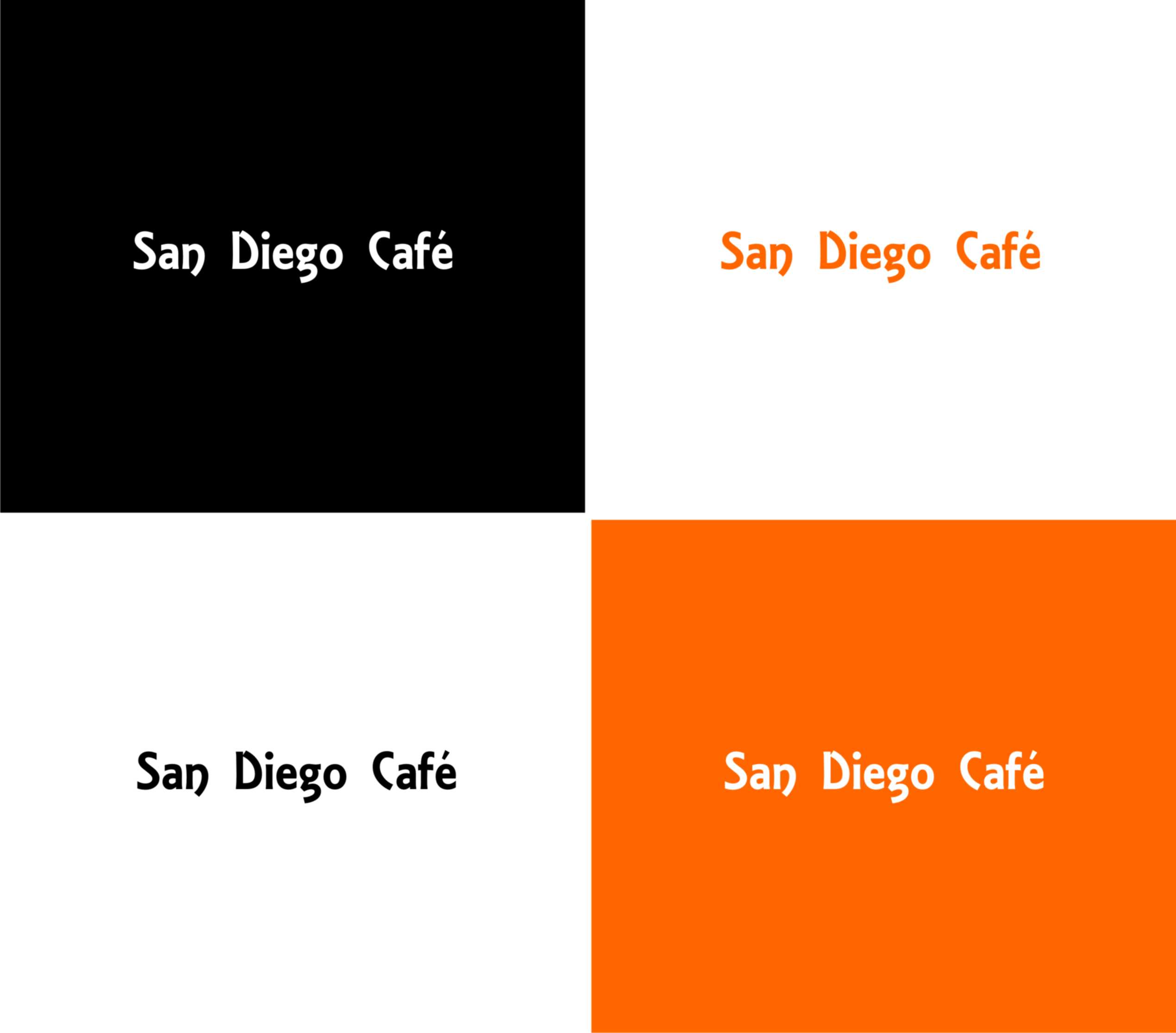
Hello! I'm Greg, creator of San Antonio Cafeteria. For a while now, we've been looking for a good logo for our Cafeteria. I think a lettermark will fit best
Hello!
I'm Greg, creator of San Antonio Cafeteria. For a while now, we've been looking for a good logo for our Cafeteria. I think a lettermark will fit best. Would you be interested?
I'm Greg, creator of San Antonio Cafeteria. For a while now, we've been looking for a good logo for our Cafeteria. I think a lettermark will fit best. Would you be interested?


Nice work!
5 months ago by Raphael Etim - Reply