Adina Stroe
Posts
1
Likes
3
Liked Posts
0
Given Feedback
1
Feedback
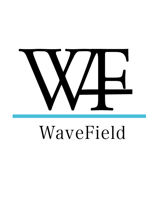
Hi. I like the blue. I don't understand the 3rd line that goes through the F.
I would end the upward last line of the W where the middle line of the F starts - connect them there and maybe make it a little curvy - to go with the "wave" concept. Or maybe make the blue line wavy (a field wave - not sure)?
Al, the client said she likes pictorial marks - maybe it's something to keep in mind.

3 years ago by Adina Stroe
Posts
Houston Jewellery
- Report
3 years ago by Adina Stroe
The diamond is also an H. Is that visible?
Hello!
I'm Van, founder of Houston Jewellery. I'm looking for someone that can make a good logo for my Jewellery. I like pictorial marks. Can you do that?
I'm Van, founder of Houston Jewellery. I'm looking for someone that can make a good logo for my Jewellery. I like pictorial marks. Can you do that?
