Dayne
Posts
1
Likes
2
Liked Posts
11
Given Feedback
12
Feedback
I thought I seen a different word at first...I wont type which word. I think you have a good idea but needs some refining. Good work!
2 years ago by Dayne
Great, I think you have designed something really professional. The logo would stick in my mind.
2 years ago by Dayne
Great- I've been working on this brief myself and I really like the way you went with it. Good work.
2 years ago by Dayne
I'd go with the top right one however all three look great. Top left has a little alignment issue on the 1992 but the detail of the teapot is nice. Well done, good work.

2 years ago by Dayne
Great. Wouldn't change a thing! Sorry I don't have any feedback.
2 years ago by Dayne
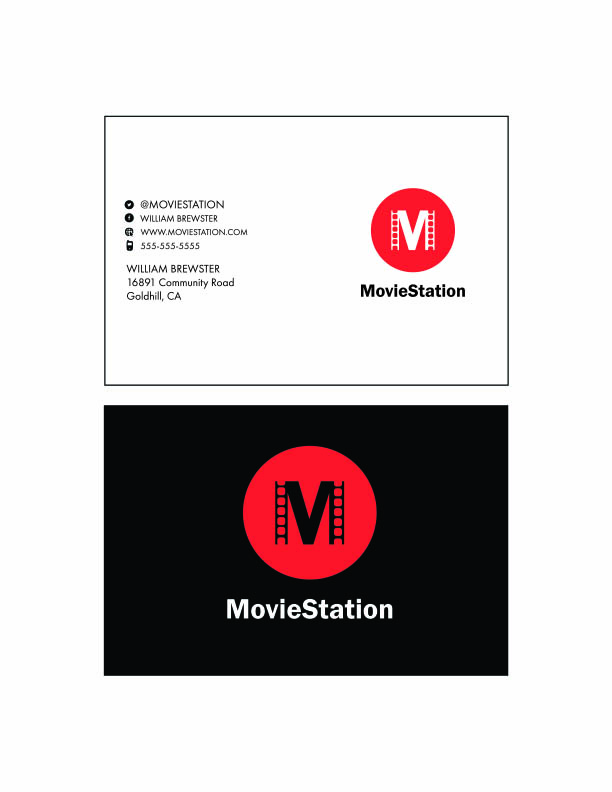
Love it! I'd be impressed if I was your client. I really like the colours and the way you have used movie tape on the M. Great work.
2 years ago by Dayne
Looks good, If I was the client I'd only ask for the star to be a little more complete, I like the way it stops but I'd like to see it go on a little further. Well done though!

2 years ago by Dayne
This is pretty neat, exactly what the brief asked for. Its a little simplistic for my liking but If I seen this out in the real world, I'd appreciate the originality. Well done!
2 years ago by Dayne
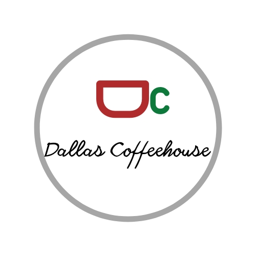
Good idea. I like the concept. I think there is a little too much white space, id even be tempted to get rid of the large circle, make the mug bigger and then use a more bolder font for the name. This is nice effort though, well done!
2 years ago by Dayne
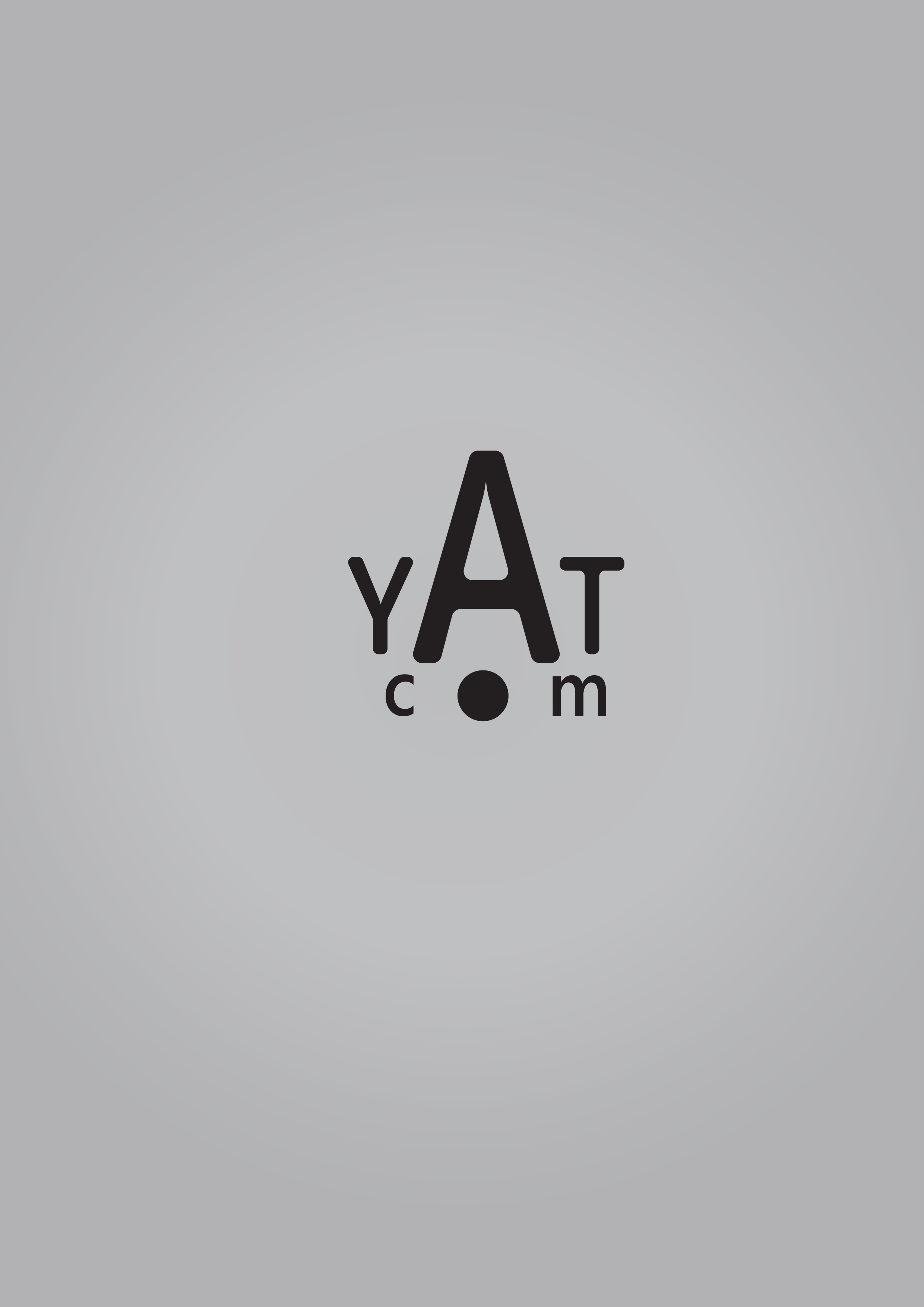
Nice! I like the A. If I was to change anything I would probably complete the O with whit circle in the centre so its a little less solid however, I would accept it either way. Good work
2 years ago by Dayne
I like the layout, good use of the space. My only feedback would be the font colour, its a little muted so doesn't jump out too well. Overall well done!
2 years ago by Dayne
I like it, the curl if the big E could do with correcting but the overall style is simplistic and nice!
2 years ago by Dayne
Posts
First ever logo attempt-DTP
- Report
Dayne • 2 years ago
I wanted to keep this simple, the left lines are meant to show movement. I liked the idea of DTP being combined but I don't think I pulled it off. I wanted to share anyway. Thanks!
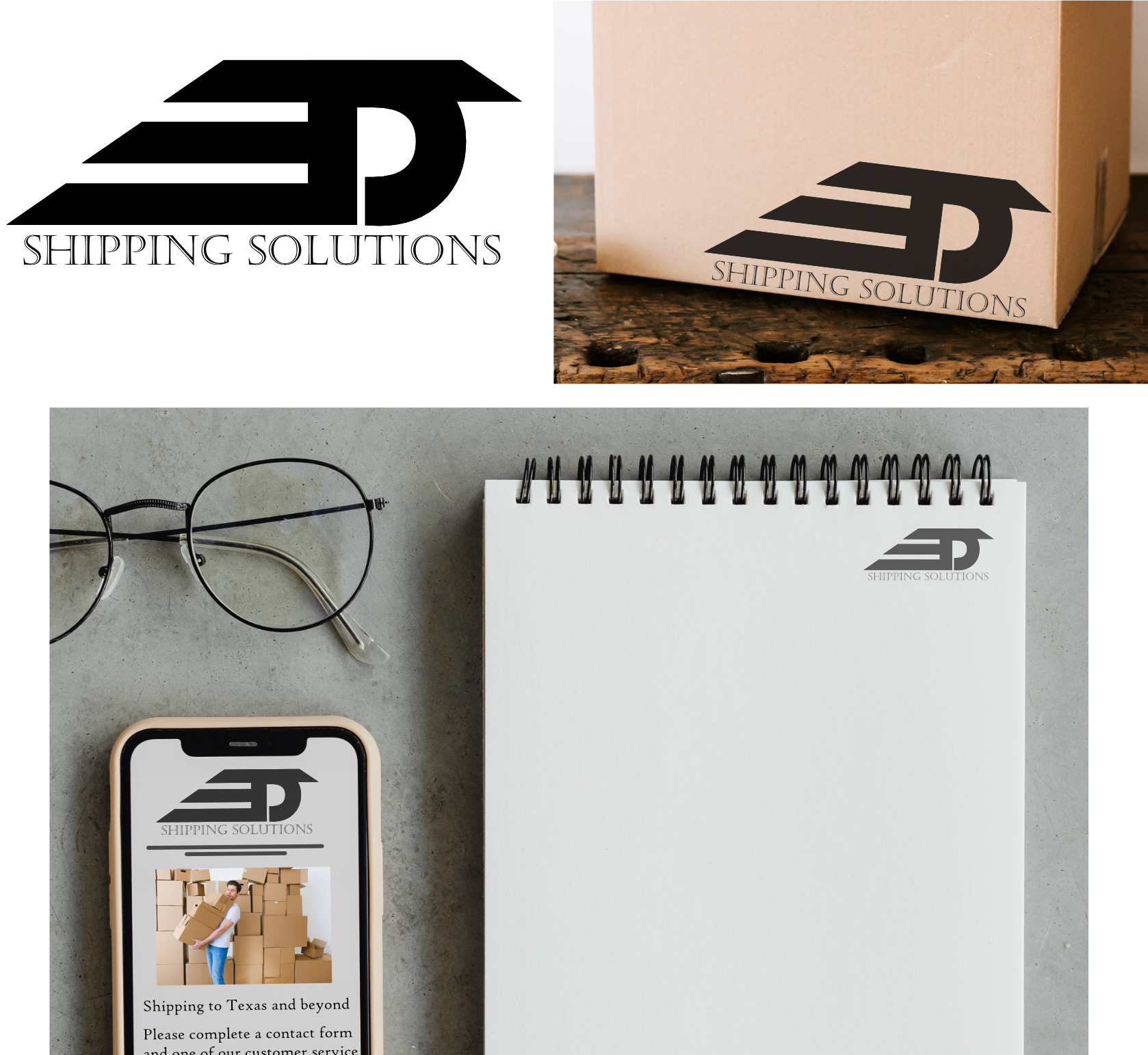


The logo is recognizable, but the text... i don't know. I see "T", i see "D", but "P" is not there or is not readable at all. Also the text is to different from the logo style, and a bit not well alligned with it. The Idea is good, but is not finished. Keep it up!
2 years ago by Aurel - Reply