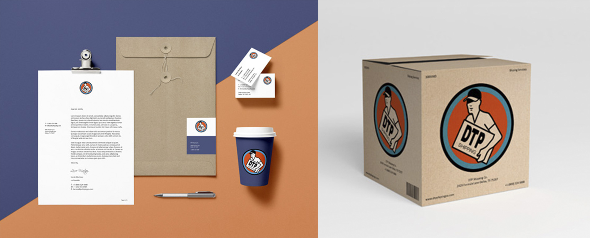
First ever logo attempt-DTP
- Report
2 years ago by Dayne
I wanted to keep this simple, the left lines are meant to show movement. I liked the idea of DTP being combined but I don't think I pulled it off. I wanted to share anyway. Thanks!

 2 Likes
 1
1
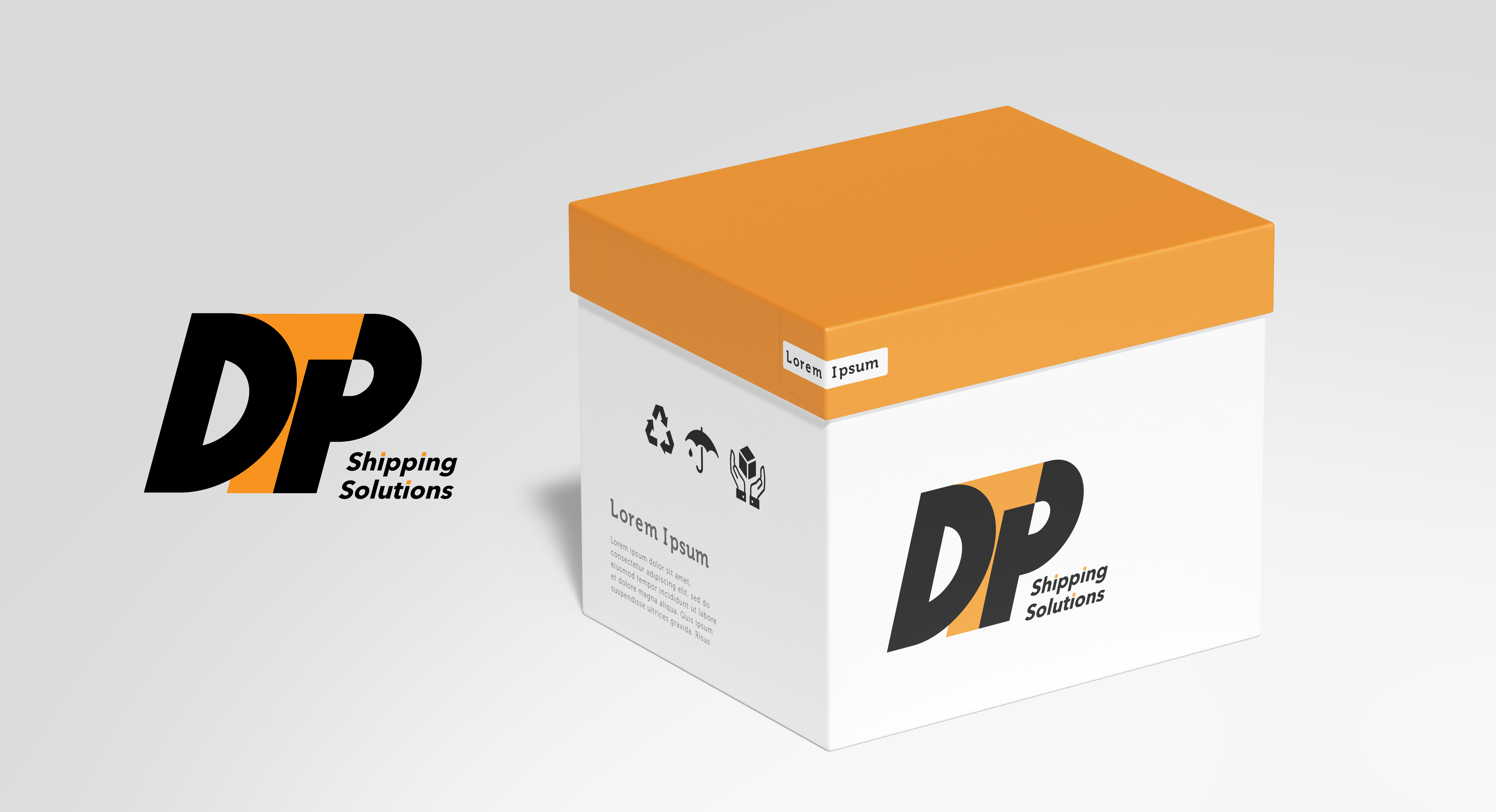
The logo is recognizable, but the text... i don't know. I see "T", i see "D", but "P" is not there or is not readable at all. Also the text is to different from the logo style, and a bit not well alligned with it. The Idea is good, but is not finished. Keep it up!
2 years ago by Aurel - Reply