Fiona Soh
Posts
4
Likes
3
Liked Posts
1
Given Feedback
5
Feedback
i wouldnt notice the 'H' in the logo if you didnt mention it!

3 years ago by Fiona Soh
omg this is so damn cool.
3 years ago by Fiona Soh
hey! great creativity but i think that this feels more like a webpage instead of a flyer. probably u can add more info about the event? like location and stuff that will be happening on the day.
3 years ago by Fiona Soh
hey. Thanks for your feedback!
Firstly, the body is actually terms and conditions of the promotion which are usually included in the flyer at the bottom of the page. It isn't important details that customers need to know of so the font is small.
Secondly, i used a total of only 2 fonts in this flyer. i played around with the kerning of the letters (eg. opening special, and 'applicable for all classic and premium teas'). However, do u think that i should standardize the fonts?
Thirdly, looking back at the image, i feel that it can be replaced with smth modern and brighter because it in fact is a little gloomy. Will make changes on that!
Also, the location is at the top, that's not the date. my intention for this flyer was to come up with a promotion event for customers to patronize the new business so no sponsors.
I agree with the hierarchy of what should be important because i was trying to figure out how to make use of the space below the image to squeeze in all the information i want to convey to the customers but making it less cluttery. Any suggestions? would love to hear it!
3 years ago by Fiona Soh
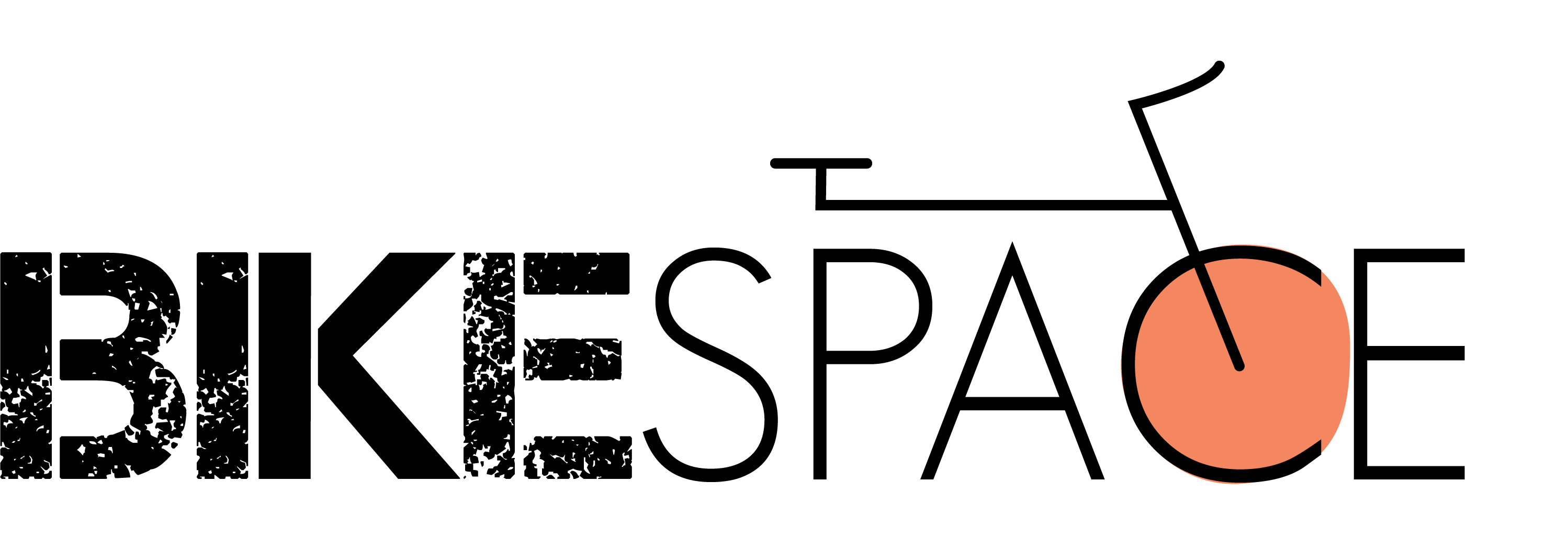
love how you incorporated an outline of a bike in the logo. rlly cool!
3 years ago by Fiona Soh
Posts
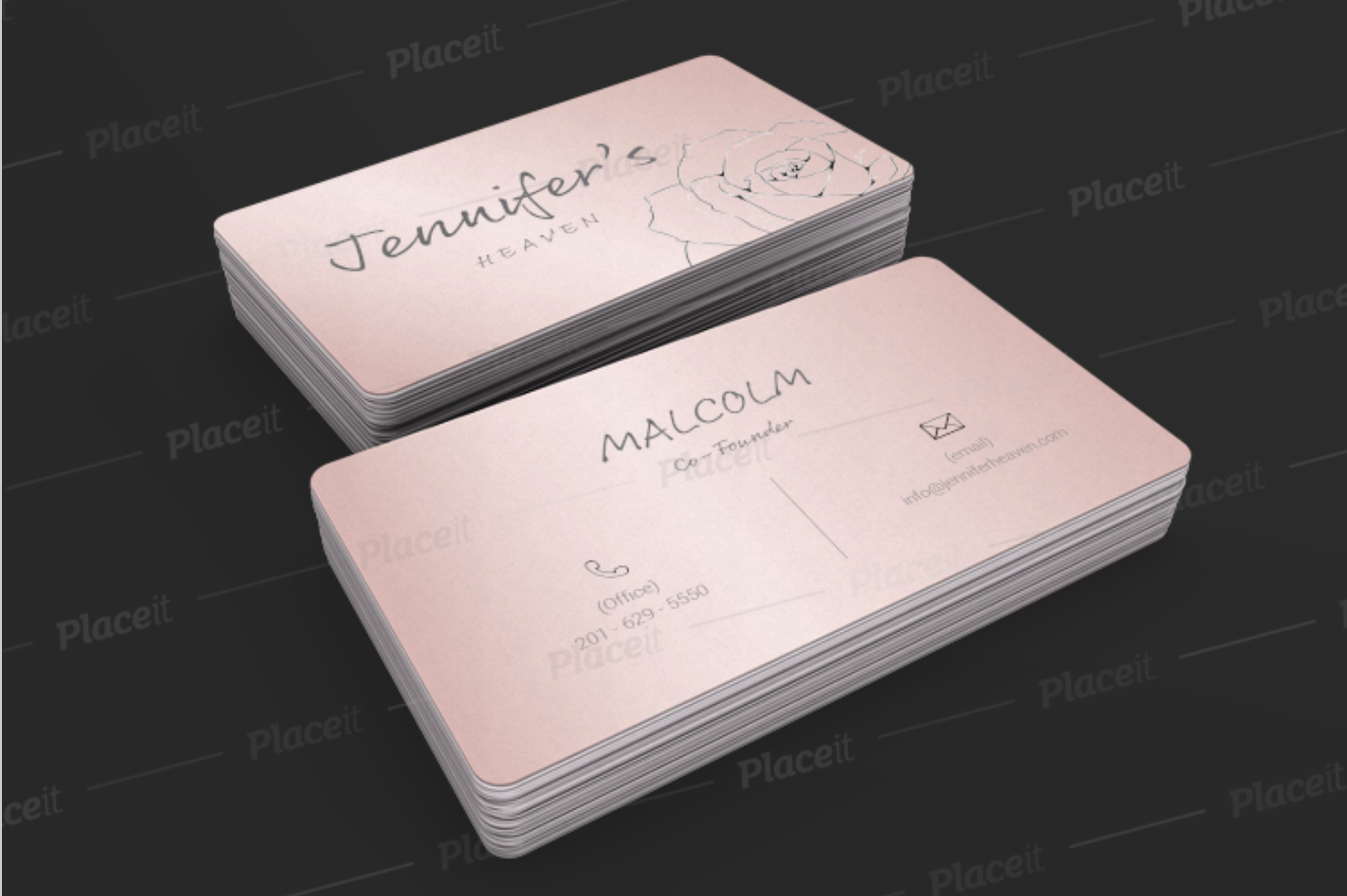
Jennifer's Heaven Business Card (Floristry)
- Report
3 years ago by Fiona Soh
Business Card Mock Up
Jennifer's Heavengraphic
 1 Like
 1
1
Overall card is looking good but fonts are not visible
2 months ago by dk - Reply
Jennifer's Heaven Business Card (Floristry)
- Report
3 years ago by Fiona Soh
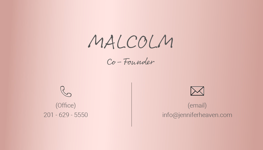
Business Card Page 2
Jennifer's Heavengraphic
 Like
1
Like
1
you should work on contrast
2 months ago by dk - Reply
Jennifer's Heaven Business Card (Floristry)
- Report
3 years ago by Fiona Soh
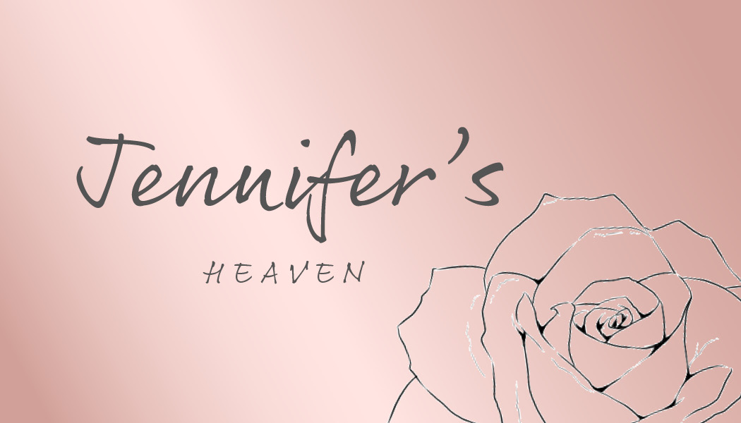
Business card Page 1
Jennifer's Heavengraphic
 1 Like
1
1 Like
1
good one
2 months ago by dk - Reply
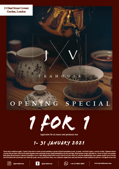
JXV teahouse event flyer (promo)
- Report
3 years ago by Fiona Soh
I've created a promotion event flyer, and created a logo for JXV teahouse. I chose a darker red for the theme as i feel that it gives off a modern cafe vibe which is something i'm going for. I would love to hear your feedback and thoughts on my design so that i can continue improving. :)
Hello!
I'm Angelic, I just founded a new business called JXV Teahouse. For a while now, I've been looking for a good designer for my Teahouse. I would like a simple flyer for an event. We primarily use the color red. Can you help me out?
I'm Angelic, I just founded a new business called JXV Teahouse. For a while now, I've been looking for a good designer for my Teahouse. I would like a simple flyer for an event. We primarily use the color red. Can you help me out?
1 Like
3
hey. Thanks for your feedback!
Firstly, the body is actually terms and conditions of the promotion which are usually included in the flyer at the bottom of the page. It isn't important details that customers need to know of so the font is small.
Secondly, i used a total of only 2 fonts in this flyer. i played around with the kerning of the letters (eg. opening special, and 'applicable for all classic and premium teas'). However, do u think that i should standardize the fonts?
Thirdly, looking back at the image, i feel that it can be replaced with smth modern and brighter because it in fact is a little gloomy. Will make changes on that!
Also, the location is at the top, that's not the date. my intention for this flyer was to come up with a promotion event for customers to patronize the new business so no sponsors.
I agree with the hierarchy of what should be important because i was trying to figure out how to make use of the space below the image to squeeze in all the information i want to convey to the customers but making it less cluttery. Any suggestions? would love to hear it!
3 years ago by Fiona Soh - Reply
Also, the logo ends up being read as "JV Teahouse", not JXV Teahouse. Please play around with the initials more to make everything easily readable.
3 years ago by Maddie - Reply
You can use 2-3 columns for the body because it's kinda unreadable. Also, how many fonts did you use, because the maximum is 2-3 kinds of fonts. The royalty-free image you used looks more like it's fit for a traditional tea ceremony for Budist monks, not a '"modern cafe" because the atmosphere it gives off is too gloomy.
The hierarchy of what's importance is also off. why is the date on top, when it should be the logo?
Also, will there be sponsors for such an event? What is this "1 for 1" for because the copy is unreadable? How do you apply?
Please have these fixed, design-wise
3 years ago by Maddie - Reply