Maddie
Posts
0
Likes
0
Liked Posts
2
Given Feedback
11
Feedback
wasn't specified*
3 years ago by Maddie
Nice attempt and your submission is better compared to how others tried tackling this brief.
However, don't put the logo type font on top of the logo icon. It's unprofessional and not visually appealing to look at.
Also, I think you shouldn't have tackled this brief because it's actually incomplete. The user profile of Michelle doesn't provide enough information for any actual graphic designer to go with. No color preferences, logo preferences she might like, and even quick info on her book was specified for anyone to adjust to.
3 years ago by Maddie
This is not a logo, just an illustration... There's too many elements such as the circular road, lightbulb, magnifying glass, and pin point book.
A logo has one icon.
3 years ago by Maddie
This little detail of the (u) is not necessary because you already have that coffee bean.
3 years ago by Maddie
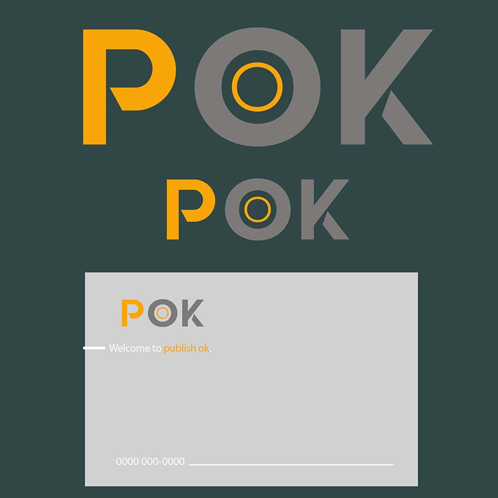
Don't use white on light gray because it's unreadable
3 years ago by Maddie
Italize the name even more to go with the flow of the entire logo.
3 years ago by Maddie
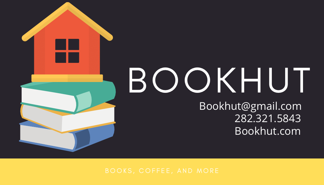
Also, this part is not readable. Don't use white on extremely light colors...
Use the eyedropper and copy the color of the light-gray background and use that as the color of the "BOOKS, COFFEE, AND MORE".
3 years ago by Maddie
Please actually put the name of the client as this is a business card. Also, where's the backside of the card? What does the logo of the card look like, as the image on the left is an illustration and not a logo.
3 years ago by Maddie
I think this looks pretty cool but this is still just the logo icon, and not a full logo. Try adding in the name of the company "Fex", underneath your logo icon to make it complete.

3 years ago by Maddie
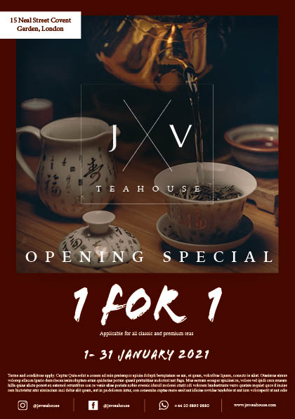
Also, the logo ends up being read as "JV Teahouse", not JXV Teahouse. Please play around with the initials more to make everything easily readable.
3 years ago by Maddie
You can use 2-3 columns for the body because it's kinda unreadable. Also, how many fonts did you use, because the maximum is 2-3 kinds of fonts. The royalty-free image you used looks more like it's fit for a traditional tea ceremony for Budist monks, not a '"modern cafe" because the atmosphere it gives off is too gloomy.
The hierarchy of what's importance is also off. why is the date on top, when it should be the logo?
Also, will there be sponsors for such an event? What is this "1 for 1" for because the copy is unreadable? How do you apply?
Please have these fixed, design-wise
3 years ago by Maddie