Amber
Posts
4
Likes
19
Liked Posts
0
Given Feedback
3
Feedback
I love the illustration of the cup. The style is great. I would avoid curving the business name as it makes it difficult to read. Maybe making the cup smaller and moving it in front of the name and straightening out the name would work just a bit better. Good work!
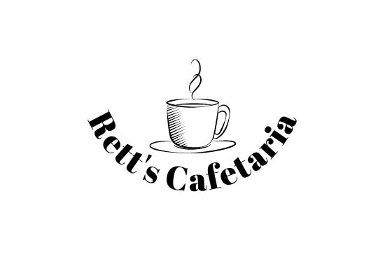
3 years ago by Amber
I like the concept you have here. I might suggest watching the spacing between letters. There seems to be too much space between the letters in 'pizza'. This second font also adds unwanted negative space between Branden & Pizza. I'd consider making them the same font.
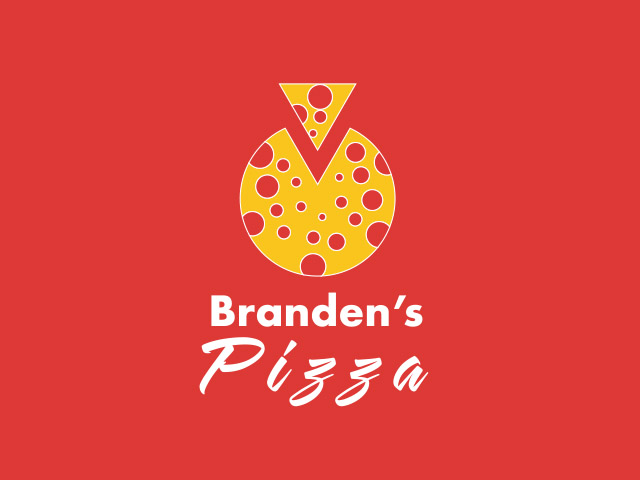
3 years ago by Amber
Hi! I really enjoy this font and concept. When I hear the word lettermark, I tend to lean more toward designs that are more simple. Like Google's simple G lettermark for example. I think you have a great concept but would challenge you to simplify even further with maybe using just the R or REA.
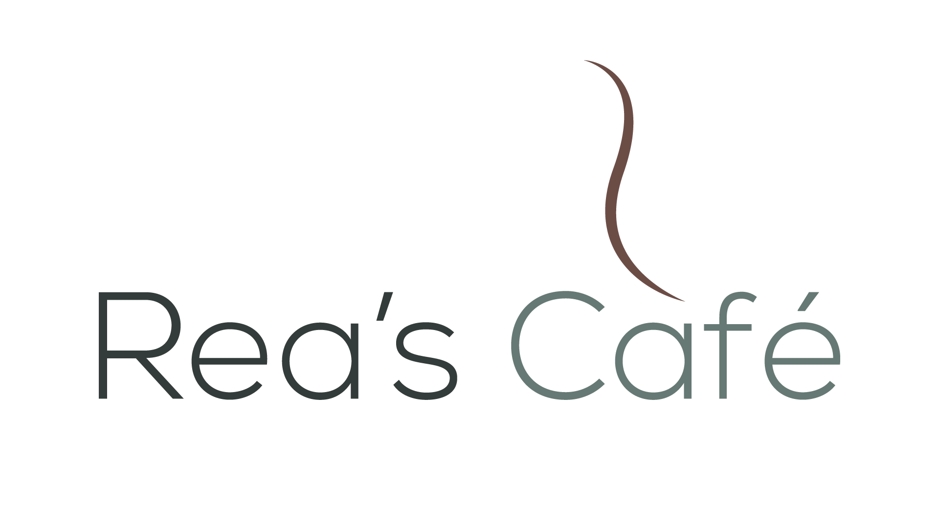
3 years ago by Amber
Posts
Les Saveurs Du Monde Business Card
- Report
Amber • 3 years ago
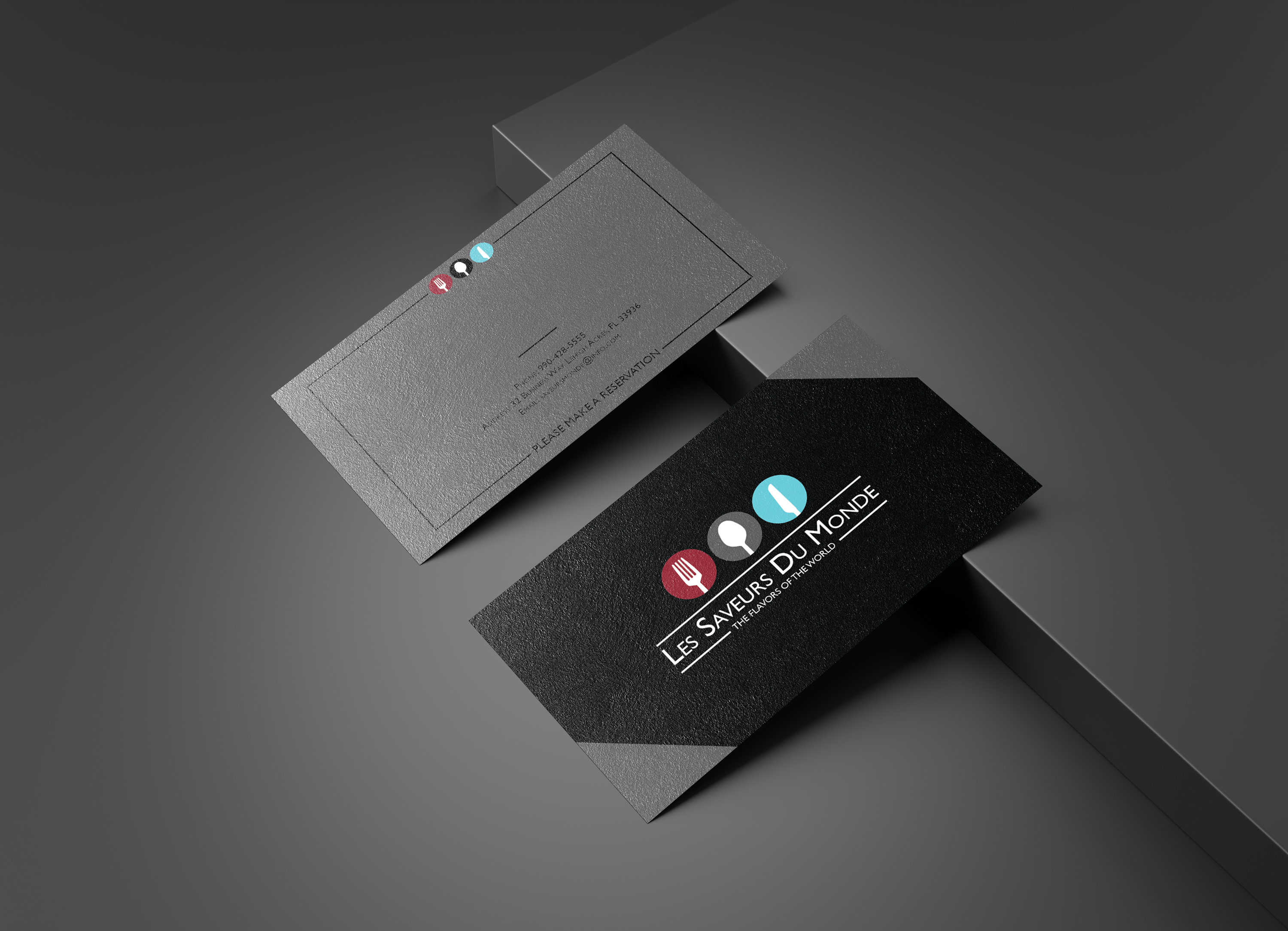


I would leave the gray triangles on the front off. Otherwise great design.
1 month ago by Bobbie Hall - Reply
This card really stands out, great job!!.
3 years ago by Zachary Ellis - Reply
Dog Walking Flyer
- Report
Amber • 3 years ago
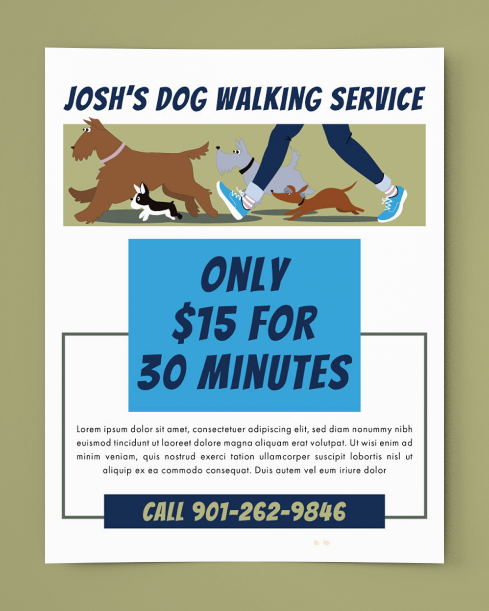

Beautiful and smart! I like the negative space and the choice of font style plus the stroke line that aligns the work to make it elegant. 😋🤟🙏
3 years ago by Intwari M Brian - Reply
Jennifer's Heaven Business Cards
- Report
Amber • 3 years ago
I tried to come up with a simple logo and design for this business card. I added clouds but didn't want them to be the main focus.
Jennifer's Heavengraphic
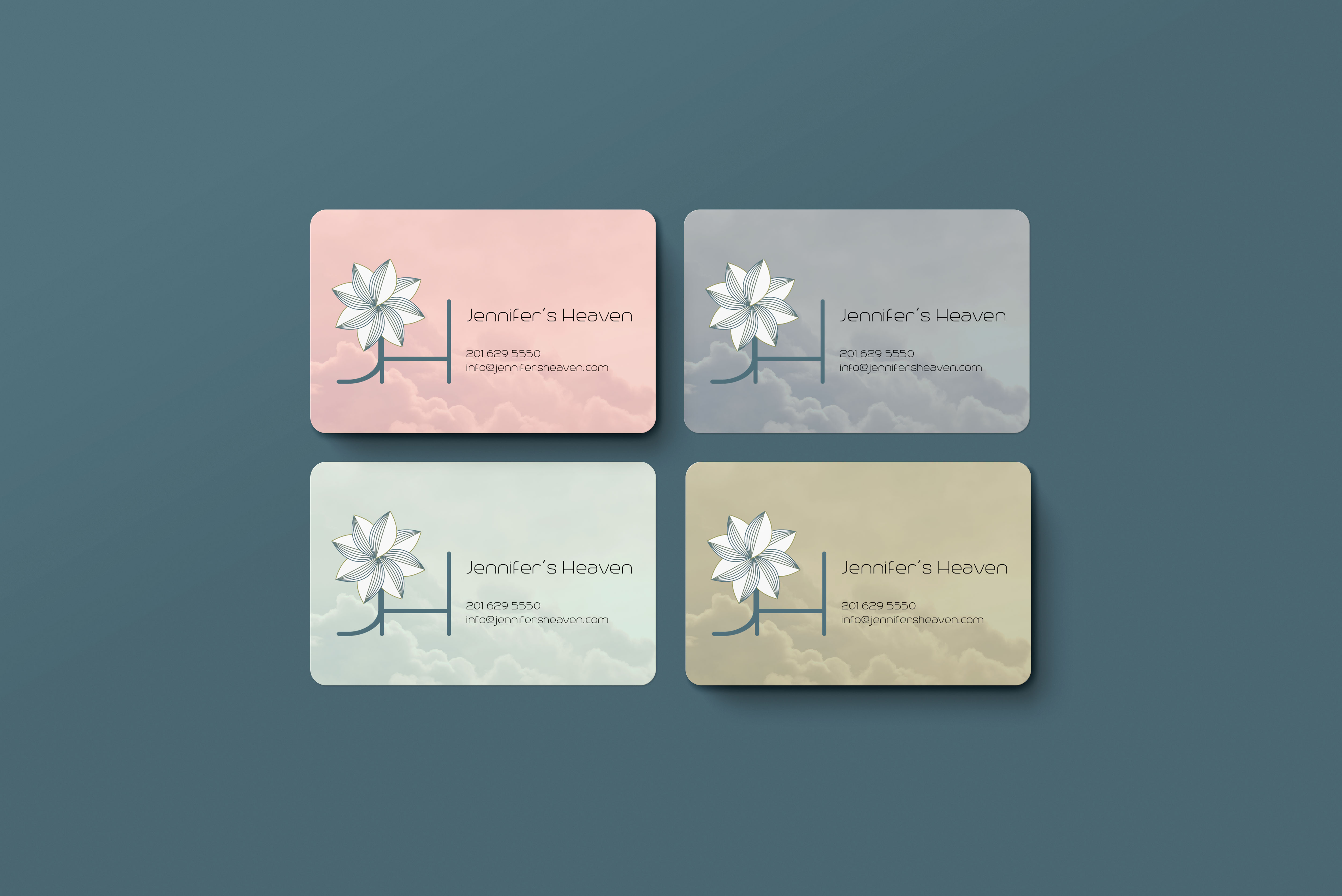

THIS A GOOD DESIGN AND A GOOD LOGO.BUT I EXPECT THE LOGOMORE SIMPLE.I WILL GIVE U 7 OUT OF 10.BEST OF LUCK
3 years ago by md sadat - Reply
Illustrator Logo
- Report
Amber • 3 years ago
Michelle Gobeillogo


I would change the font of the text.
3 years ago by Bogdan George Verman - Reply