Zachary Ellis
Posts
3
Likes
2
Liked Posts
4
Given Feedback
4
Feedback
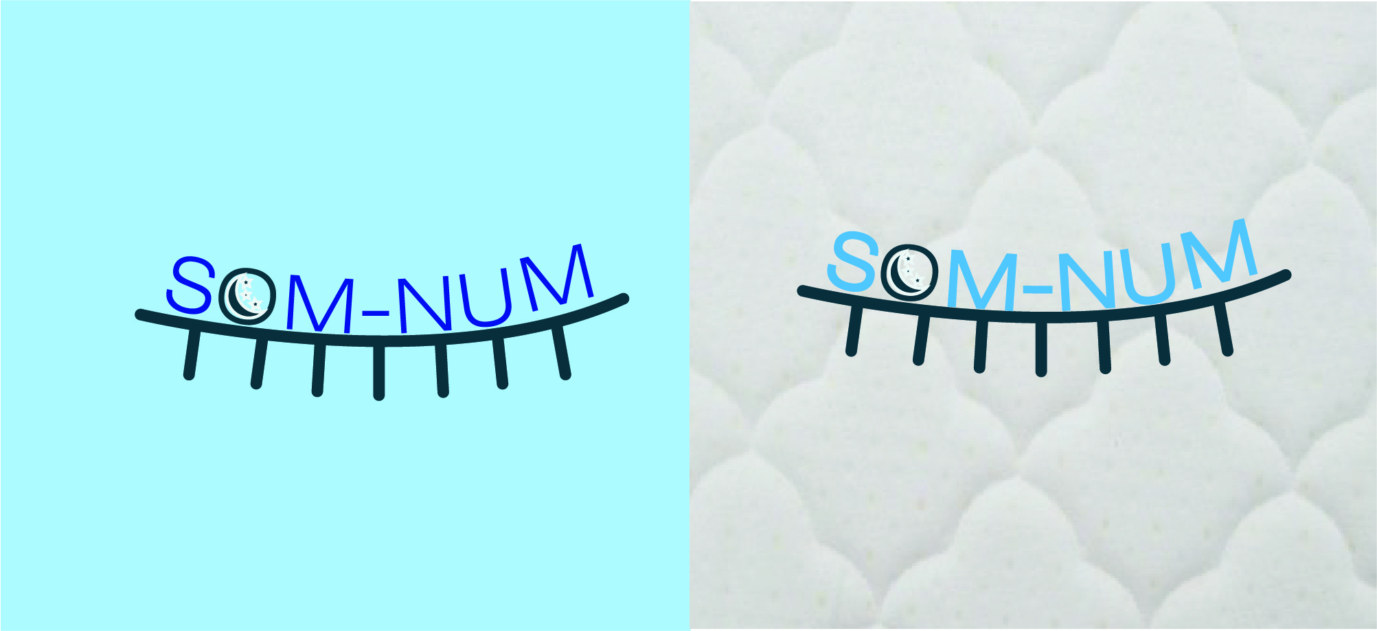
I would at least make it more readable, its to blurry.

2 years ago by Zachary Ellis
I really like this. great work!

2 years ago by Zachary Ellis
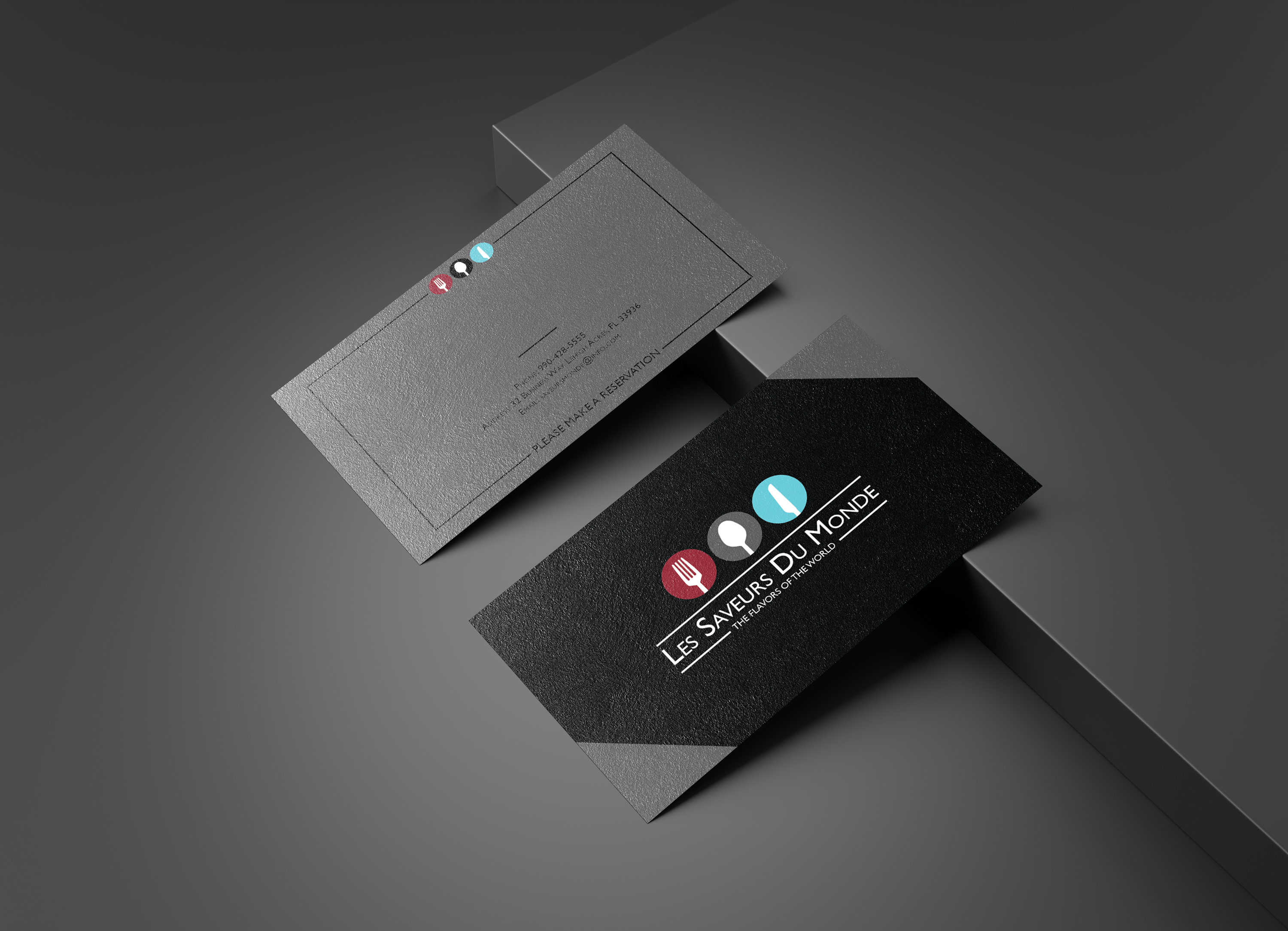
This card really stands out, great job!!.
2 years ago by Zachary Ellis
I think you need to raise the type off the line, put some space in-between. its a good design.
2 years ago by Zachary Ellis
Posts
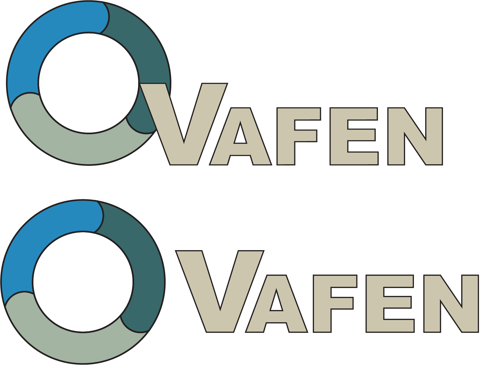
Vafen
- Report
2 years ago by Zachary Ellis
This is a bookkeeping company that need a quick logo.
 Like
Like
 1
1
I would at least make it more creative, there's no any creative
2 years ago by onga - Reply
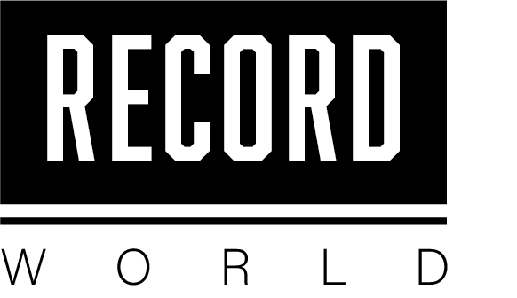
Record World
- Report
2 years ago by Zachary Ellis
In the brief it said they wanted a logo that was similar to the record covers, so I went with "WHAM" the black and white.
 1 Like
1
1 Like
1
This is simple and cool. It really looks like a record cover.
2 years ago by Adefisoye Tope - Reply
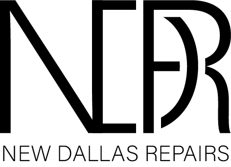
New Dallas Repairs
- Report
2 years ago by Zachary Ellis
I went simple, I wanted to make the letters seem like they wrap around each other.
Hi!
I am Lilliam,I just founded a new business called The New Dallas Repairs. We're looking for someone that can make a good logo for our Repairs. I think a lettermark will fit best. Can you do that?
I am Lilliam,I just founded a new business called The New Dallas Repairs. We're looking for someone that can make a good logo for our Repairs. I think a lettermark will fit best. Can you do that?
 1 Like
2
1 Like
2