Peter Strucely
Posts
2
Likes
3
Liked Posts
1
Given Feedback
3
Feedback
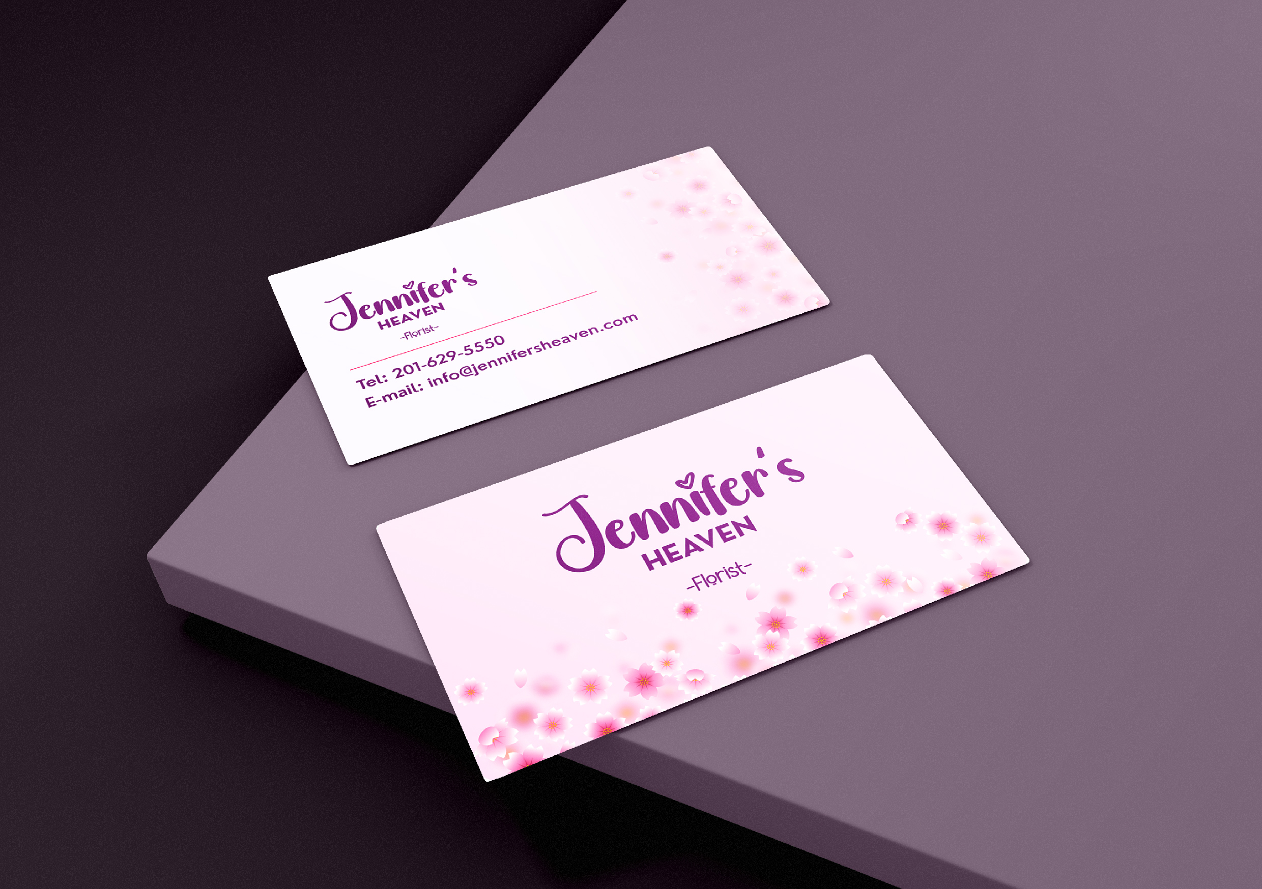
This is a nice looking card. The alignment of the logo with the contact information looks a little off since it goes from center aligned to left. It might flow better if the logo was centered as a whole over the contact information.
2 months ago by Peter Strucely
Thank you, I appreciate that!

2 months ago by Peter Strucely
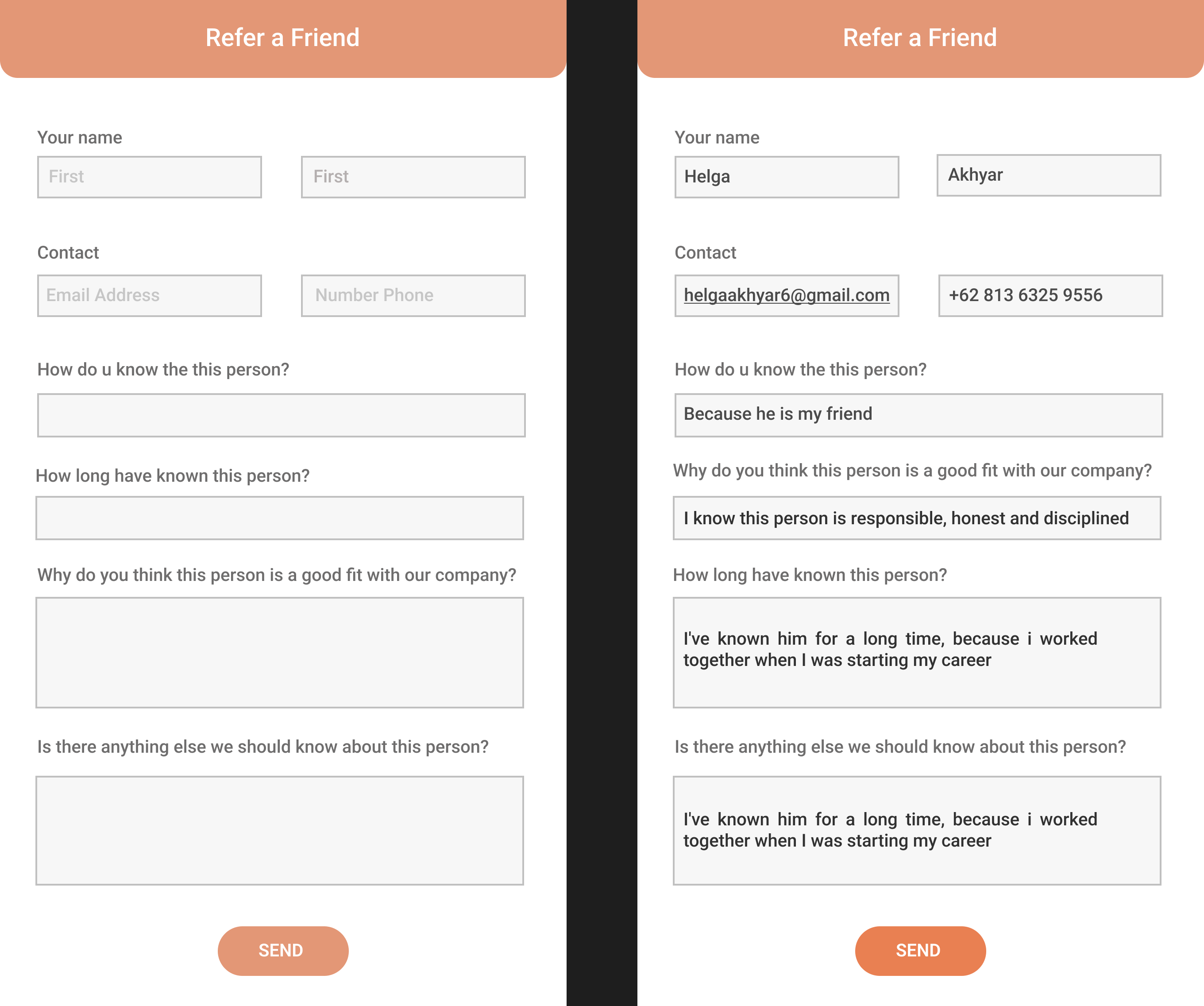
Nice clean design. The input fields could look a little more modern. I would recommend lightly rounded corners and removing the stroke except on the active field.
2 months ago by Peter Strucely
Posts
TimTim - UI Design
- Report
Peter Strucely • 2 months ago
TimTimui

 Like
Like


great
1 month ago by ARTA NIKOL PARANOLA PURBA - Reply
cool
1 month ago by ARTA NIKOL PARANOLA PURBA - Reply
FitFits - Clean & modern design
- Report
Peter Strucely • 2 months ago
A clean and modern design for FitFits, a clothing store for targeting men and women aged 16 - 30. Meant to draw attention to their 75% off clearance sale.
FitFitsgraphic

WOOW COOL <3
2 months ago by HELGA AKHYAR - Reply
Nice niche
2 months ago by Jenni - Reply
Wow cool!
2 months ago by Sabrina - Reply
Thank you, I appreciate that!
2 months ago by Peter Strucely - Reply