Ram
Posts
8
Likes
11
Liked Posts
1
Given Feedback
8
Feedback
good point thank you!
1 month ago by Ram
Thank you!

2 months ago by Ram
Thank you!
2 months ago by Ram
Good point, I'll see what I can do. thank you!

2 months ago by Ram
Thank you!
2 months ago by Ram
Thank you!

2 months ago by Ram
Thank you!
2 months ago by Ram
Thank you!

2 months ago by Ram
Posts
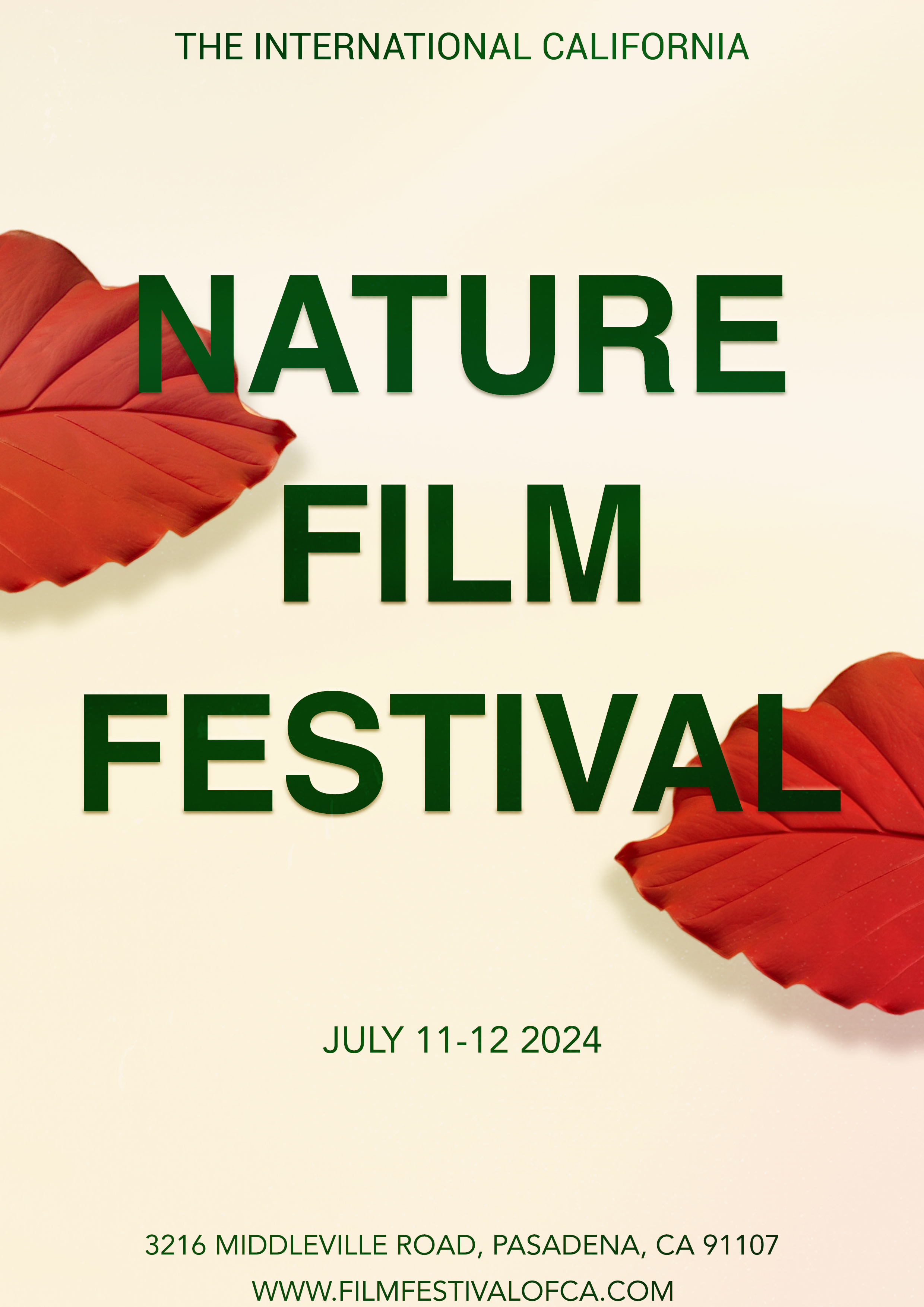
The International California Film Festival
- Report
Ram • 1 month ago


Nice simple graphics and font. I generally don't like all caps, but here it works well.
1 month ago by Bobbie Hall - Reply
The writing is just the right size for me to read The colors go so well together Amazing!
1 month ago by Lehavah Nachalah - Reply
clean and sleek
1 month ago by christopher - Reply
nice but think u should use lower case for sub topics
1 month ago by udit - Reply
good point thank you!
1 month ago by Ram - Reply


Fletwood RollerSkating Competition Flyer
- Report
Ram • 2 months ago
Feedback would be appreciated. Thank you!

I really like the colour scheme and the typography used they give a fun funky vibe. But the background feels so rough as compared to the smooth typography.
2 months ago by Harshada Chandel - Reply
I loved the Typography. It's Amazing!!
2 months ago by Isha More - Reply
Thank you!
2 months ago by Ram - Reply
Dddffgg
2 months ago by Tia - Reply
Pak N' Pay Logo
- Report
Ram • 2 months ago
This logo emphasizes on movement and fun. Feed back would be appreciated thanks!

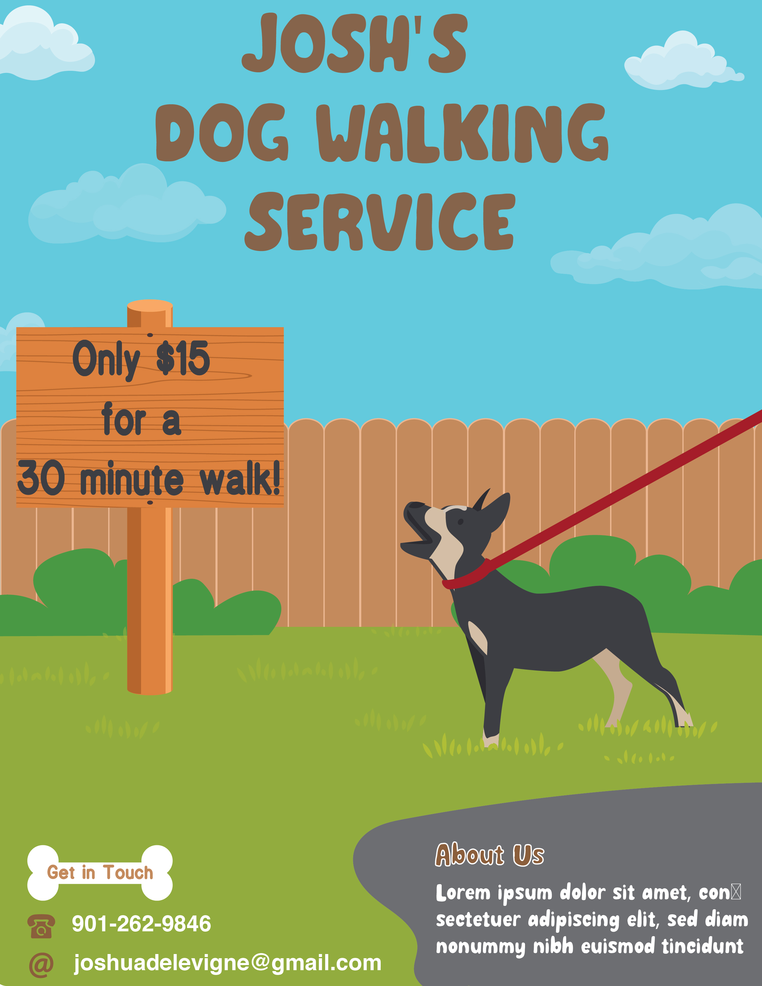
Josh's Dog walking services.
- Report
Ram • 2 months ago
Feedback would be appreciated thank you!

This design is quite interesting. The resulting colors are pleasing to the eye. the design is also simple but meaningful
2 months ago by Wafiq Salsabiilla - Reply
Thank you!
2 months ago by Ram - Reply