Madi Spector
Posts
2
Likes
5
Liked Posts
0
Given Feedback
3
Feedback
Thank you! And do you mean the painting in the background?
3 months ago by Madi Spector
Thank you!
3 months ago by Madi Spector
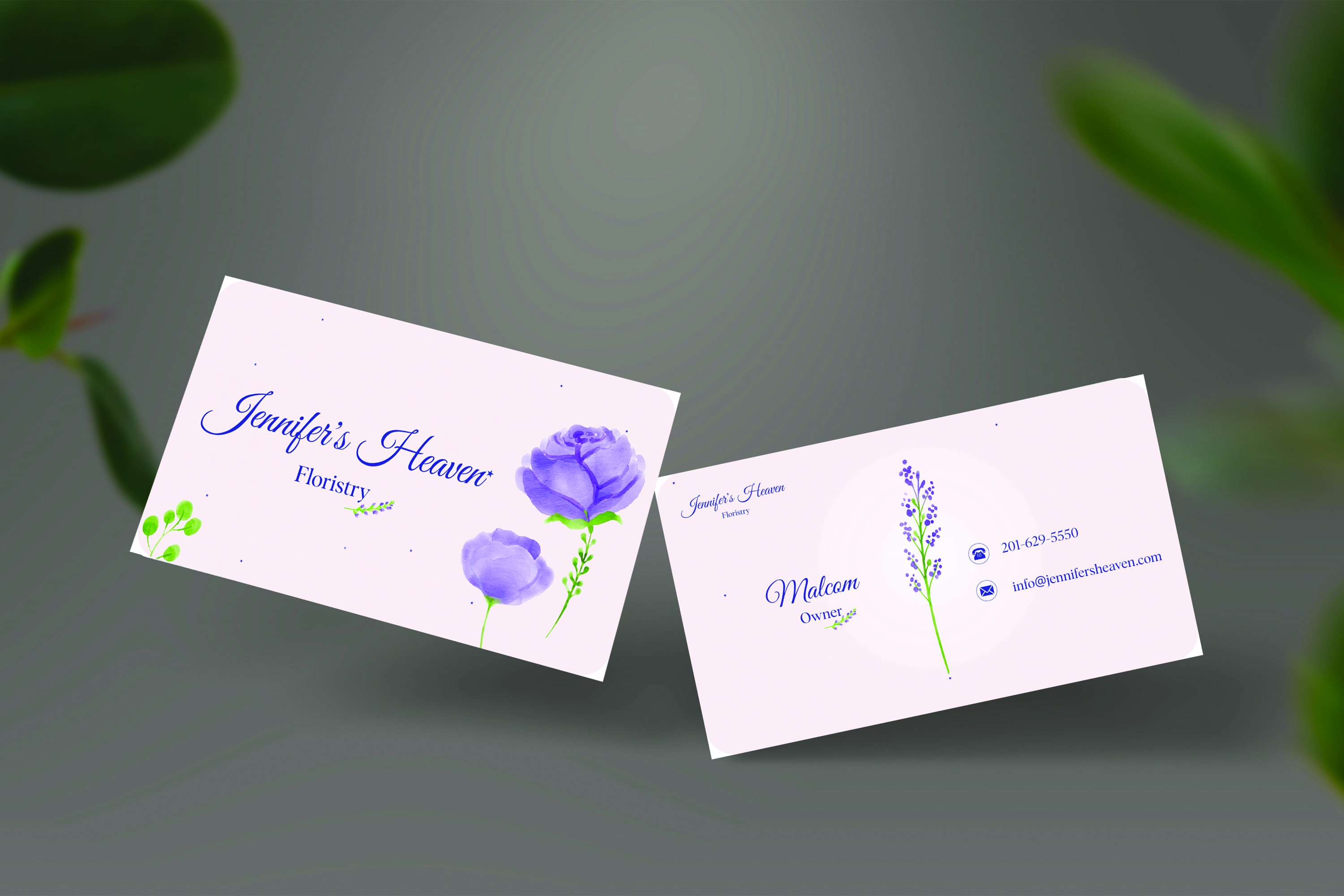
I like how you used the flower as a divider for information!
3 months ago by Madi Spector
Posts
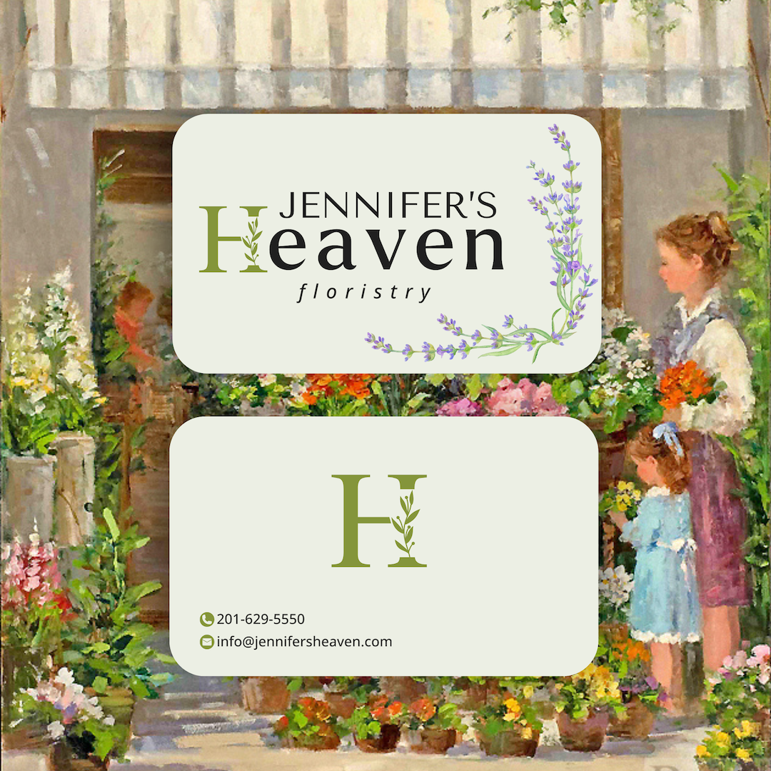
Business Card for Jennifer's Heaven floristry
- Report
Madi Spector • 3 months ago
Jennifer's Heavengraphic


Beautiful!!
2 months ago by Jordan Ragsdale - Reply
I really like it!
3 months ago by Alessandra - Reply
The logo and color selection are amazing! However, I suggest replacing the background with something different to make it cleaner and more eye-catching.
3 months ago by Shimaa Saad - Reply
Thank you! And do you mean the painting in the background?
3 months ago by Madi Spector - Reply
yes
3 months ago by Shimaa Saad - Reply
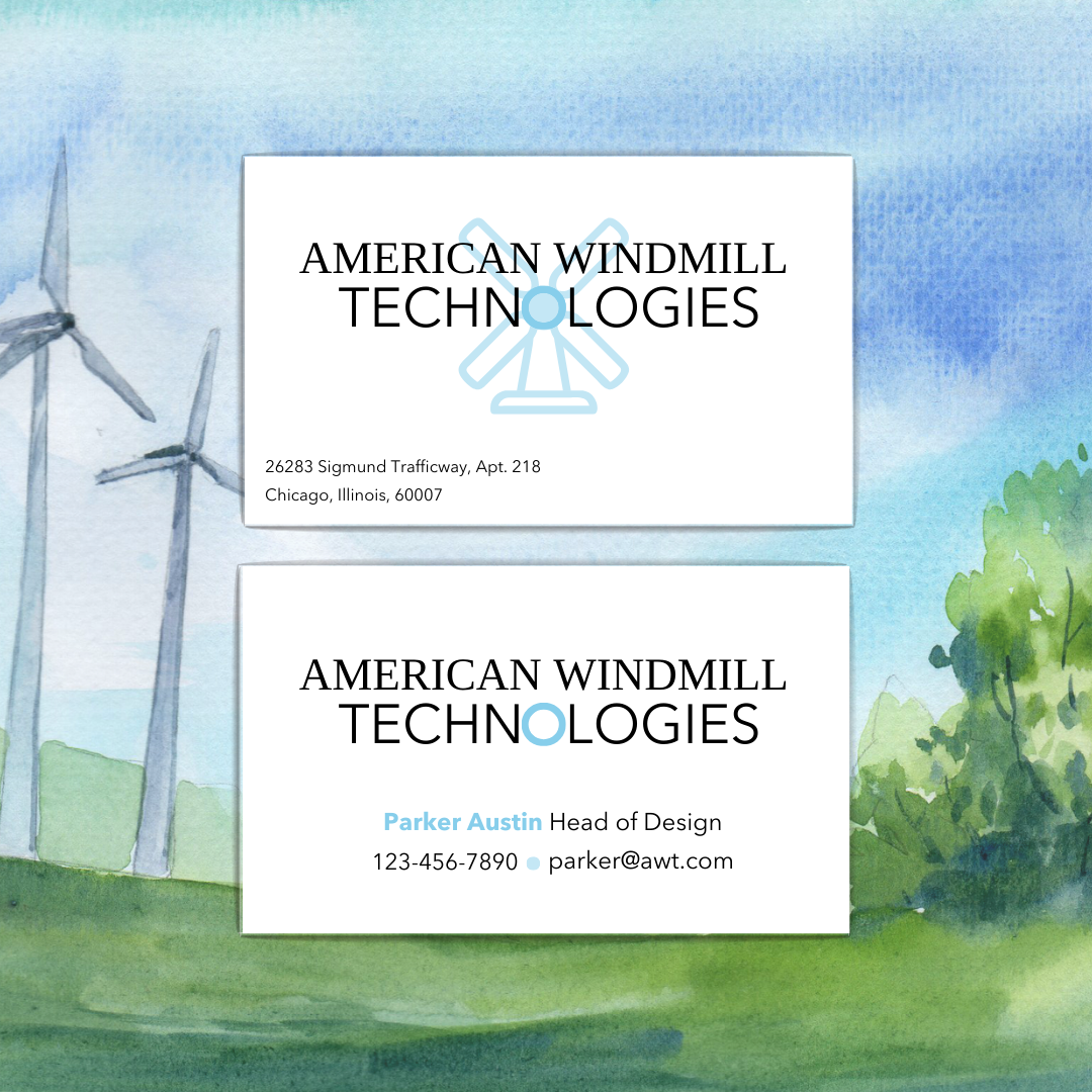
Business Card Design for American Windmill Technologies
- Report
Madi Spector • 3 months ago
Brief:
"I hope you are doing well. I am Parker Austin. I am the head of design at American Windmill Technologies. We are in urgent need of a new business card design because we just updated our website. We're a small manufacturing company and we primarily compete with Celestica. We, however, would like something in a style that is completely different than theirs. We don't have a primary company color but as an accent color, we'd like you to use blue. We would like the business card design to be modern-looking and we need a few mockups of the business card design so we can get an idea of what it will end up looking like. Also, please don't spend too much time on it as we are running on a tight budget. Please include our address that is listed below.
Regards, Parker Austin
26283 Sigmund Trafficway Apt. 218, Chicago"

I think the all upper case style is not fitting best it would be best in my opinion to use normal type style and the font seems to big to me gives the design a bulky look as a innovative and technological company you should for something more smart and the windmill blades should be pointy that would give a more concise look.
3 months ago by Ateeq - Reply
Thank you!
3 months ago by Madi Spector - Reply