Hamid Ullah
Posts
7
Likes
13
Liked Posts
1
Given Feedback
5
Feedback
Great

3 months ago by Hamid Ullah
Amazing

3 months ago by Hamid Ullah
it's good
3 months ago by Hamid Ullah
Thanks for your idea, Inshallah i do it

3 months ago by Hamid Ullah
Amazing
3 months ago by Hamid Ullah
Posts
Red Wing International Logo
- Report
Hamid Ullah • 3 months ago
we are company that develops new ways to communicate by combining open sources software with beautiful design. our main product is an app that can use at home and implements our cloud technology. our target audience is married couples we want to convey essence of power while at the same time being agreeable
Job description
you must create a logo using in the information given in this brief theorem prepare on emblem logo that use the colour yellow the logo will be used on the company website take into account the company,s values and preferences, and make sure it will work the planned use cases.
Job description
you must create a logo using in the information given in this brief theorem prepare on emblem logo that use the colour yellow the logo will be used on the company website take into account the company,s values and preferences, and make sure it will work the planned use cases.


Looks interesting, I it would've been more helpful ifI could your right process too
3 months ago by NJ - Reply
nice work
3 months ago by Sojitra Kevin - Reply
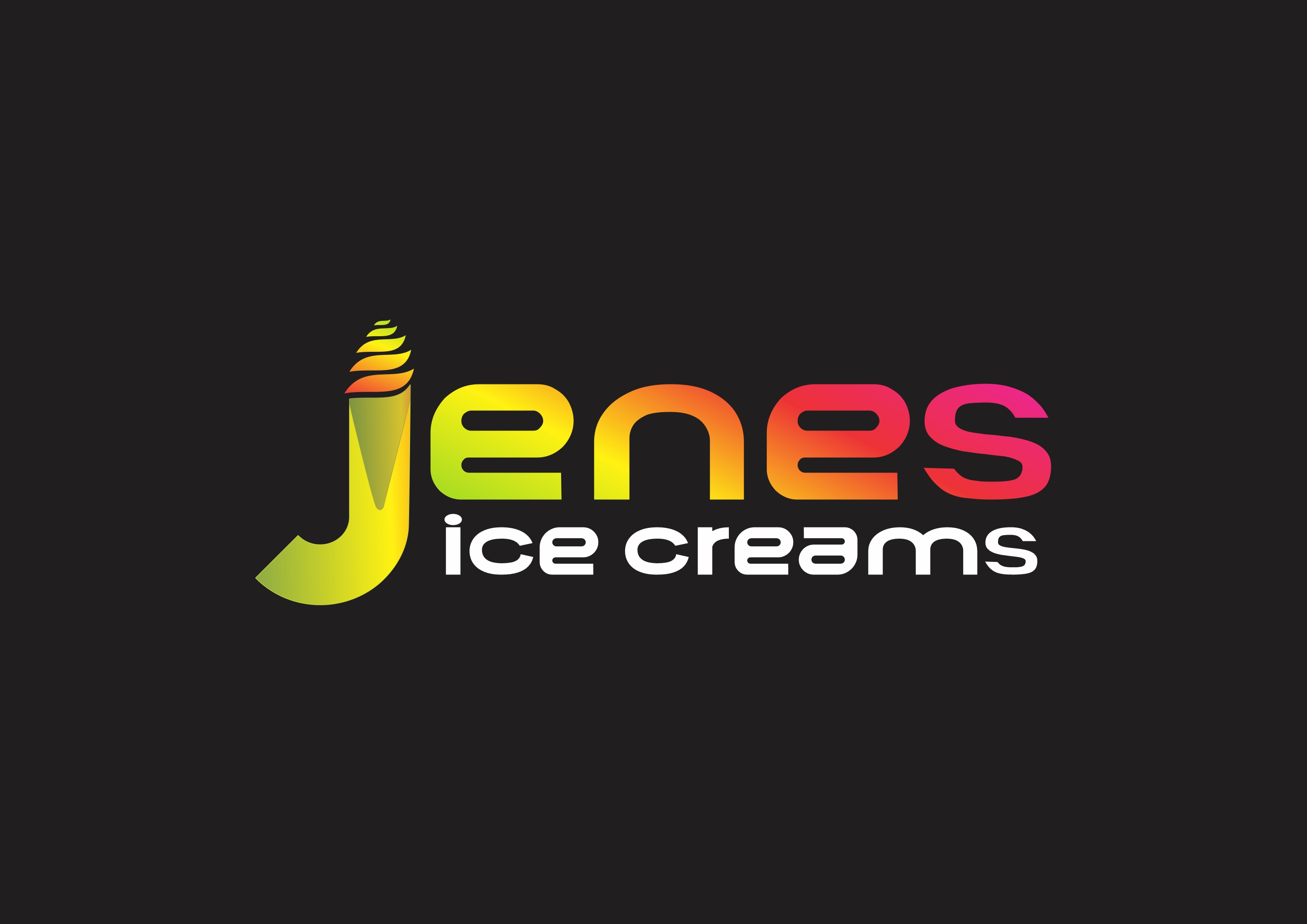
Jene's Ice Cream Logo
- Report
Hamid Ullah • 3 months ago
I am Jene, creator of Jene's Ice creams. I'm looking for someone that can create a simple logo for my business. I like Pictorial marks.

Nice works :)
3 months ago by Shimaa Saad - Reply
It's a good attempt but the colours and typeface isn't going well with the product. right now it seems like a gaming brand logo. The font used for any food based brands it is important to understand the kind of audience you're targeting... It should be a little playful and fun.
3 months ago by saoni - Reply
good job pro
3 months ago by Acila nour elislam - Reply
Point Logo
- Report
Hamid Ullah • 3 months ago

The poster looks great overall. However, when I first viewed it, the logo felt a bit subdued. Using just one color for the text may not be enough to draw the viewer in and encourage them to read the design.
3 months ago by Shimaa Saad - Reply
Nice work
3 months ago by Atul - Reply
Tenisha's Tea house Logo
- Report
Hamid Ullah • 3 months ago
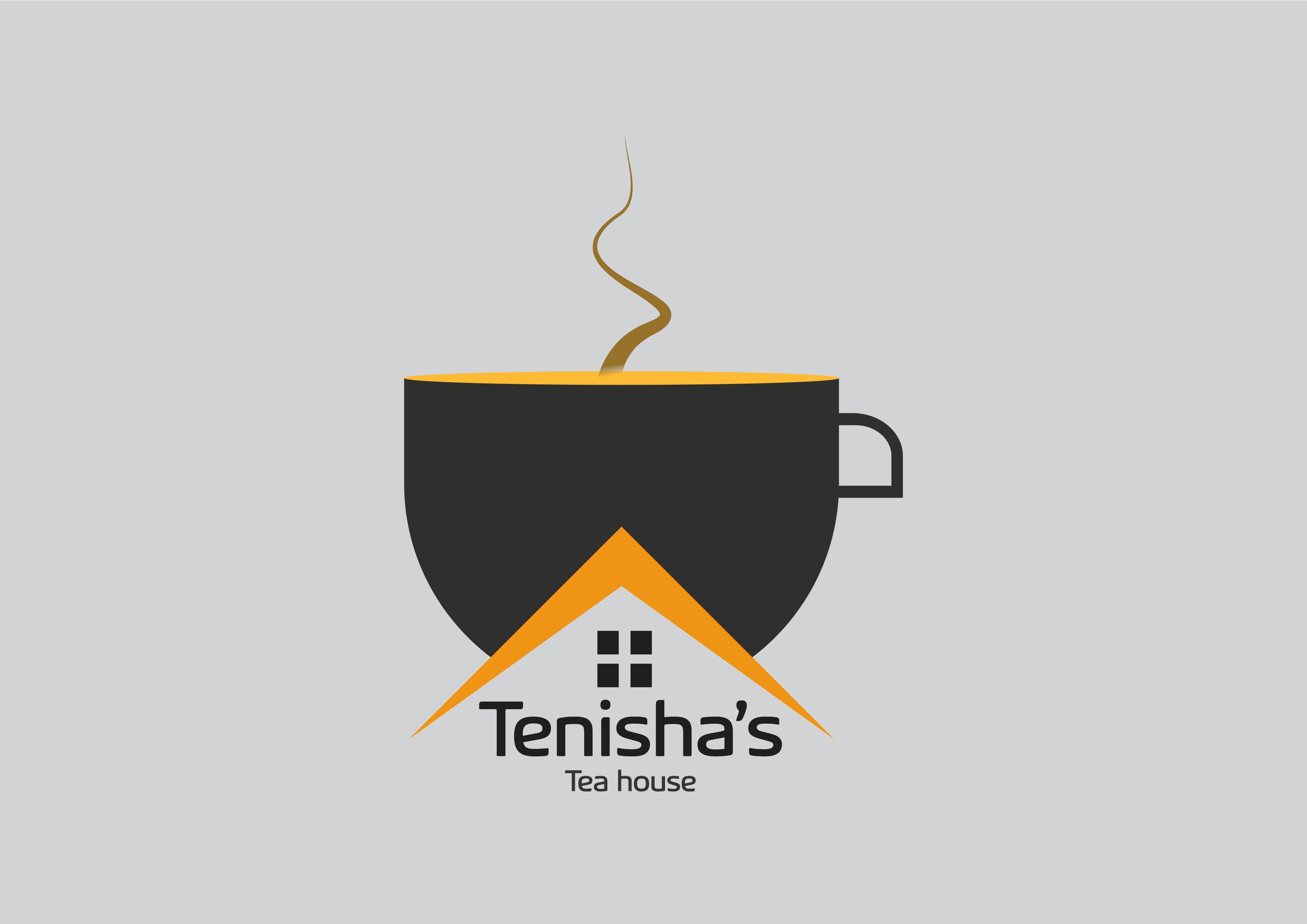

The design is great overall. However, there are too many details under the cup, which makes me as a viewer feel uncomfortable and confused when trying to read the logo."
3 months ago by Shimaa Saad - Reply
good
3 months ago by THOMAS - Reply