Fabian
Posts
1
Likes
2
Liked Posts
4
Given Feedback
2
Feedback
Already realized my mistake, abstract marks are just symbols with no letters x(
4 years ago by Fabian
very elegant logo right there
4 years ago by Fabian
Posts
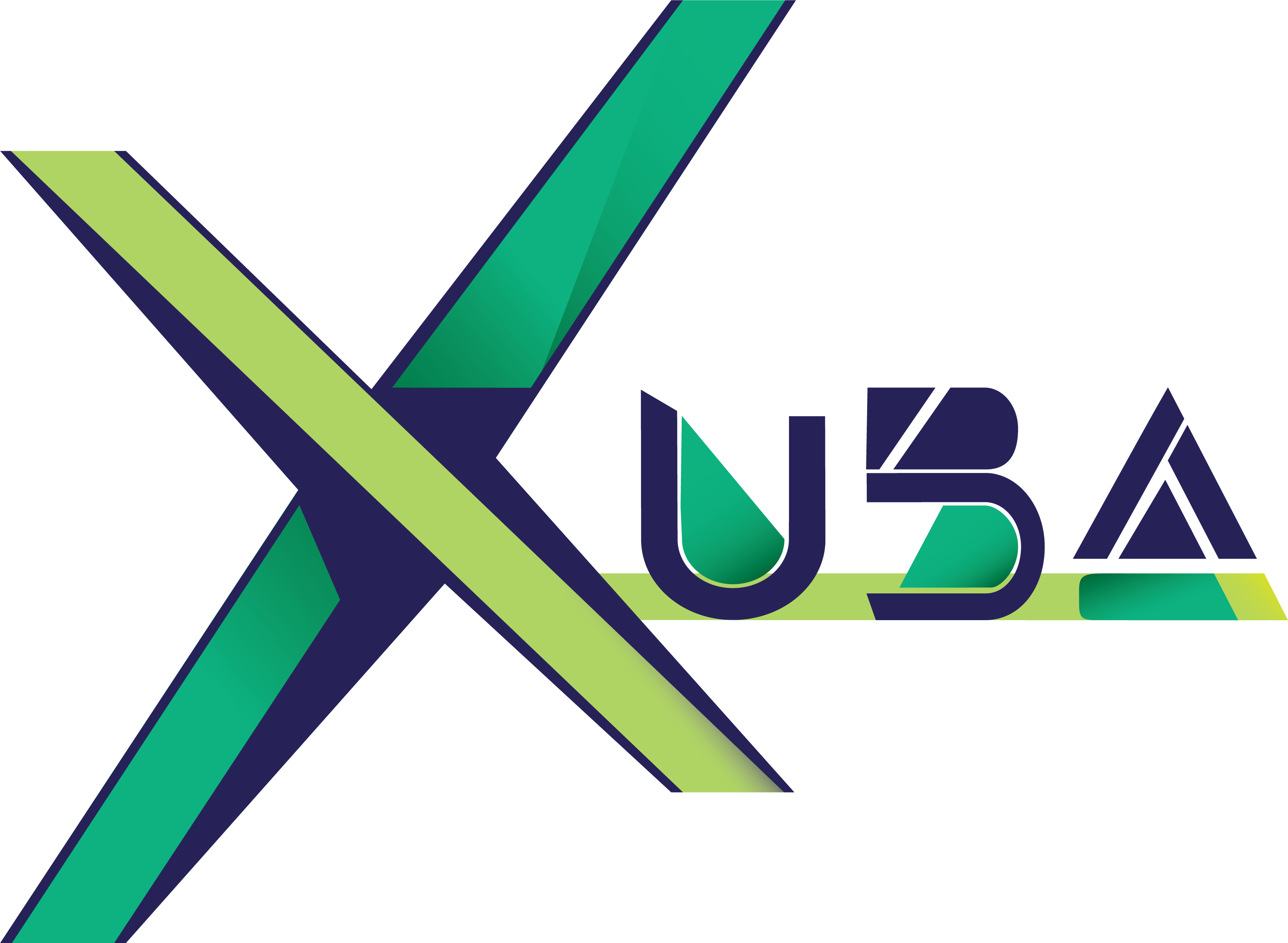
Xuba Logo
- Report
4 years ago by Fabian
My first logo for a Fake Client hope it does look abstract and simple at the same time.
Hey,
I'm Shonna, I recently started a new business called Xuba. We're looking for someone that can create a simple logo for our business. I would like the logo to be an abstract mark. Can you help me out?
I'm Shonna, I recently started a new business called Xuba. We're looking for someone that can create a simple logo for our business. I would like the logo to be an abstract mark. Can you help me out?
 2 Likes
 4
4
I feel like there is too much going on with this logo, it's difficult to take in. There is also little consistency with your type; the spacing is all over the place and there are two gradients per letter. However, I look forward to seeing you improve and post more. Cheers!
4 years ago by pndmx - Reply
Already realized my mistake, abstract marks are just symbols with no letters x(
4 years ago by Fabian - Reply
Good design but work on the font, some magic element is missing
4 years ago by Anahat Srihari - Reply
wow
4 years ago by Leangheng Ou - Reply