Jayne Attwood
Posts
1
Likes
0
Liked Posts
0
Given Feedback
4
Feedback
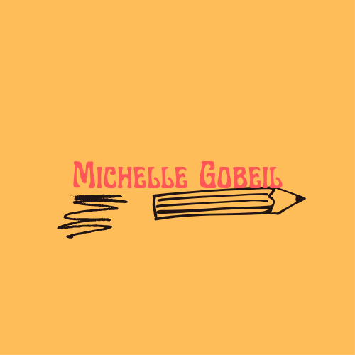
I like the font but the brief wanted a handwritten name. Otherwise, I love the look and design. It might work for another client
8 months ago by Jayne Attwood
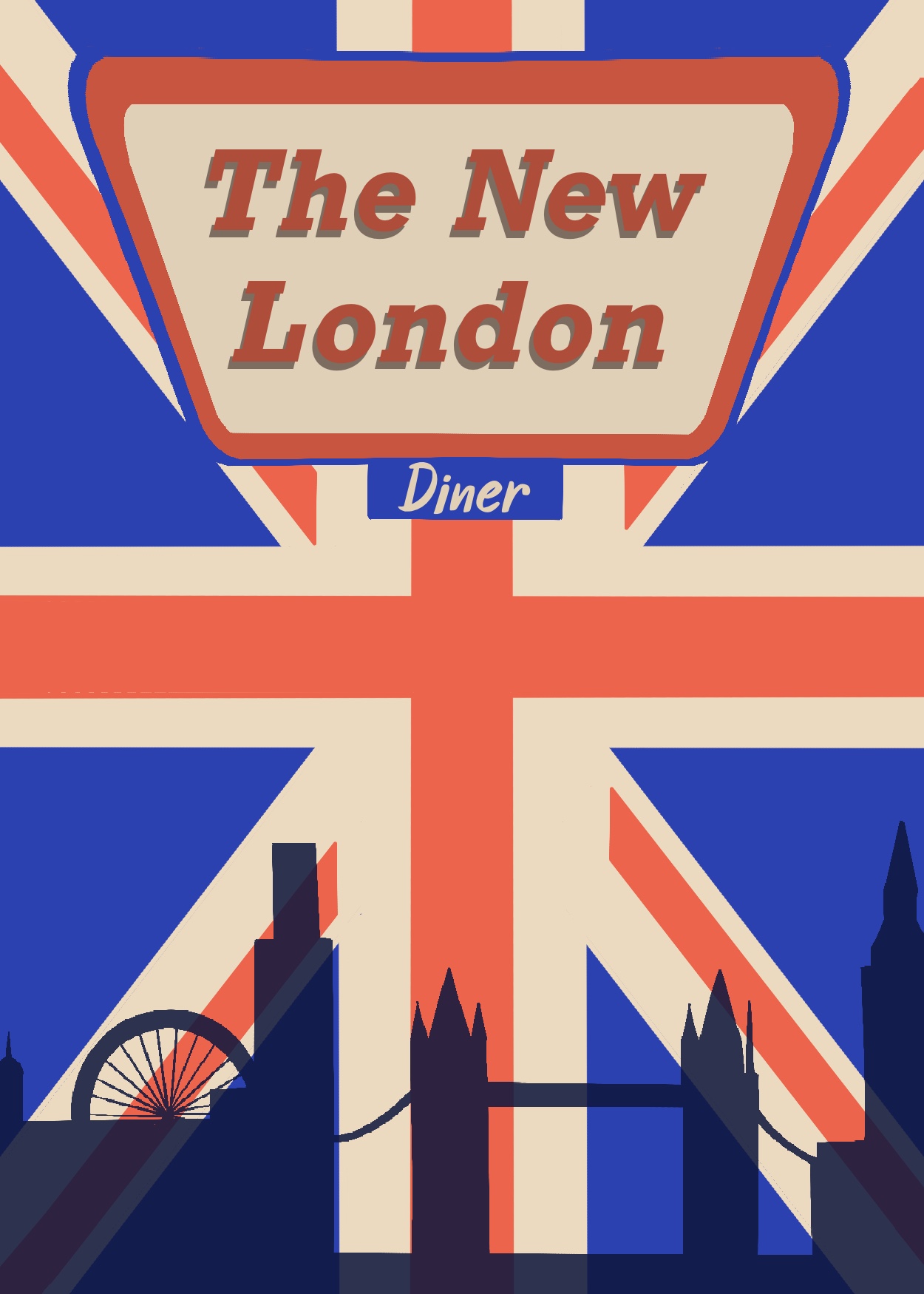
I love the colour palette and the font. I really like the ideas you are trying to convey with the skyline and the Union Jack. Have you tried dividing the page and having the skyline on the bottom and Union Jack on the top?
8 months ago by Jayne Attwood
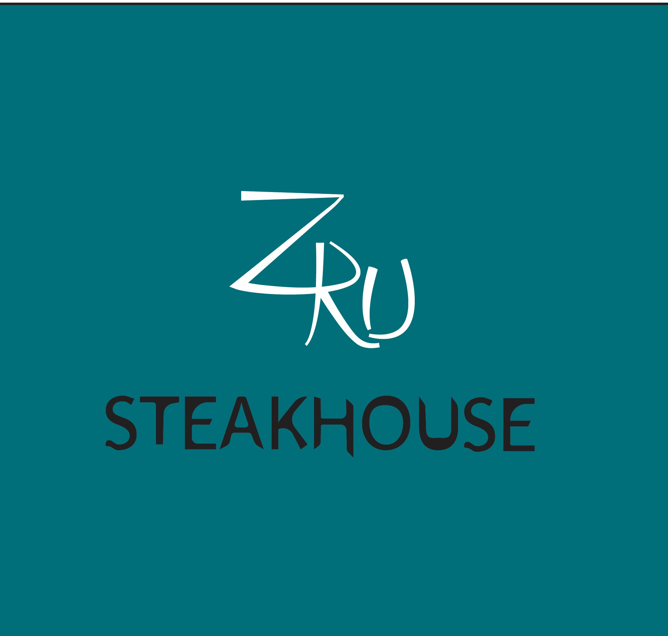
I like the colours and the structure of the logo. It looks very distinct to other shipping companies. I have to wonder how it will translate to being put on pens (having this battle myself with this brief).

8 months ago by Jayne Attwood
I love the font and the colours. Maybe try playing with the size and placement of the text. Place it off Centre.
8 months ago by Jayne Attwood
Posts
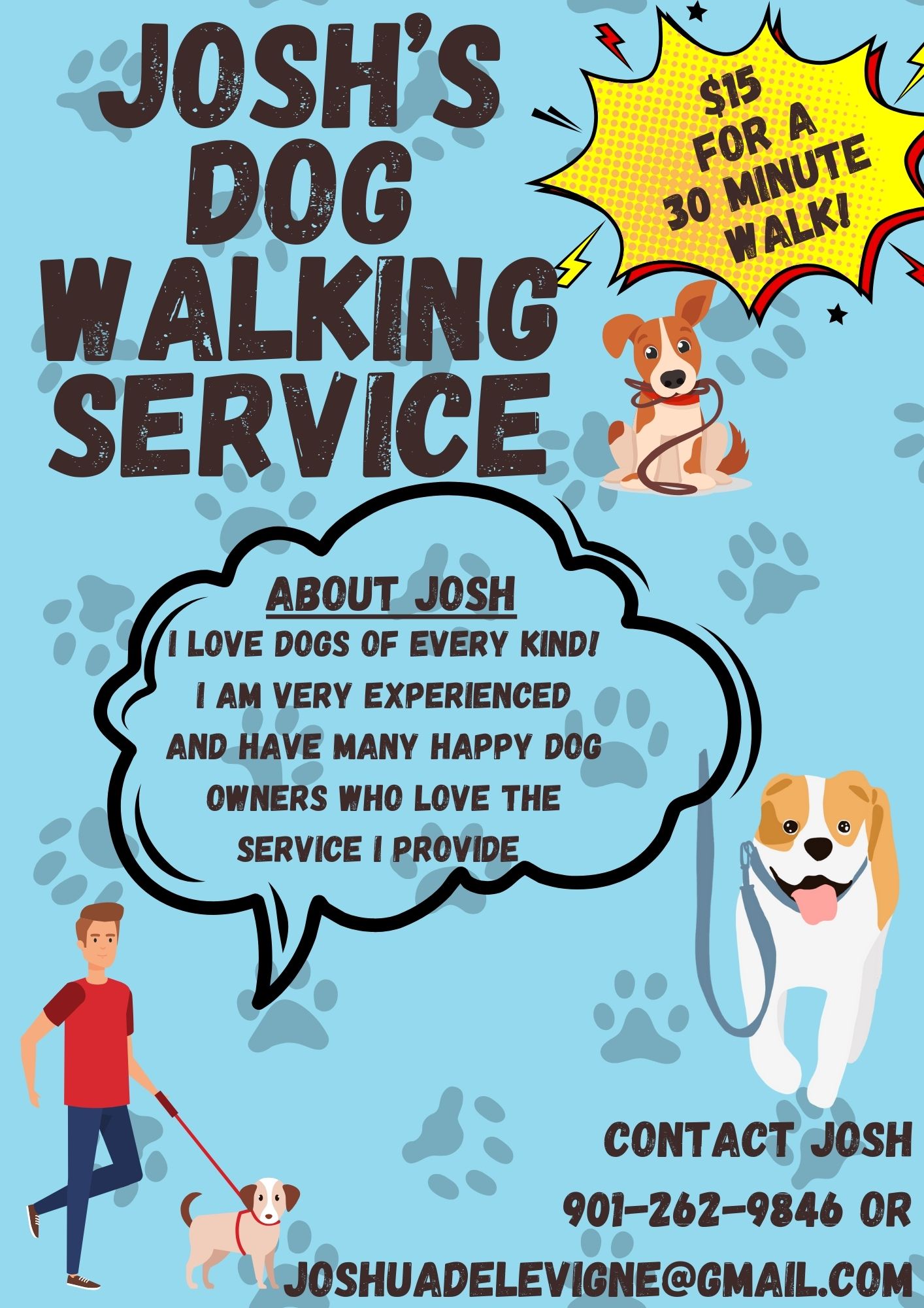
Josh’s dog walking
- Report
Jayne Attwood • 8 months ago
I’m experimenting with size and text placement. Any feedback is appreciated.
 Like
Like


I really like the overall playful and friendly atmosphere the poster projects. I'm wondering if you could think about hierarchy a bit? As in: which of the different text elements draws the reader in? And which one are they going to find by themselves, because they are looking for it?
8 months ago by Jo - Reply
Hello, This is really good, but I would advise you to make the text in the top left corner a little bit smaller and a couple of the graphics could be smaller as well. Also, make sure you leave enough negative space so the poster does not look crowded. Good Job! Have A Nice Day!
8 months ago by Anthony - Reply