Jo
Posts
1
Likes
0
Liked Posts
0
Given Feedback
3
Feedback
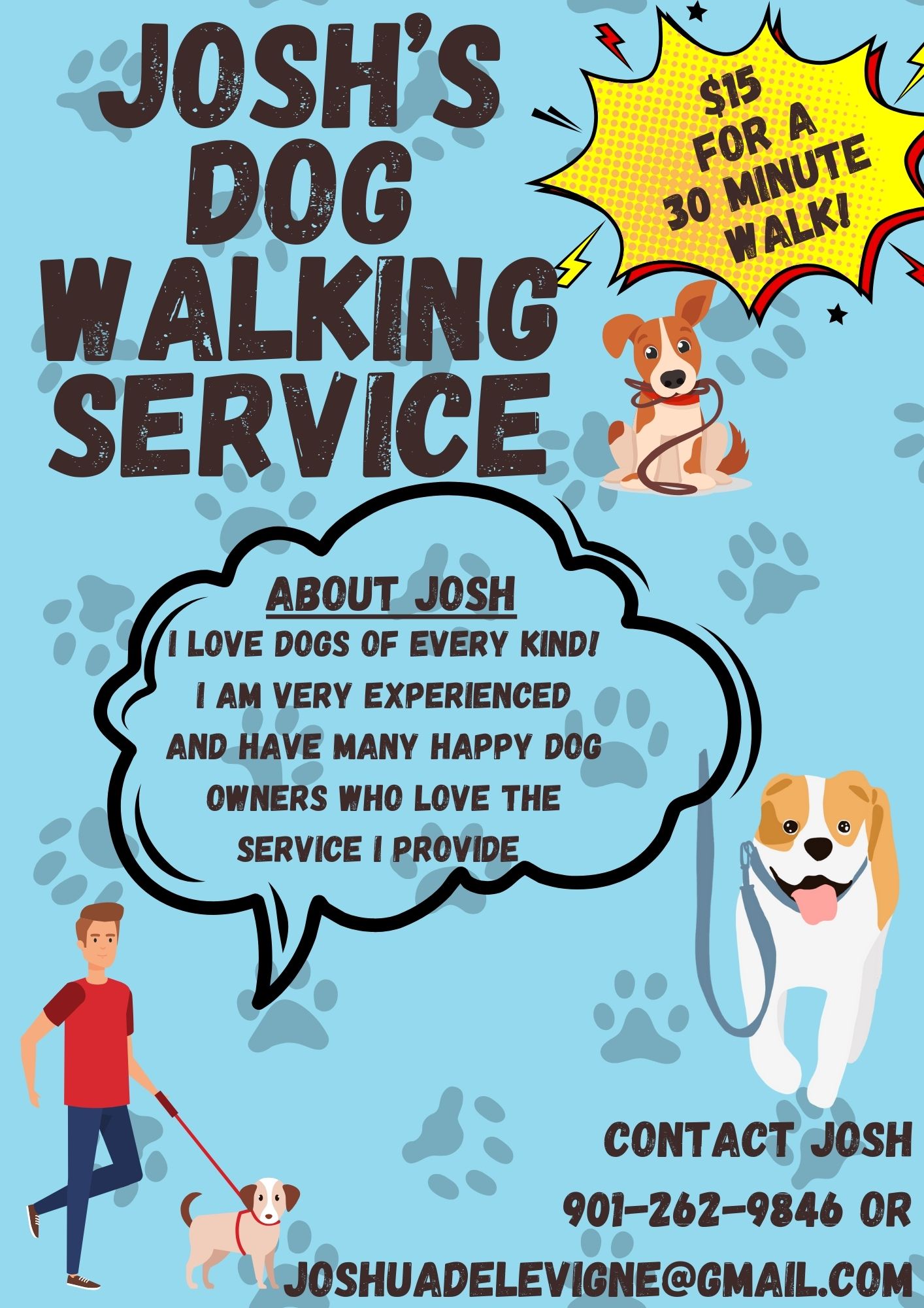
I really like the overall playful and friendly atmosphere the poster projects. I'm wondering if you could think about hierarchy a bit? As in: which of the different text elements draws the reader in? And which one are they going to find by themselves, because they are looking for it?

9 months ago by Jo
I love the balance, the contrast, the colours. Maybe think about the Steakhouse font, how can you make it look elevated, as well as culinary?

9 months ago by Jo
I like how the logo clearly picks up on the function as well as the name of the brand. I'm wondering if you can think about making it more easily scalable? (think about it very small, for example as a browser tab icon, and very big, for example on top of a tall building)

9 months ago by Jo
Posts
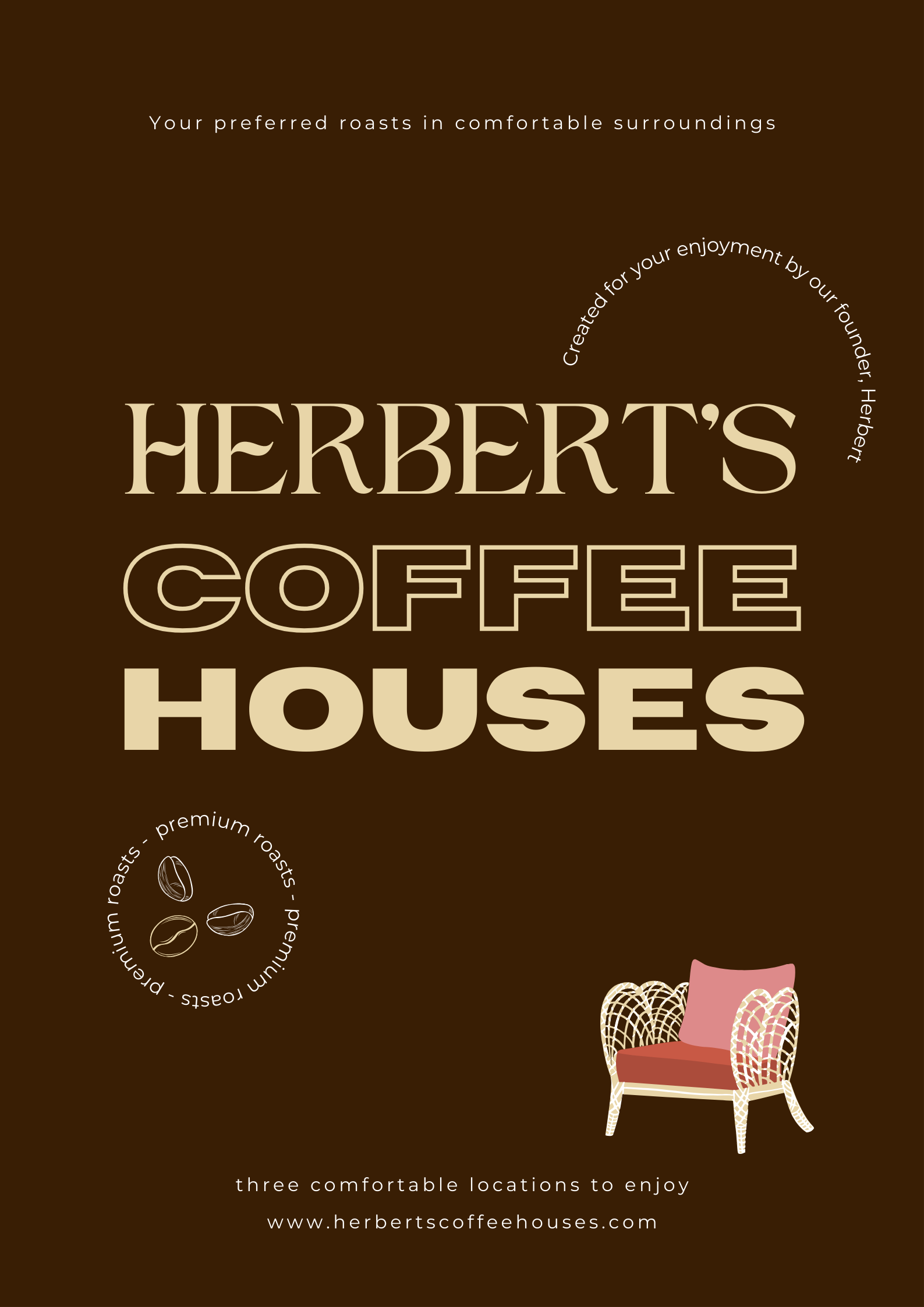
Herbert's Coffeehouses advertising poster
- Report
Jo • 9 months ago
I went for a comfy look, evoking elegance, and coffee aromas as well as laid back seating.
I love how the fonts complement each other, and your color scheme is nice to look at. I wish that the very top text, the arched text, and the bottom text had a little bit of a bigger font size so it would be easier to read. Overall, I love the vibe!
9 months ago by Kaelyn Kluding - Reply
not good
9 months ago by noori fatma - Reply
Can you elaborate on why?
9 months ago by Kaelyn Kluding - Reply
