Bukola Olatunde
Posts
1
Likes
1
Liked Posts
1
Given Feedback
1
Feedback
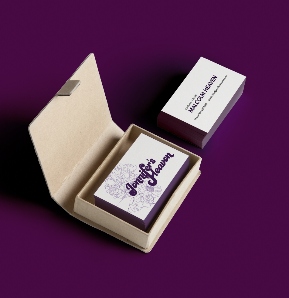
I love the design, but I find it hard seeing "Jennifer's heaven" because of the font
But to say the truth your design look professional and cool
8 months ago by Bukola Olatunde
Posts
Jennifer's Heaven
- Report
8 months ago by Bukola Olatunde
Business card

 1 Like
 2
2
The yellow is a bit too bright and even if its in the title, its not exactly clear what this business card is for. Flowers are often used just as decoration on other business cards. Maybe drawing a bouquet would make it more clear. Or just write what its for under the brand's name. Also the font for the info in the back could be changed or make the text the same size.
8 months ago by Lisa - Reply
Maybe try going for a softer yellow
8 months ago by erin - Reply