Lisa
Posts
0
Likes
0
Liked Posts
4
Given Feedback
3
Feedback
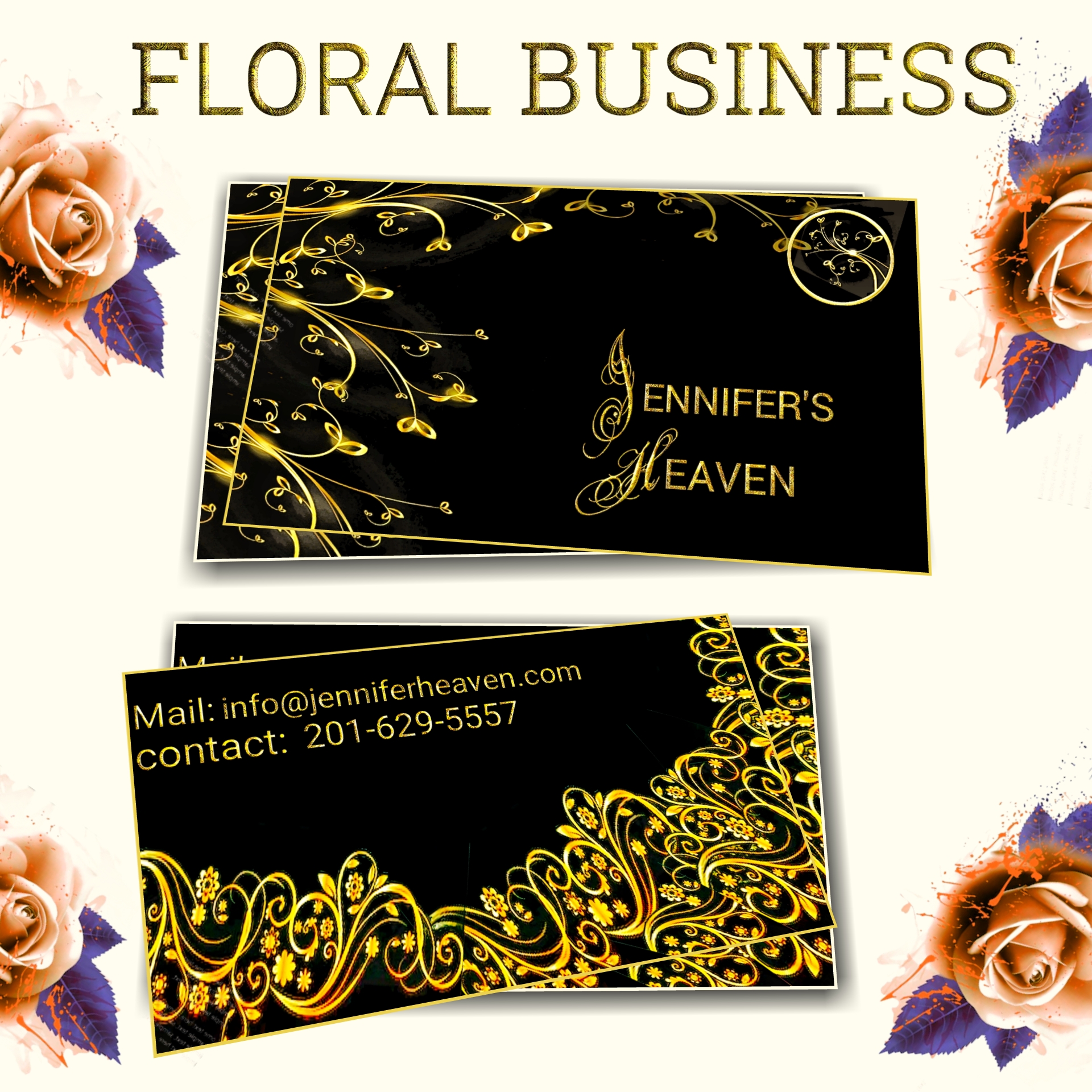
The yellow is a bit too bright and even if its in the title, its not exactly clear what this business card is for. Flowers are often used just as decoration on other business cards. Maybe drawing a bouquet would make it more clear. Or just write what its for under the brand's name. Also the font for the info in the back could be changed or make the text the same size.
9 months ago by Lisa
Pretty nice although I believe the buttons with the numbers should contrast more with the background, so it'd be better if they were darker or even a different color.

9 months ago by Lisa
The coffee beans are adorable :) But I believe the font used for the logo doesn't fit well and the I isn't even the same font. I think it needs to be something that can be read easier even from a far, so a font that's thicker and simpler can do the trick. And you could have some fun with the composition with the coffee beans and the name of the brand. But keep up the good work!

9 months ago by Lisa