Joanne Ike
Posts
3
Likes
2
Liked Posts
0
Given Feedback
7
Feedback
Great work! The S is a little hard to read. Maybe open up that upper curve a little.

5 years ago by Joanne Ike
These look good. Though the first looks a bit like it might topple over. Maybe you can try to spread the words on one line rather than stack it? Just a suggestion. The second one looks good. All in all, great.
5 years ago by Joanne Ike
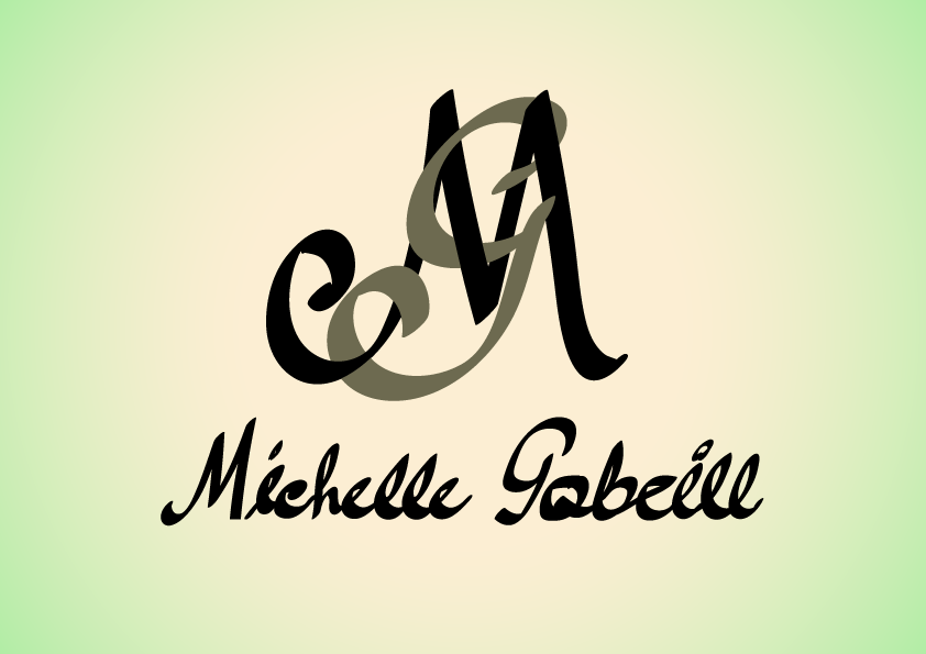
I love this. Especially the colours. The front of the business card however looks a bit cluttered. But all in all, it's really great.

5 years ago by Joanne Ike
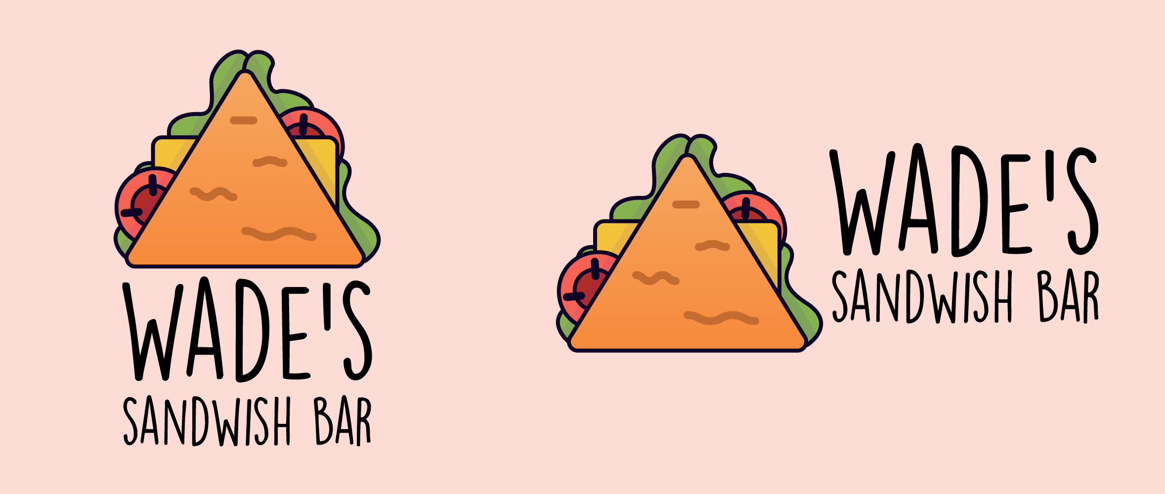
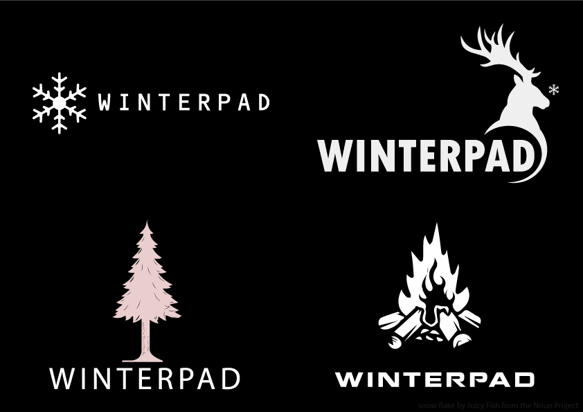
I like these. Great job. Only the first looks appropriate for a gaming company though. The others don't really seem like they relate. I really love the deer too.
5 years ago by Joanne Ike
Also you commented on one of my designs but the feedback wasn't constructive. Can you go back and clarify. Thanks
5 years ago by Joanne Ike
It's kind of messy and needs to be cleaned up but good attempt
5 years ago by Joanne Ike
I love this but i think maybe you shldnt cover so much of the 'u' in 'us'

5 years ago by Joanne Ike
Posts
Event flyer
- Report
Joanne Ike • 5 years ago
Flyer for Sow car rental shop. Main color should be green.
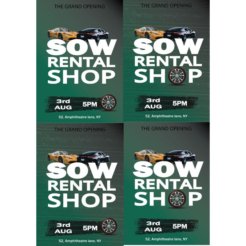
 Like
Like


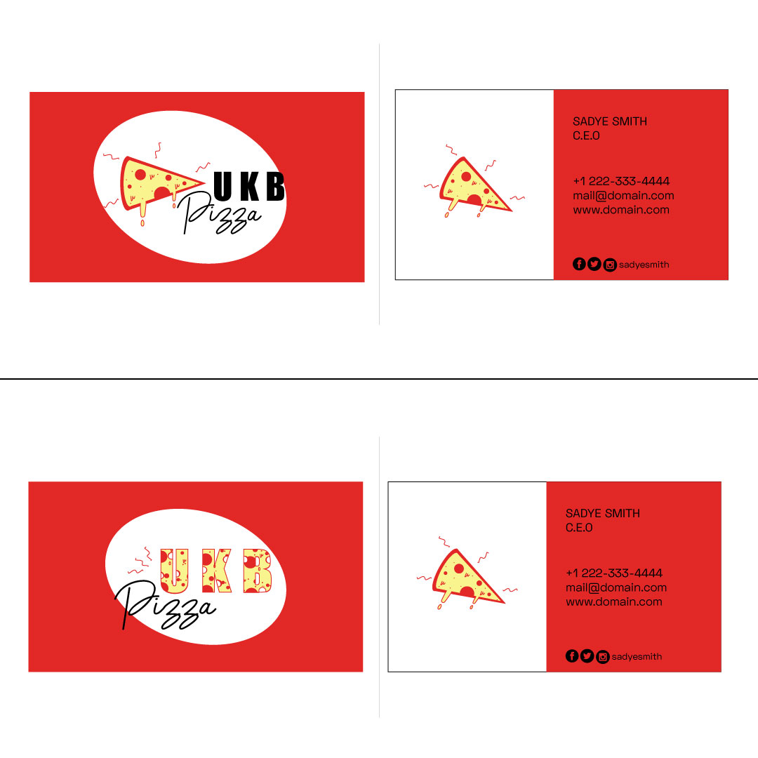
UKB PIZZA
- Report
Joanne Ike • 5 years ago
Sadye needs a business card for her new business, UKB pizza. The business color is red.
CONSTRUCTIVE feedback appreciated. Thank you.
CONSTRUCTIVE feedback appreciated. Thank you.

Great work Joanne! I like the first one, the second may be a little hard to read with the pizza pattern and the bold text.
Maybe the first one would look better if you use a lighter font for "UKB" so it looks a bit more balanced. Keep it up :)
5 years ago by August van de Ven - Reply
The concept is fine, but filling the text with the texture of the pizza did not look too good, in my view.
5 years ago by Vinycius - Reply
WinterPad
- Report
Joanne Ike • 5 years ago
Jarvis requires a logo for a new business called Winterpad. He thinks a combination logo would lool good. No other info given.
I have created 4 samples for WinterPad, a fictional gaming company.
Would greatly appreciate some feedback please.
I have created 4 samples for WinterPad, a fictional gaming company.
Would greatly appreciate some feedback please.
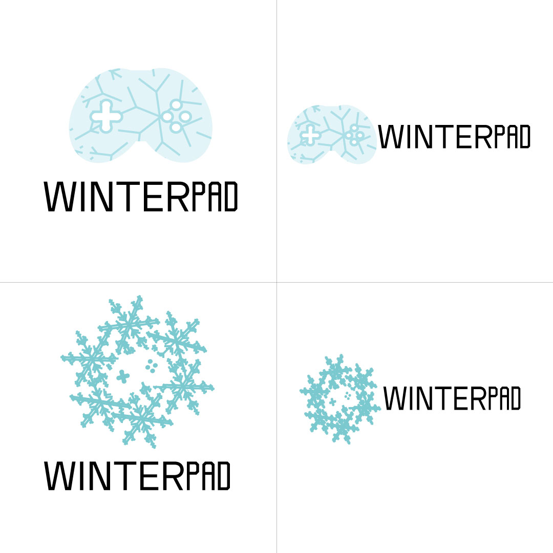

think again creatively , you can do it better
5 years ago by kunal das - Reply