Engy
Posts
5
Likes
14
Liked Posts
1
Given Feedback
7
Feedback
Thank you so much
8 months ago by Engy
right , will do that .. thanks alot
8 months ago by Engy
will try to do some edit , thanks alot
8 months ago by Engy
thank you so much
8 months ago by Engy
Thank you Siddhant
8 months ago by Engy
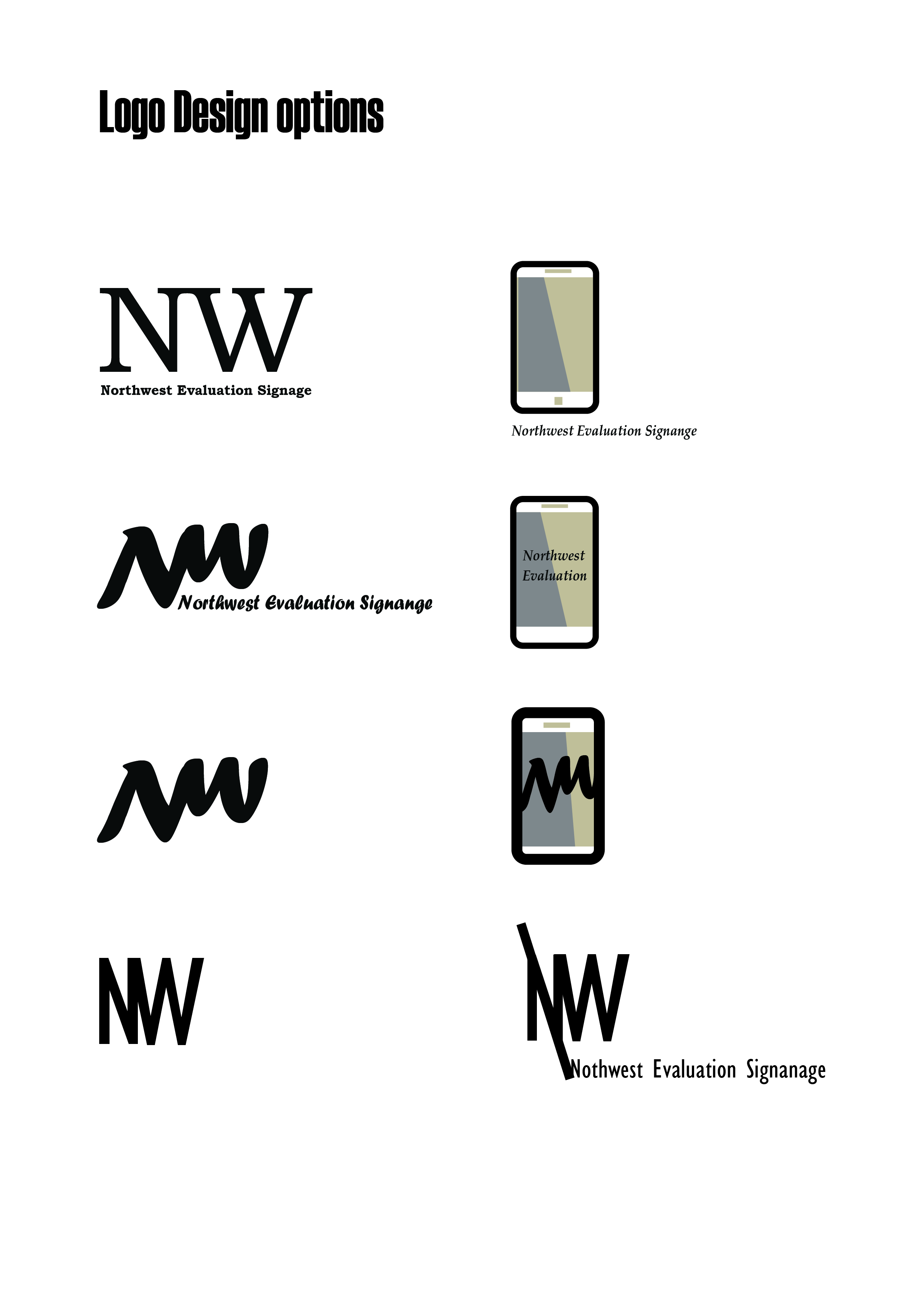
I think to reduce the number of lines , because when you reduce the size of the logo it won't be that clear.
8 months ago by Engy
I created a simple logo using muscular font, could be used in branding . Happy to know your feedback.
8 months ago by Engy
Posts
flyer design
- Report
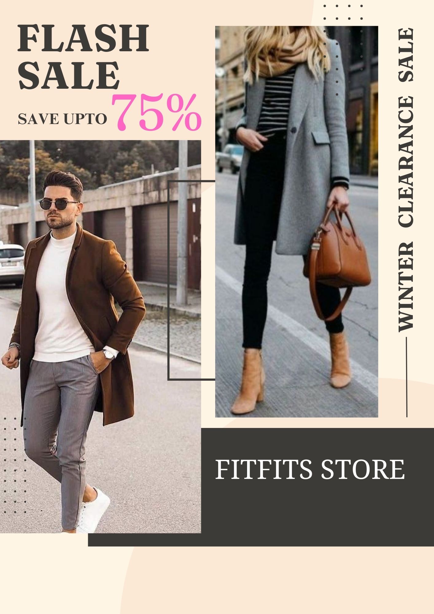
8 months ago by Engy
The project is for a clothing store for men and women , they are closing so they want to sell as much as they can, this promotional flyer to help them to sell as much as they can. Appreciate your feedback!
 8 Likes
 5
5
really good design i would just center it, to much blank space on the bottom
8 months ago by Mario - Reply
right , will do that .. thanks alot
8 months ago by Engy - Reply
Ok
8 months ago by Mujeeb Amoo - Reply
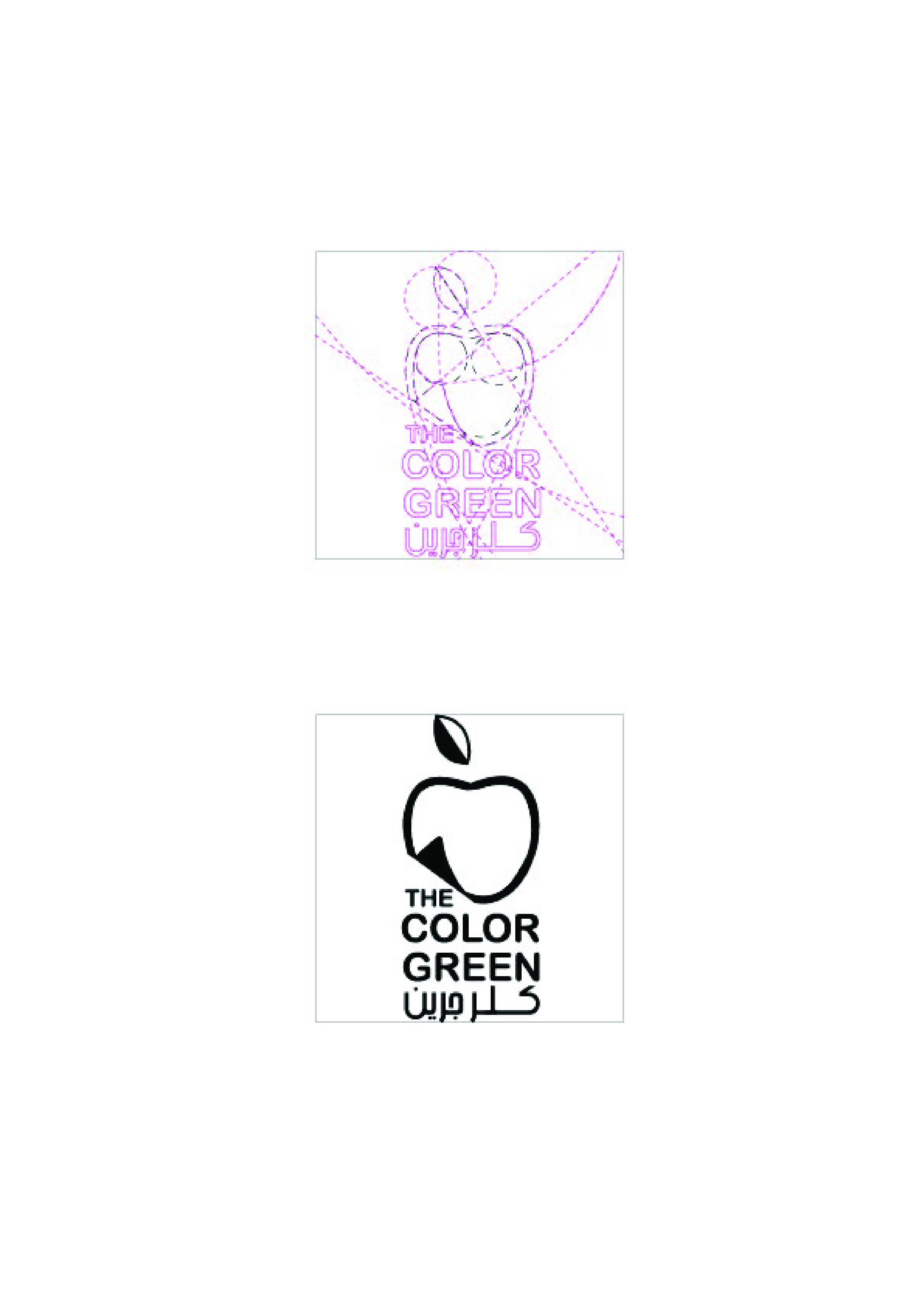
fresh food restaurant logo
- Report
8 months ago by Engy
this logo is for fresh food restaurant , the decoration of the restaurant depends on some sticky notes to stick your memories on the wall, used the apple as it refers to fresh food and also the colour green.
 3 Likes
1
3 Likes
1
irrelevant
8 months ago by Japheth - Reply
Logo Design
- Report
8 months ago by Engy
Logo is designed for a mobile products company based in Hongkong called Northwest Evaluation Signage , It is simplified letters N and W which is the first letter in each word , also used the colour red which refers to the fast products . The logo could be used in different dimensions and could be used in the brand Identity.
 Like
1
Like
1
The first option looks really elegant and easy to identify. The typeface of the logo suits well for mobile products company.
8 months ago by Stuart - Reply
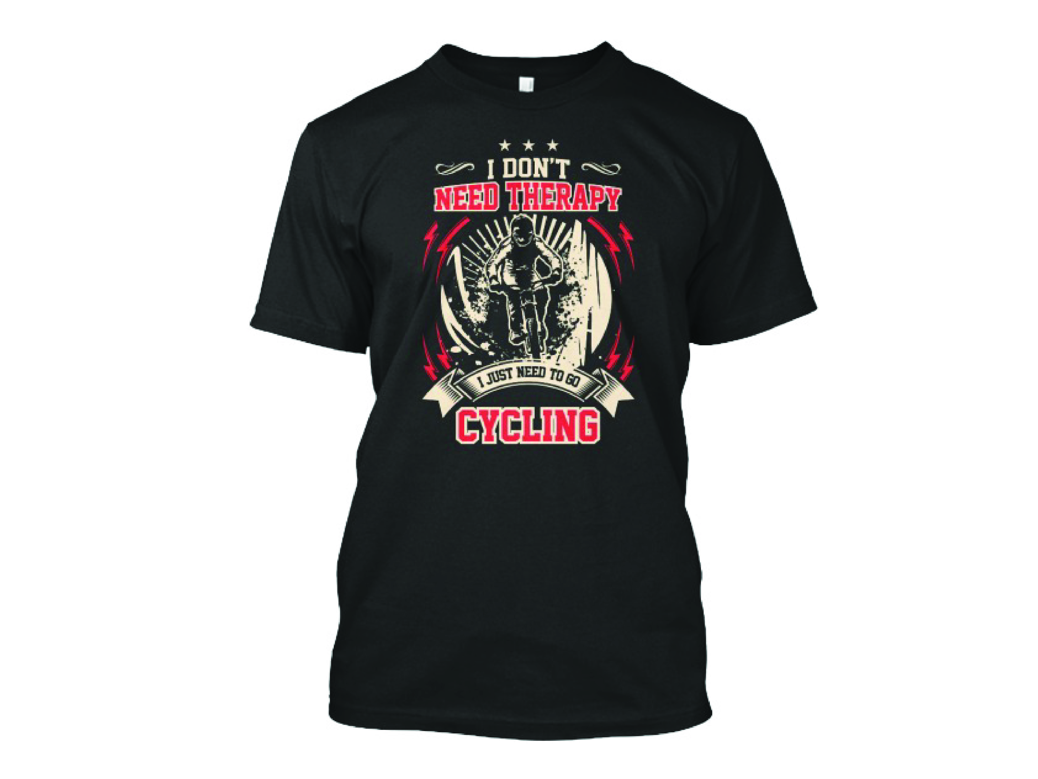
Illustration T.shirt Design
- Report
8 months ago by Engy
Designed and drew the design using Adobe illustration using the tablet for a T shirt design Factory
2 Likes
2
That look so great
8 months ago by Siddhant Mishra - Reply
Thank you Siddhant
8 months ago by Engy - Reply
logo
- Report
8 months ago by Engy
I created a simple logo using muscular font, could be used in branding . Happy to know your feedback.
1 Like
4
I really like the simplicity of this (sometimes less is more!) - the second one with the weights each side is great because it captures the nature of the business.
8 months ago by Shona McQuillan - Reply
thank you so much
8 months ago by Engy - Reply