sefa
Posts
3
Likes
2
Liked Posts
4
Given Feedback
12
Feedback
IT WAS NICE AND SIMPLE

1 year ago by sefa
nice
1 year ago by sefa
nice

1 year ago by sefa
it was nice, i just dont like that you use different font in the sentence below
1 year ago by sefa
its nice but it would be great if you make it simple change the color, dont like the darker color that you use in the main subject

1 year ago by sefa
nice. like the fonts and the background. very simple

1 year ago by sefa
COOL. IT WAS GOOD. I LOVE HOW YOU PUT THE SOUND WAVE AROUND THE LETTER i BUT IT EXCEEDS THROUGH LETTER D and O

1 year ago by sefa
ITS MINE, CAN'T SEND FEEDBACK ON MY OWN. LOL
1 year ago by sefa
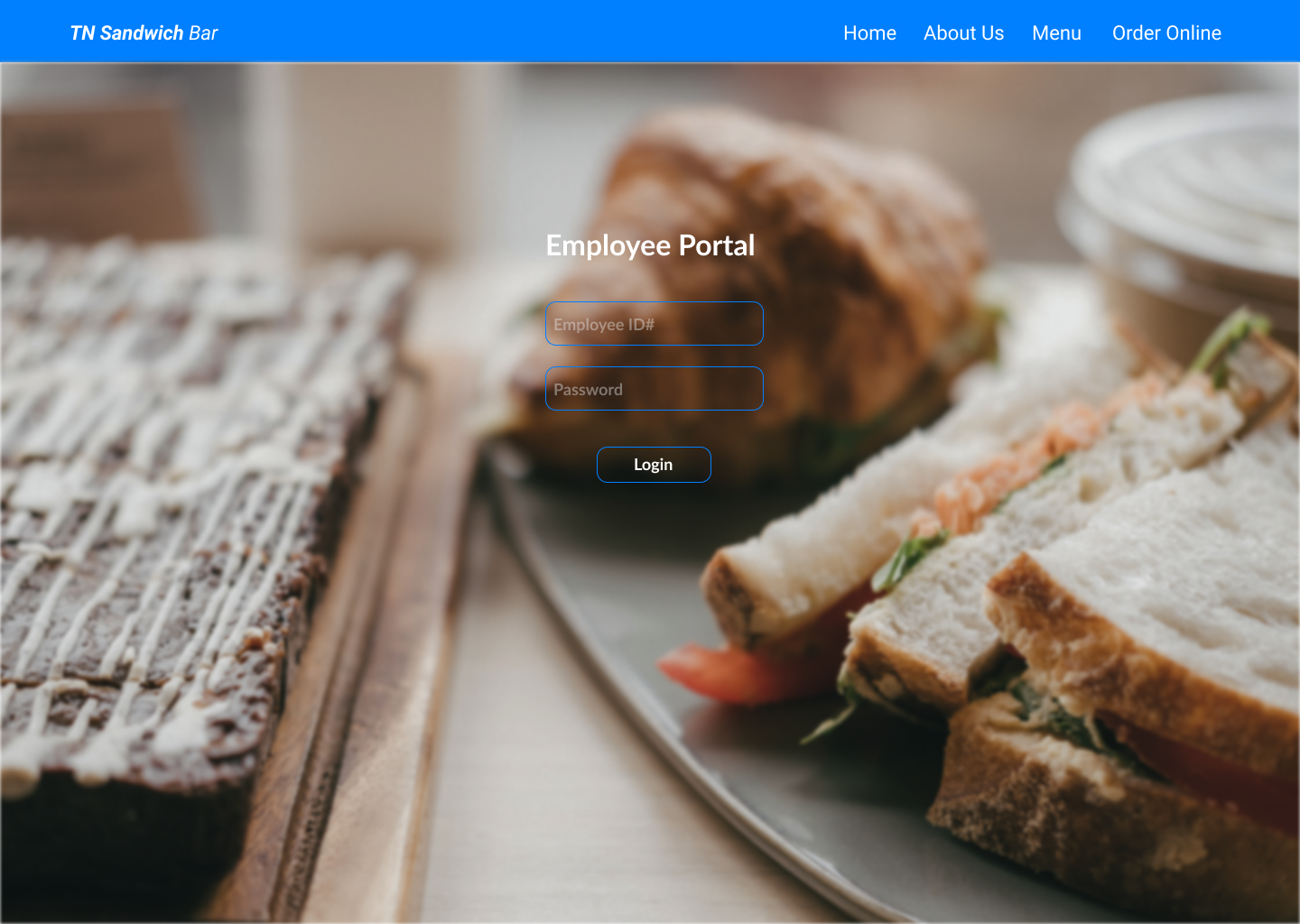
I LIKE IT, IT WAS SIMPLE. THE BACKGROUD WAS NICE, IT SUIT THE NAME OF THE COMPANY, I LIKE HOW YOU PUT THE EMAIL AND PASS BAR A LIL VISIBLE. NICE WORK
1 year ago by sefa
cool, your design was amazinf. you did a good job for creating what the clients wants which is putting mascot into the logos. but for me i would love if you make it simple, i see so much details and it kinda loooks drown for it. outlines are too obvious, make it less
1 year ago by sefa
your work was amazing the client wants the watercolor illustration and you did it but you didn't follow what the client really wants which is to use just outlines for the water illustration. i hope it helps. ty

1 year ago by sefa
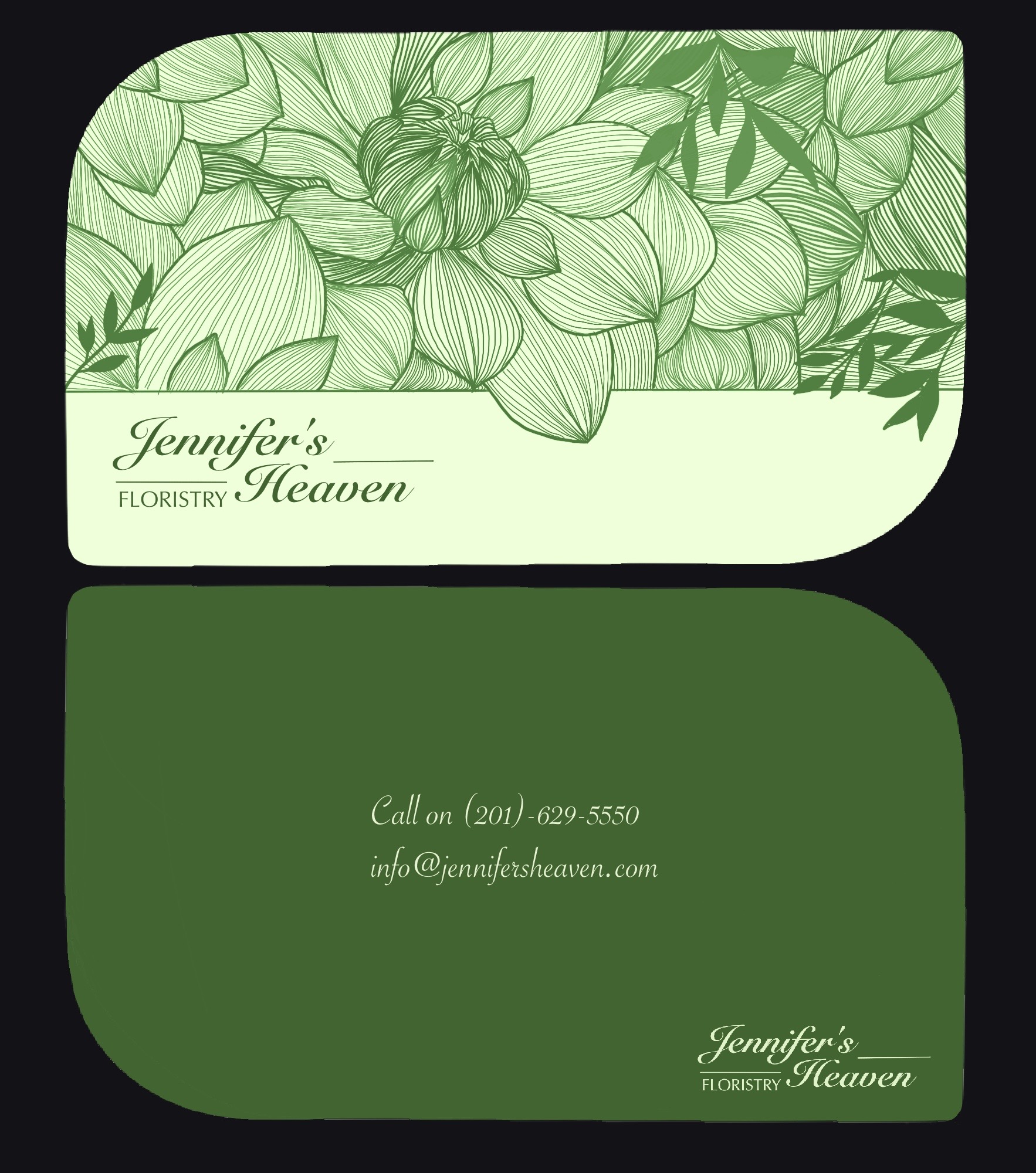
I'm also new, a student. please excuse my english. hard for me to construct word.
i just want to say it was good for a beginner. it was simple, i love that you use green, i like also the shape of the card. i just want to suggest that you put other color than the green, because it was floristy, which means flower, and flower comes from different color. and i feel like it would be great if its texture kinda looks like vintage. the font was perfect. yeah thats it. ty
1 year ago by sefa
Posts
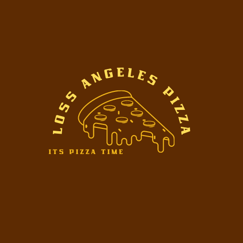
LOGO FOR LOSS ANGELES PIZZA
- Report
1 year ago by sefa
Hello!
I'm Wade, I recently started a new business called Los Angeles Pizzas. I am looking for someone that can design a professional logo for my Pizzas. I think a combination mark will fit best with the business. Can you do that?
I'm Wade, I recently started a new business called Los Angeles Pizzas. I am looking for someone that can design a professional logo for my Pizzas. I think a combination mark will fit best with the business. Can you do that?
 1 Like
 4
4
Yeah, alignment is the main issue. Two options (from what I can imagine) is aligning it to the left (where the L in "Loss angeles (misspelled btw) is), or in the center and have some of the text covered by the pizza, which might actually turn out cool
1 year ago by Endo - Reply
This is a good design! The pizza logo works well with the chosen font, perhaps just align the "it's pizza time" to the centre?
1 year ago by Luke - Reply
I like this design it’s simple and beautiful
1 year ago by Fatima Habshee - Reply
I love the dynamic of this design. I like how the pizza goes nicely visualy with the how the name of the pizzeria is portrayed, and how there is a lot of good contrast. What I do have to say is that in my opinion the "it's pizza time" writing should be more centered rather than aligned to the left, but besides that, I feel like this is a very visually pleasing design!
1 year ago by Iris Troian - Reply
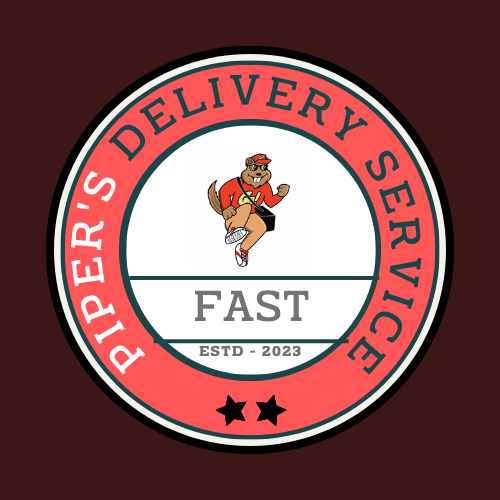
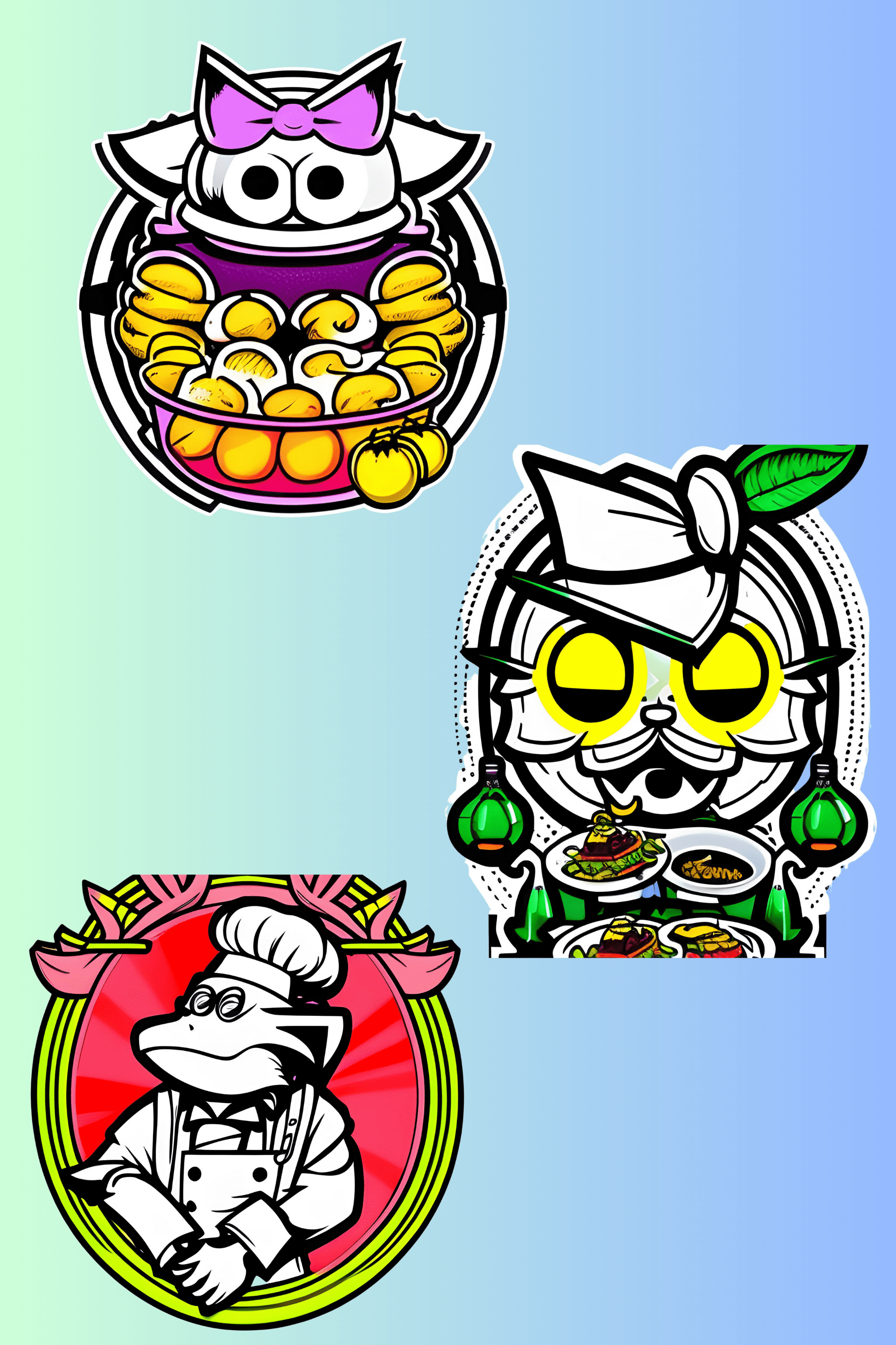
LOGO FOR PIPER'S DELIVERY SERVICE
- Report
1 year ago by sefa
try something hard for the second try.
Hey,
I'm Piper, I recently started a new business called Piper's Delivery Service. I'm looking for someone that can create a simple logo for my business. I love mascot logos. Would you be interested?
I'm Piper, I recently started a new business called Piper's Delivery Service. I'm looking for someone that can create a simple logo for my business. I love mascot logos. Would you be interested?
1 Like
3
Lines are too long (they overlap), the spacing above and below the text seems of (everywhere), and why 2 stars and not 5? reading the text is a little hard as it is partially upside down, if you want to do round text I don't recommend going all the way upside down. Finally, the mascot will be hard to see in smaller versions of the logo, so I recommend making it the head of the mascot instead of the whole mascot
1 year ago by Endo - Reply
I personally find it quite difficult to read the name "Piper" on this design. Perhaps you could place "Piper's" at the top of the circle and "Delivery Service" at the bottom.
1 year ago by Ian Szymanski - Reply
nice
1 year ago by sefa - Reply
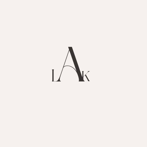
LAK LOGO FOR BUSINESS
- Report
1 year ago by sefa
trying simple logos, for a simple and beginner like me.
Hi,
I am Pat, creator of Lak. We're looking for someone that can make a good logo for our business. I think a wordmark would look cool. Would you be interested?
I am Pat, creator of Lak. We're looking for someone that can make a good logo for our business. I think a wordmark would look cool. Would you be interested?
Like
2