khushi
Posts
1
Likes
5
Liked Posts
1
Given Feedback
5
Feedback
looks great! but wish the lines were a little thicker in some places to add more
depth

1 year ago by khushi
i think the font could have been a little more younger but great background!

1 year ago by khushi
oh wow! interesting
1 year ago by khushi
love your style!

1 year ago by khushi
looks nice and vibrant!

1 year ago by khushi
Posts
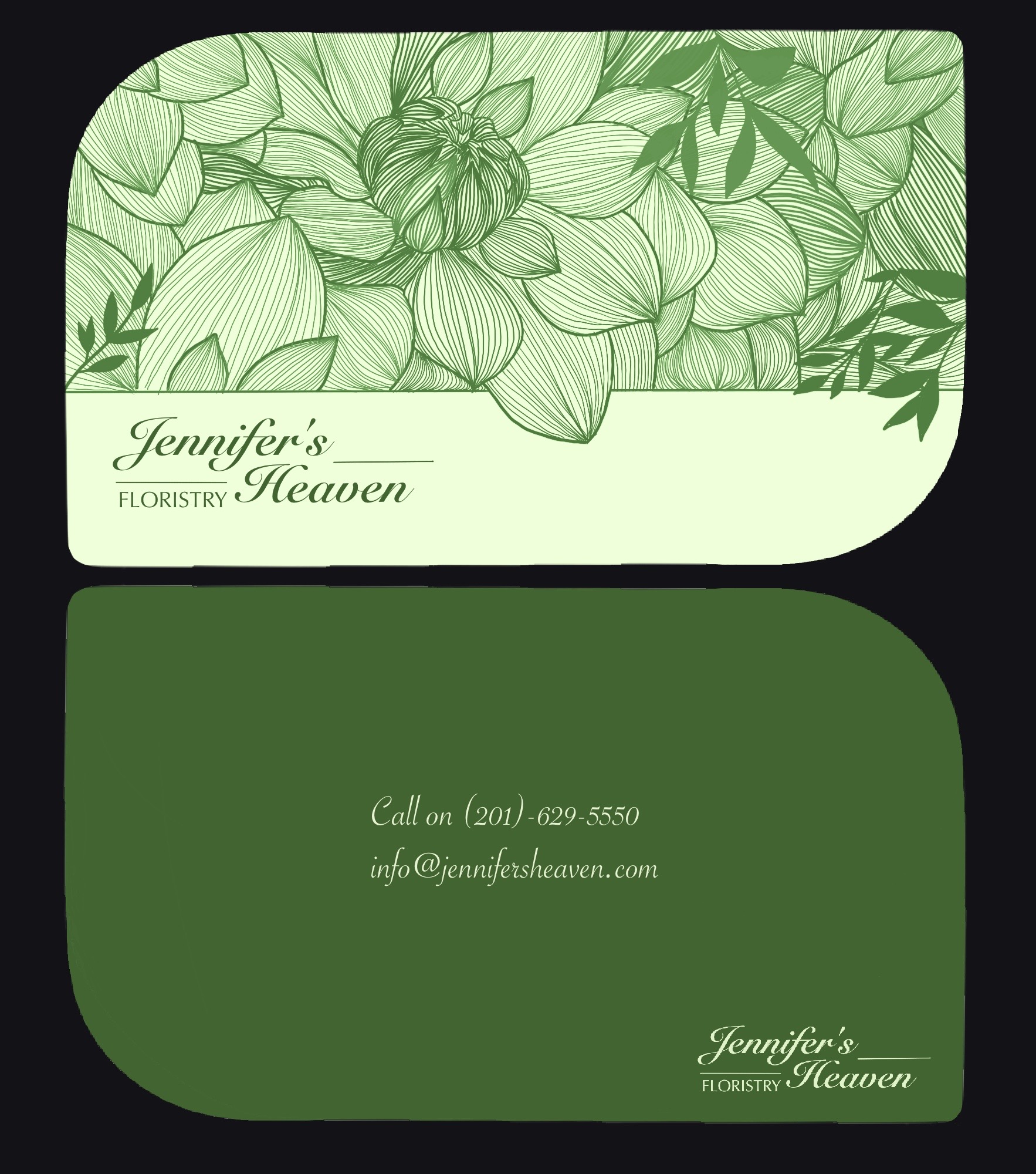
Jennifer’s Heaven Business cards
- Report
1 year ago by khushi
hey guys! i’m very new at graphic design and would love some feedback.
ps. i’m still figuring out how to make mock-ups
ps. i’m still figuring out how to make mock-ups
 5 Likes
 3
3
hey, love the font for the brand and the front side, it is super pretty. Maybe you could increase the font on the back, apart from that great work, keep going :)
1 year ago by Ananya - Reply
Very nice concept. Perhaps consider having the contact info in the same font as "Floristry" to increase legibility/readability? Otherwise, well done!
1 year ago by Luke - Reply
I'm also new, a student. please excuse my english. hard for me to construct word.
i just want to say it was good for a beginner. it was simple, i love that you use green, i like also the shape of the card. i just want to suggest that you put other color than the green, because it was floristy, which means flower, and flower comes from different color. and i feel like it would be great if its texture kinda looks like vintage. the font was perfect. yeah thats it. ty
1 year ago by sefa - Reply