paul
Posts
5
Likes
15
Liked Posts
17
Given Feedback
2
Feedback
Thanks for your reply! You are probably right.
2 years ago by paul
Thank you for your advice! Will try removing it.
2 years ago by paul
Posts

Jewelry logo design
- Report
2 years ago by paul
My first serious work in Logo design. Would love to hear your critique!
Alice Wonders
Jewelry creation and selling
Associations: Modern, Elite
Bond with Alice in Wonderland
Alice Wonders
Jewelry creation and selling
Associations: Modern, Elite
Bond with Alice in Wonderland

 3 Likes
 1
1
Maybe add a layer that lightens or darkens the background, that will create more contrast so the logo is a bit more visible. Furthermore, I like the idea behind the logo.
2 years ago by Stefan - Reply
Nak.org
- Report
2 years ago by paul
Hello!
I am Corrie, owner of nak.org. I'm looking for someone that can design something for my music production business. We will need a poster to advertise our business. We primarily use the color green (#91e57a). Would you be interested?
I am Corrie, owner of nak.org. I'm looking for someone that can design something for my music production business. We will need a poster to advertise our business. We primarily use the color green (#91e57a). Would you be interested?
 1 Like
1
1 Like
1
nice colors
11 months ago by Moane - Reply
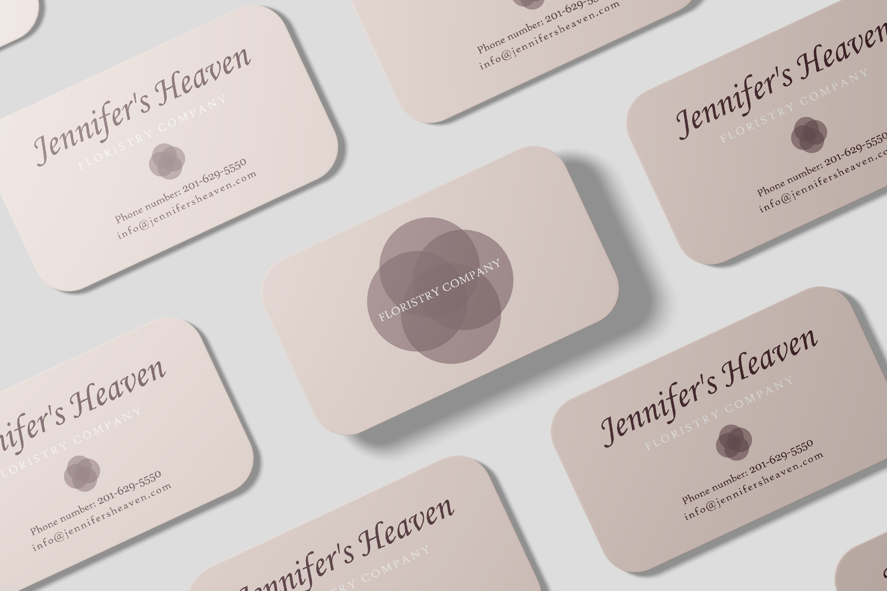
Jennifer's Heaven
- Report
2 years ago by paul
would love to hear some critique
Jennifer's Heavengraphic
7 Likes
4
I enjoy the round edges to go with the circular shapes and soft colors.
My main concern to point out is "Floristry Company" being in white against a light background. It does look stylish, but it may be difficult to read for those who don't have great eyesight.
2 years ago by Macklin Legan - Reply
Thanks for your reply! You are probably right.
2 years ago by paul - Reply
Very nice color palette - not too colorful but also not too bland. I personally don’t think you really need to add “company” after floristry. I think moving floristry directly in the middle of the icon would work better.
2 years ago by Nina - Reply
Thank you for your advice! Will try removing it.
2 years ago by paul - Reply