Nina
Hi! My name is Nina and I’m a beginner graphic designer. I’m currently in school pursing my BA so I’m creating projects here to continue practicing what I’m taught. Feel free to follow me on my socials!
Posts
3
Likes
10
Liked Posts
4
Given Feedback
2
Feedback
Very nice color palette - not too colorful but also not too bland. I personally don’t think you really need to add “company” after floristry. I think moving floristry directly in the middle of the icon would work better.
2 years ago by Nina
Thank you <3
2 years ago by Nina
Posts
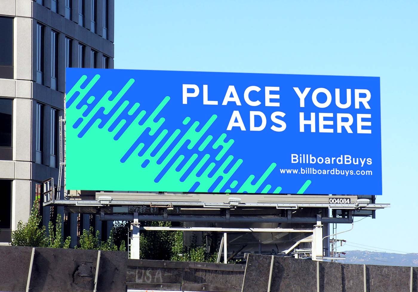
BillboardBuys
- Report
Nina • 2 years ago
For this project I researched a lot of billboards and also ones from Spotify. The color palette used in one of the ads from Spotify helped me create my final design. I wanted to follow the clients instructions as clear as possible by maintaining a simple yet colorful design while also having eligible text.


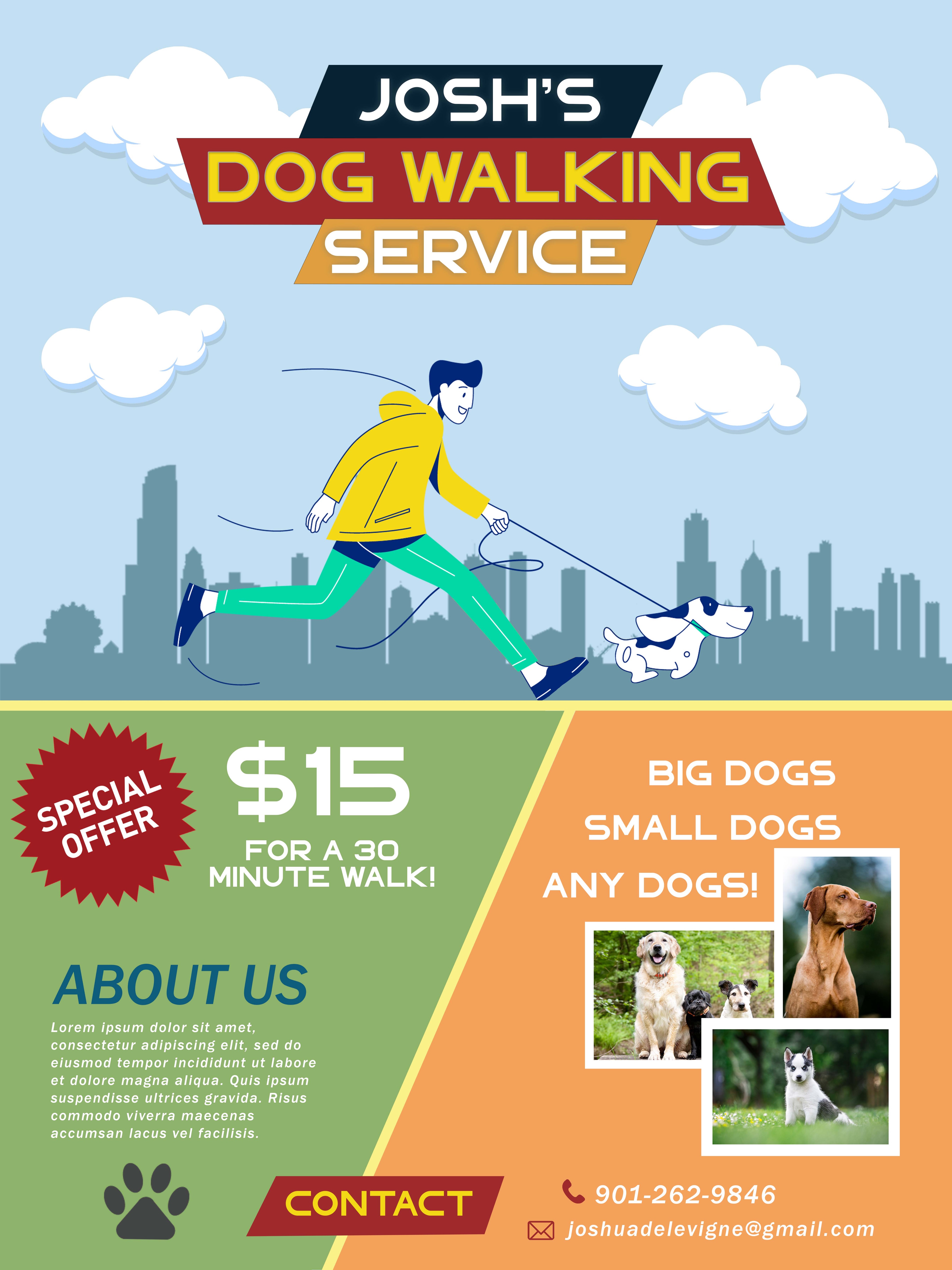
Josh’s Dog Walking Service
- Report
Nina • 2 years ago
I really love the flat illustration trend and wanted to showcase this with my final project. I wanted to honor the clients wishes by being clear and concise with their service.

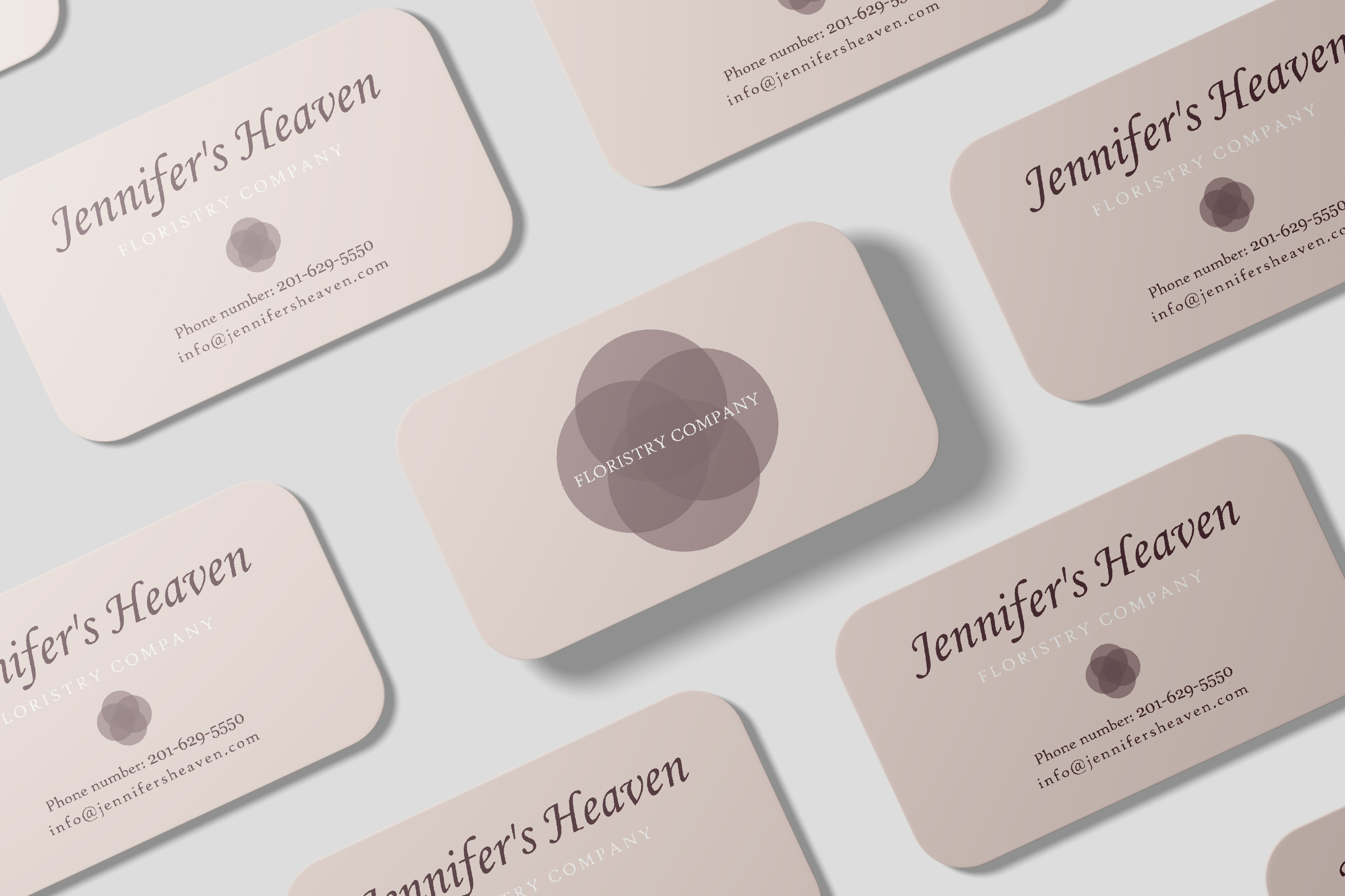
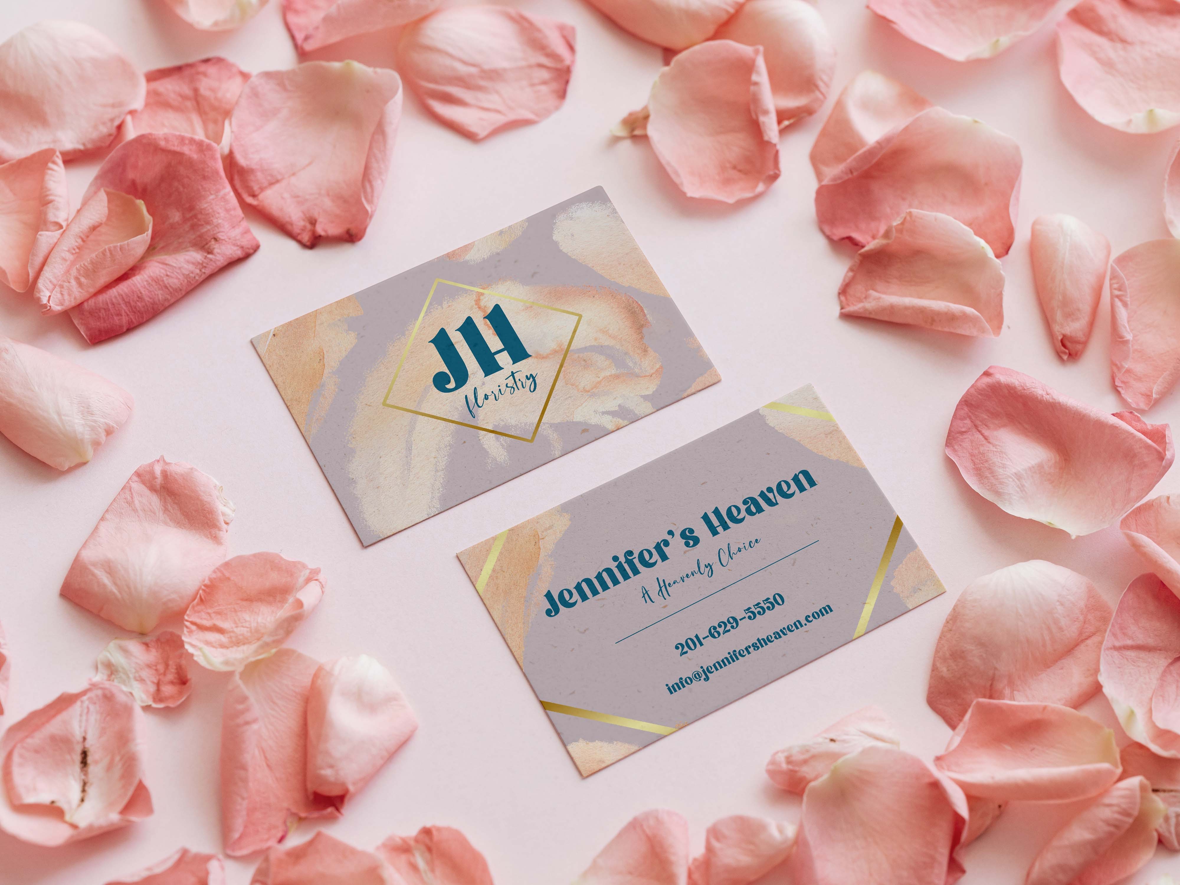
Jennifer’s Heaven
- Report
Nina • 2 years ago
I wanted to add abstract elements to the design of the business card to show a more elevated style of the brand. I also wanted to maintain a play on the word “heaven” by adding a tagline on the back of the card. Simple and elegant was the goal for the finished project.
Jennifer's Heavengraphic
