aedayrit
Posts
1
Likes
0
Liked Posts
2
Given Feedback
2
Feedback
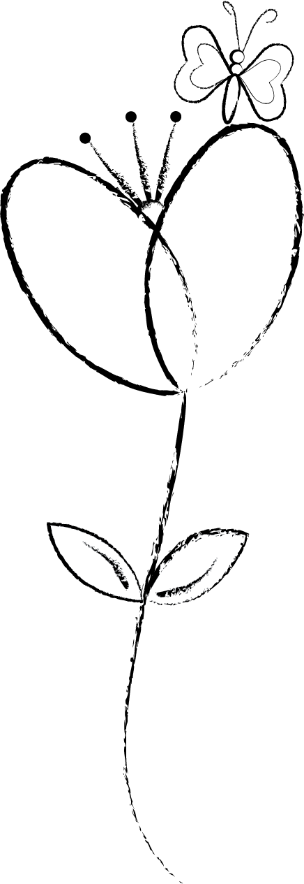
Nice illustrator design, not too complex in details so its easy to understand. The leaf has a fill color in it while the petals doesn't have, the butterfly should have a little form I think that can be seen sitting on a flower but other than that nice work.

2 years ago by aedayrit
Nice concept for the logo. Simple and clean, the heirarchy is there, alignmen not totally balance from Y to c, white balance is good. Nice job for first experience.

2 years ago by aedayrit
Posts
Graphics Design - Poster
- Report
2 years ago by aedayrit
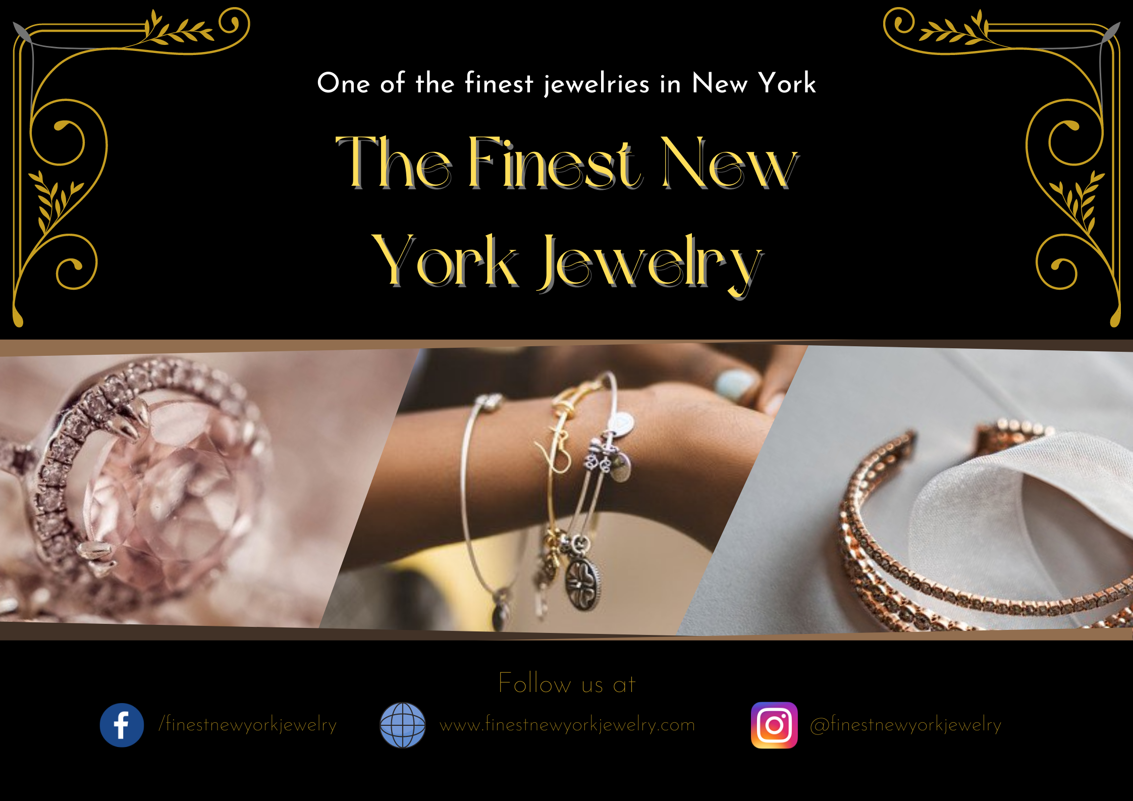
I forgot the brief I worked on but it says I need to make a poster for their jewelry business.
I made this using canva.
I tried to make it simple but elegant but I feel something is missing. Would love to know your side. Thanks!
I made this using canva.
I tried to make it simple but elegant but I feel something is missing. Would love to know your side. Thanks!
Don't make the text double (exception if is decorative and no need to read it). The bottom text is too thin, and not readable (i see it clear just with zoom). And maybe the icons for social media you would likely change the overall color to some gold or soft grey like in the image in the center.

2 years ago by Aurel - Reply
I like the layout, good use of the space. My only feedback would be the font colour, its a little muted so doesn't jump out too well. Overall well done!

2 years ago by Dayne - Reply