Marco Chekmeyan
Posts
1
Likes
5
Liked Posts
4
Given Feedback
2
Feedback
Solid wordmark, changing the typeface from a serif to sans serif would do the trick.
2 years ago by Marco Chekmeyan
I love the symmetrical balance and the simplistic yet effective UI. Good job
2 years ago by Marco Chekmeyan
Posts
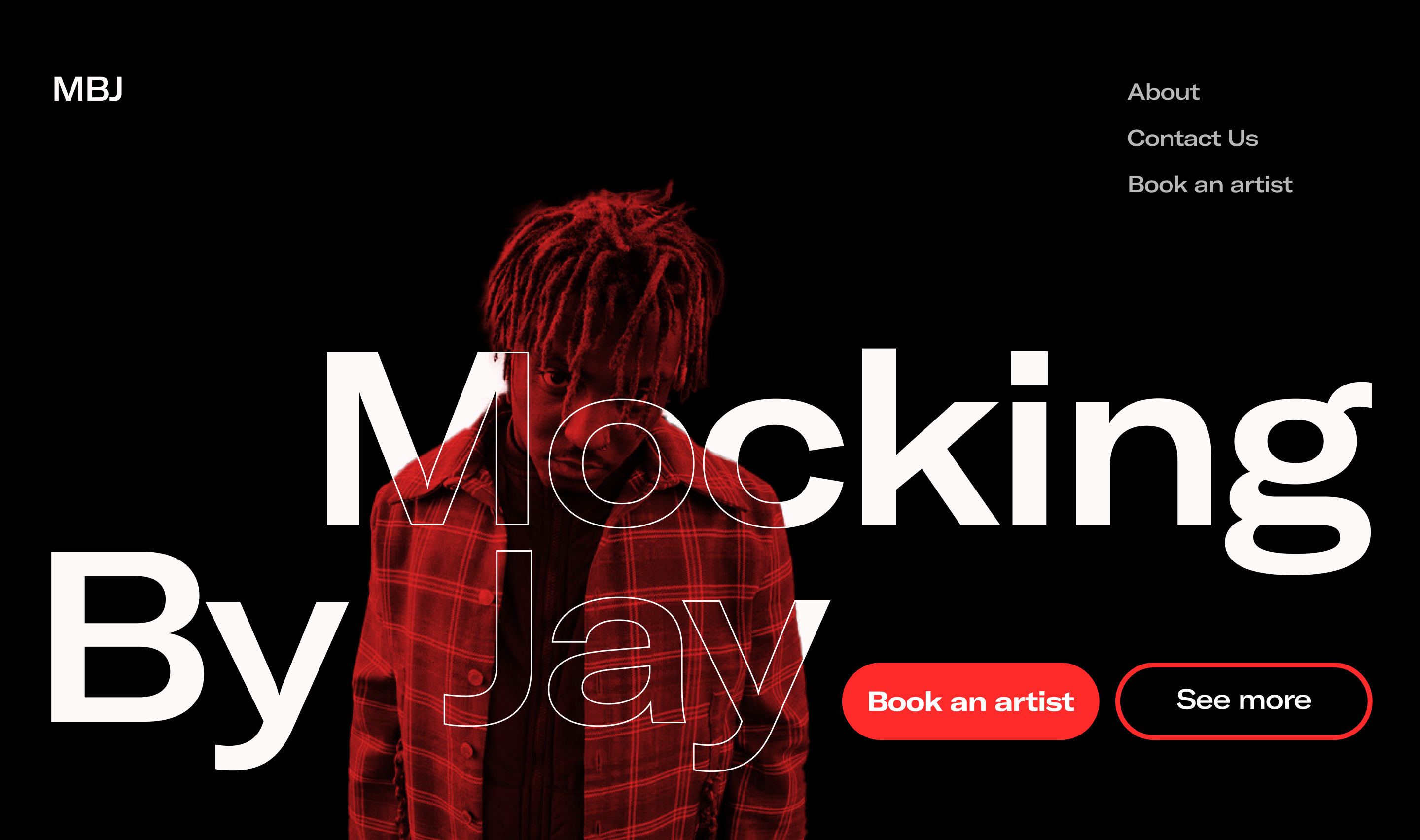
The landing page of Mocking By Jay
- Report
2 years ago by Marco Chekmeyan
 5 Likes
 3
3
a very cool take on this.
2 years ago by Daniel Medrano - Reply
I really like the way you've blended the person in with the text, really helps show the brand in a very unique way!
2 years ago by Daniel Lewis Roberts - Reply
Great use of hierarchy and focus. Works very well and fits with the brief nicely. I feel like the top right corner is a little distracting and I’m not quite sure how wells it works with the rest of the design. Overall looks great and eye catching but still simple
2 years ago by Ian smith - Reply