Daniel Medrano
Posts
1
Likes
3
Liked Posts
5
Given Feedback
4
Feedback
a very cool take on this.
2 years ago by Daniel Medrano
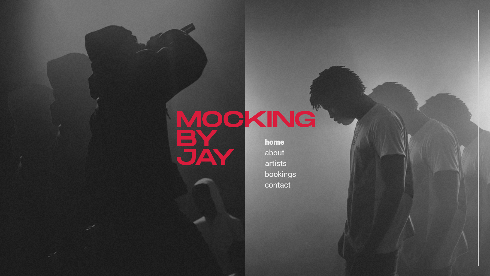
Clean layout. I like the accented J in the logo at the top left; only this is that I don't think it hit the briefs suggested colors, and the text on the hover panel on the left is a bit intense.
2 years ago by Daniel Medrano
Loving the super simple approach, I kind of wish I did it this way. Props.
2 years ago by Daniel Medrano
This logo is readable as a music note; the only issue I can see is that it seems a bit squished.

2 years ago by Daniel Medrano
Posts
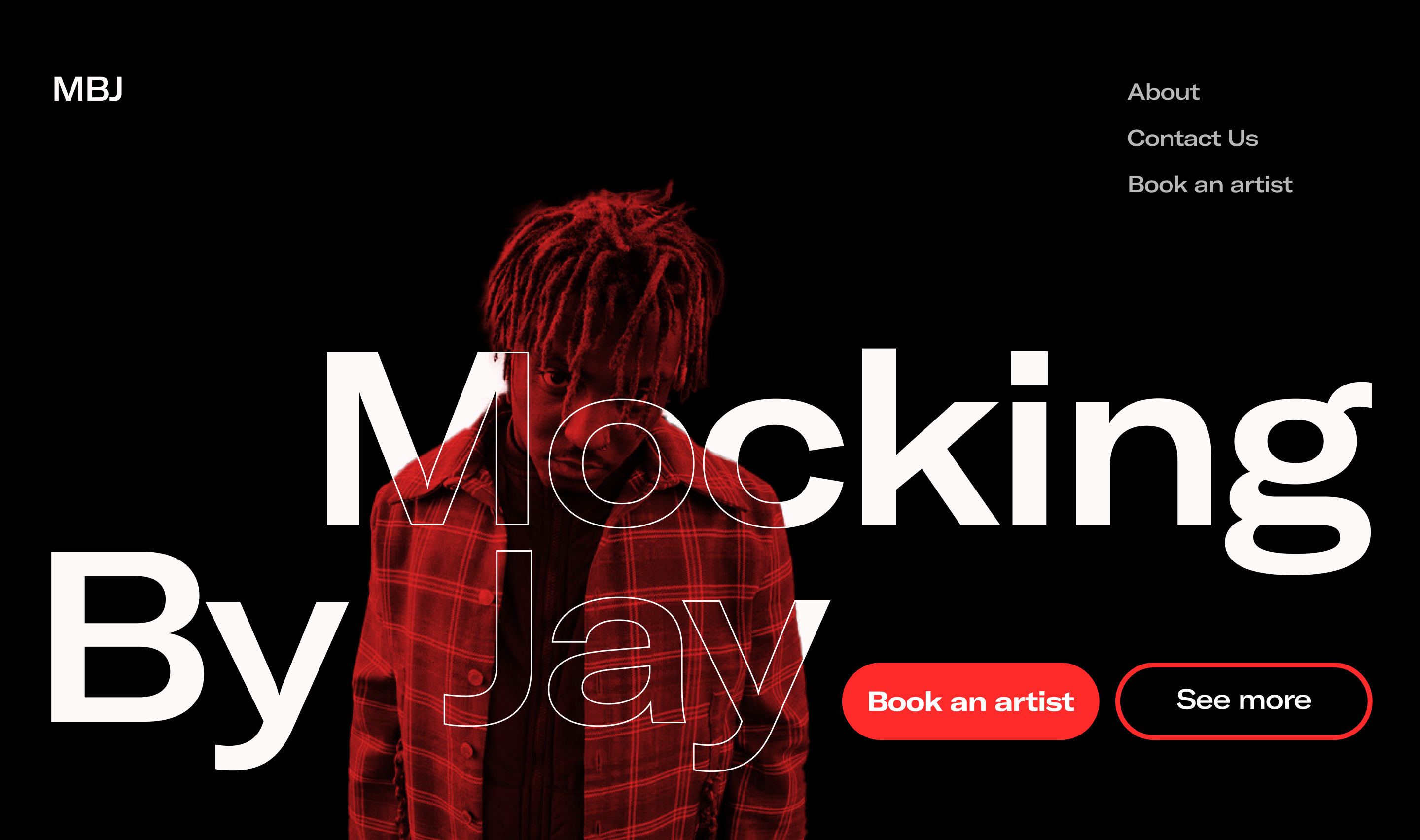
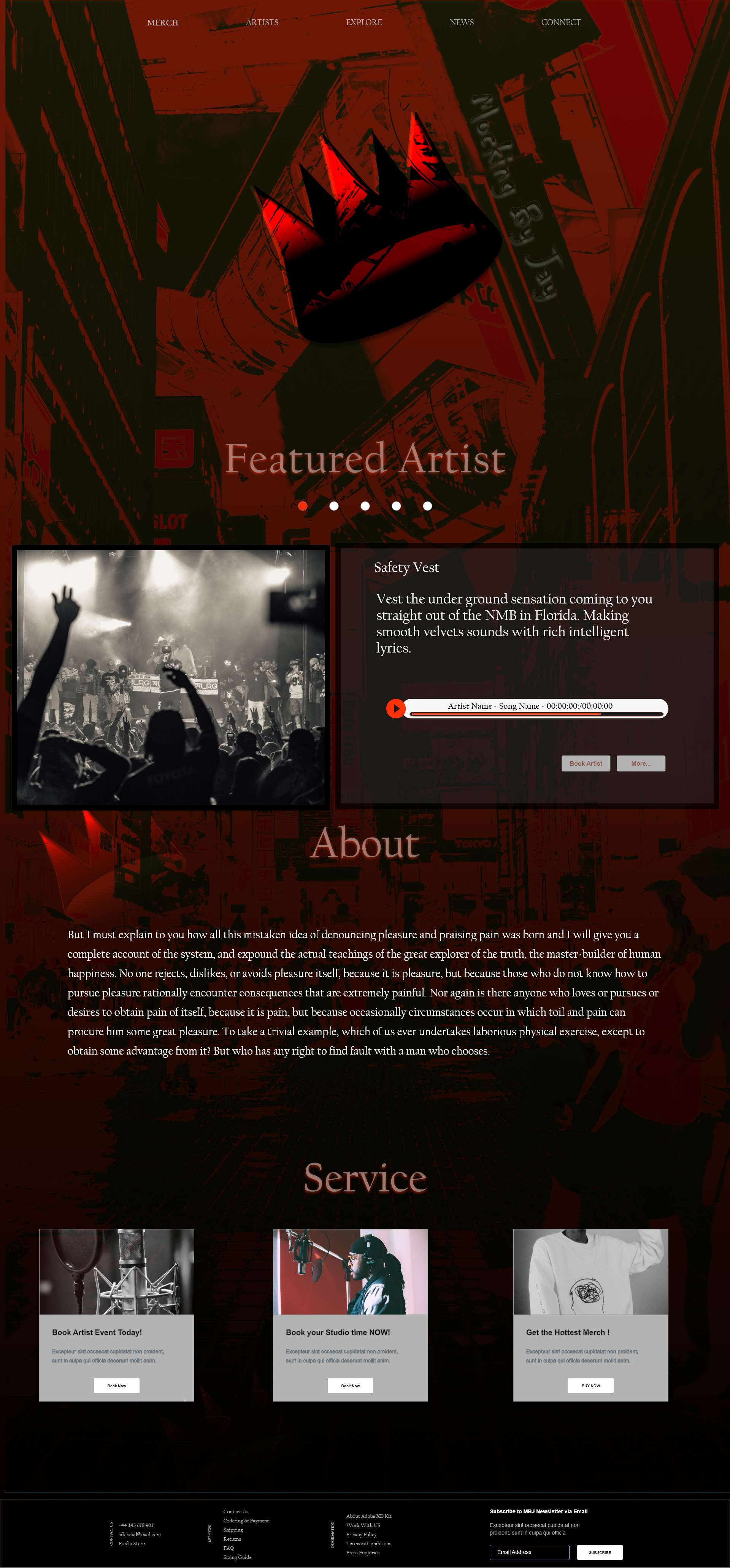
Mocking By Jay
- Report
2 years ago by Daniel Medrano
Indie Hip Hop record label
 3 Likes
 2
2
These cards are good! Maybe try switching it to a white instead of a light grey and utilise the red colour for the buttons
2 years ago by Daniel Lewis Roberts - Reply
its great to look at but legibility might become a issue for some people.
2 years ago by vaishnavi kaul - Reply