Daniel Lewis Roberts
Posts
2
Likes
4
Liked Posts
6
Given Feedback
6
Feedback
This is beautiful! Very well done! I'd maybe just add some vertical spacing between each of the sentences (not much!) and to me it looks like the text is slightly off-centre. Great work otherwise :D

2 years ago by Daniel Lewis Roberts
Thanks :D
2 years ago by Daniel Lewis Roberts
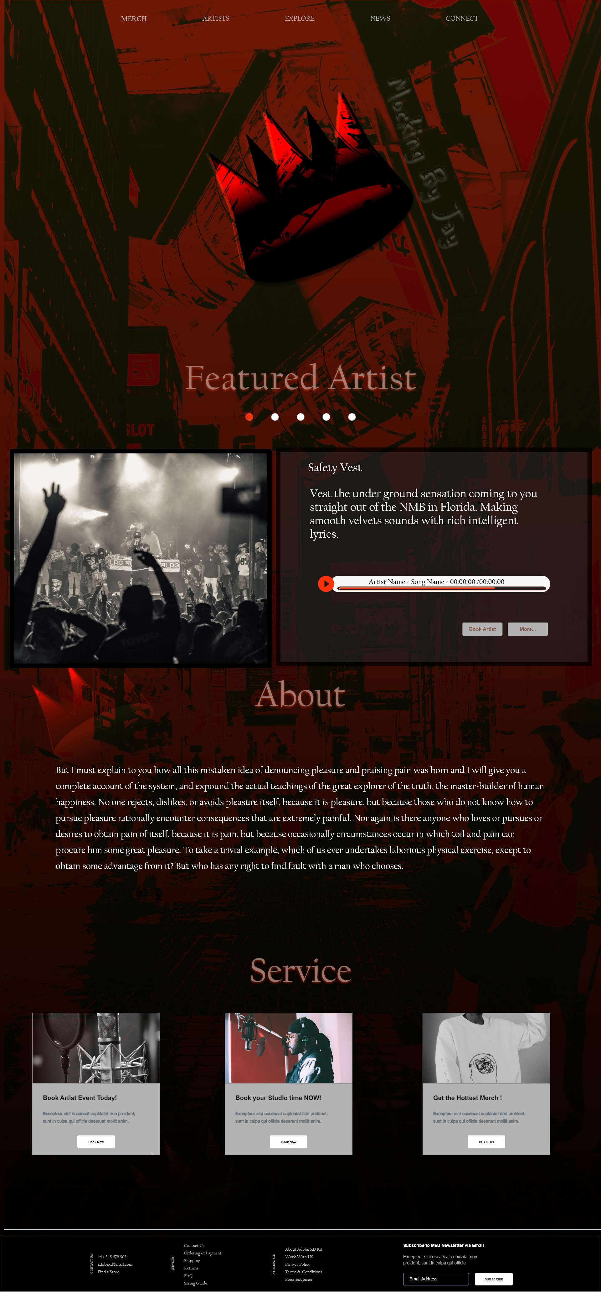
These cards are good! Maybe try switching it to a white instead of a light grey and utilise the red colour for the buttons
2 years ago by Daniel Lewis Roberts
I agree with Charmaine, but maybe that can be resolved by increasing the thickness of the line.

2 years ago by Daniel Lewis Roberts
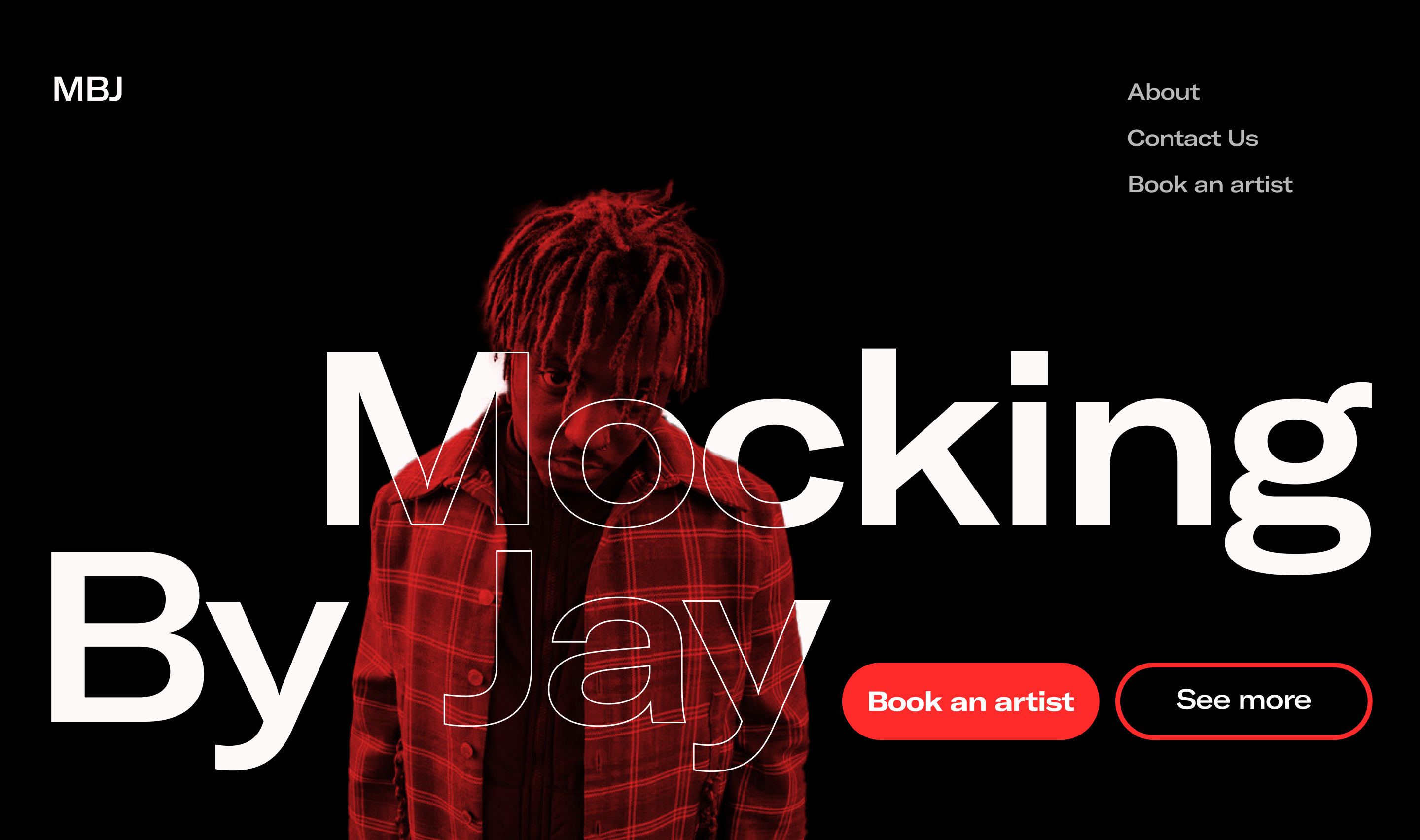
I really like the way you've blended the person in with the text, really helps show the brand in a very unique way!
2 years ago by Daniel Lewis Roberts
Thank you! Appreciate the kind words :)
2 years ago by Daniel Lewis Roberts
Posts
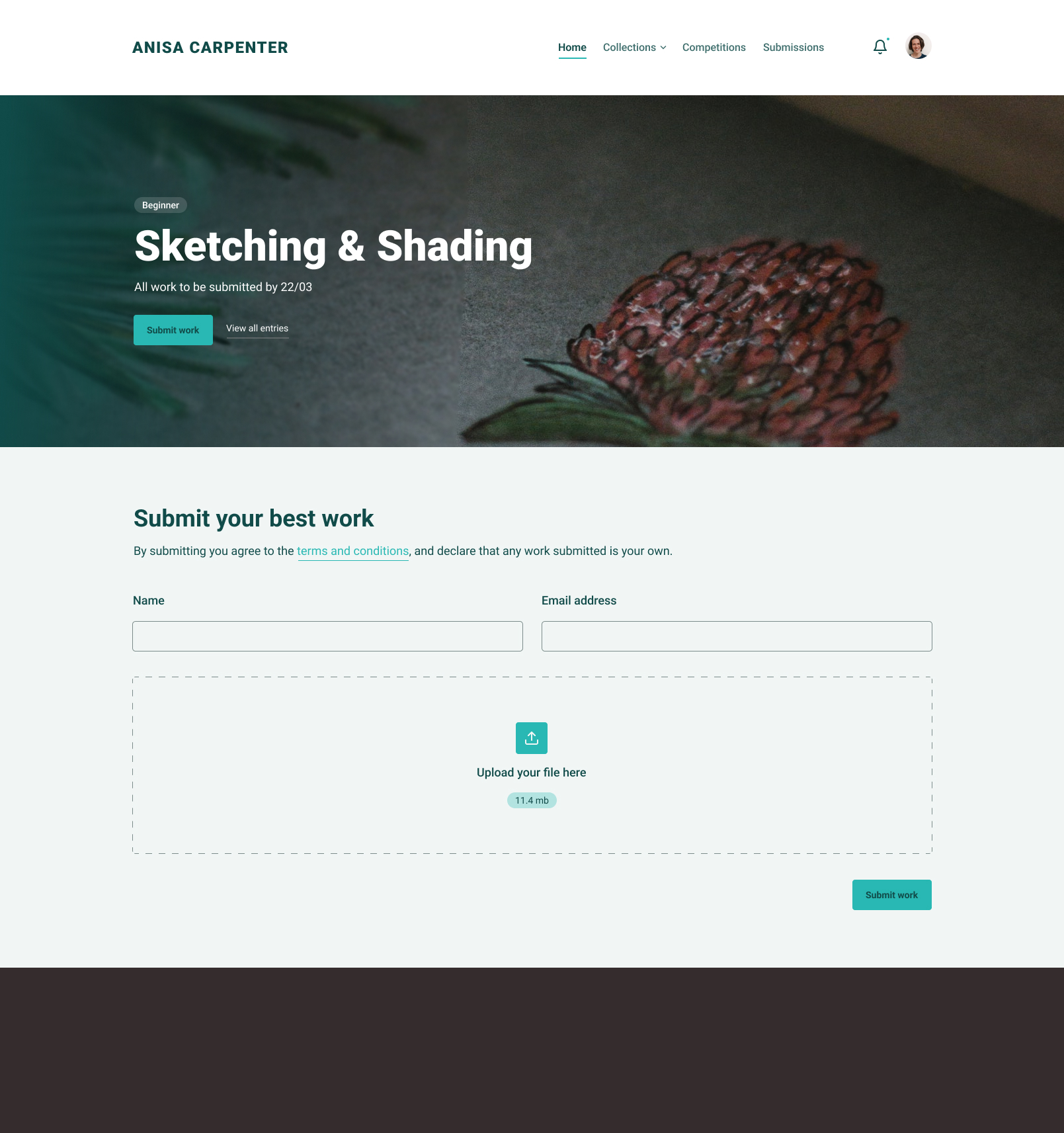
ANISA CARPENTER
- Report
Daniel Lewis Roberts • 2 years ago
Very clean and professional-looking, I like it
2 years ago by Amir - Reply
Thanks :D
2 years ago by Daniel Lewis Roberts - Reply
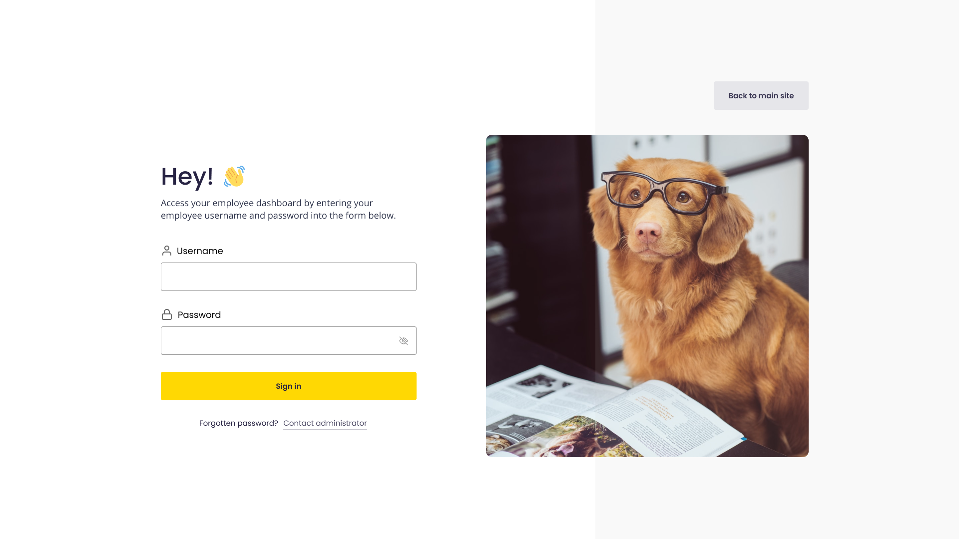
PetPlace Employee Login
- Report
Daniel Lewis Roberts • 2 years ago
An employee login for PetPlace's employee web portal
Hey!
I am Jack, owner of PetPlace. For a while now, I've been looking for a good website for my business. We need a new login-page for our employee web portal. Would you be interested?
I am Jack, owner of PetPlace. For a while now, I've been looking for a good website for my business. We need a new login-page for our employee web portal. Would you be interested?
I love the symmetrical balance and the simplistic yet effective UI. Good job
2 years ago by Marco Chekmeyan - Reply
Thank you! Appreciate the kind words :)
2 years ago by Daniel Lewis Roberts - Reply