Diana
Posts
5
Likes
15
Liked Posts
20
Given Feedback
2
Feedback
Looking great
1 year ago by Diana
I like your Icon and the font u used
3 years ago by Diana
Posts
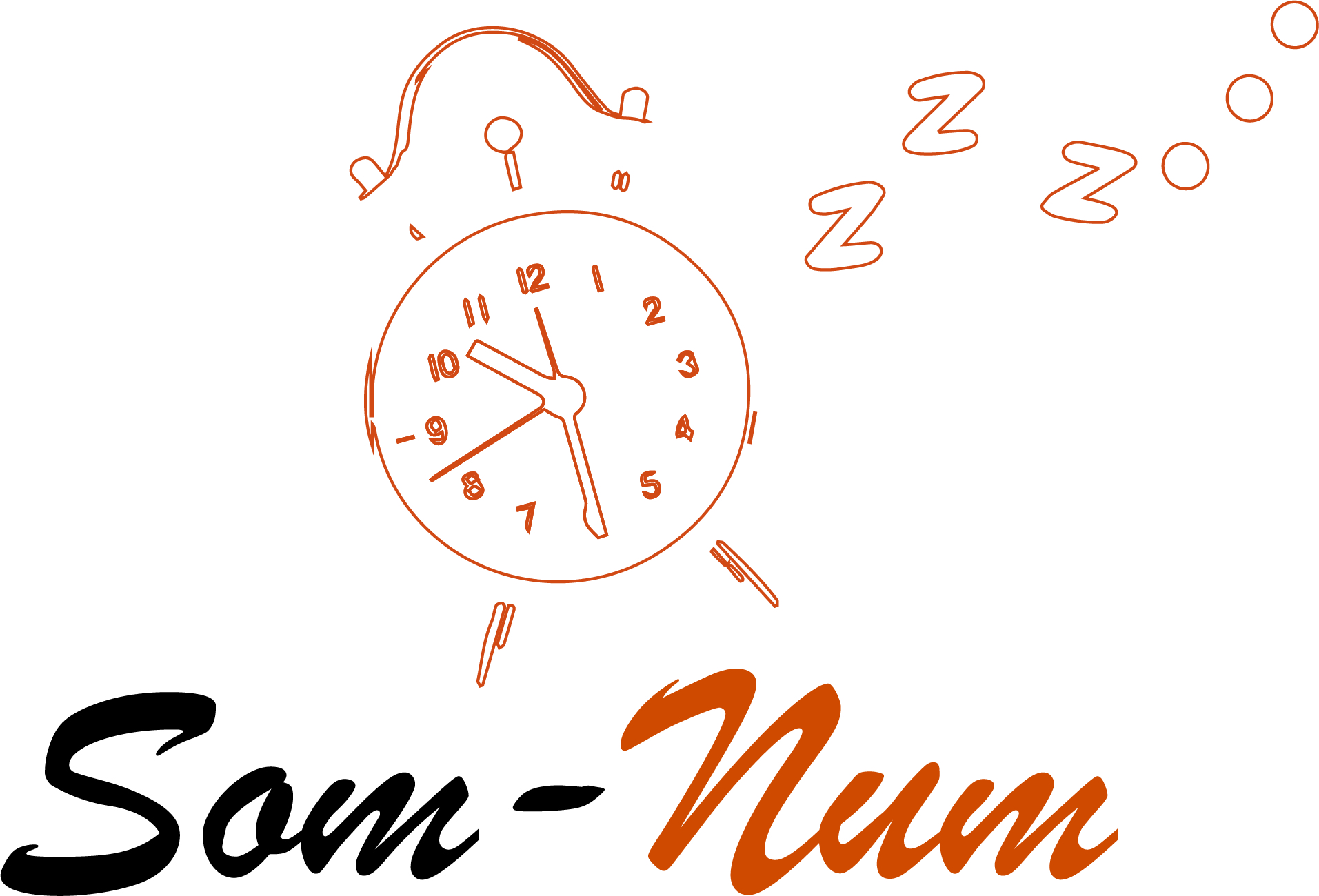
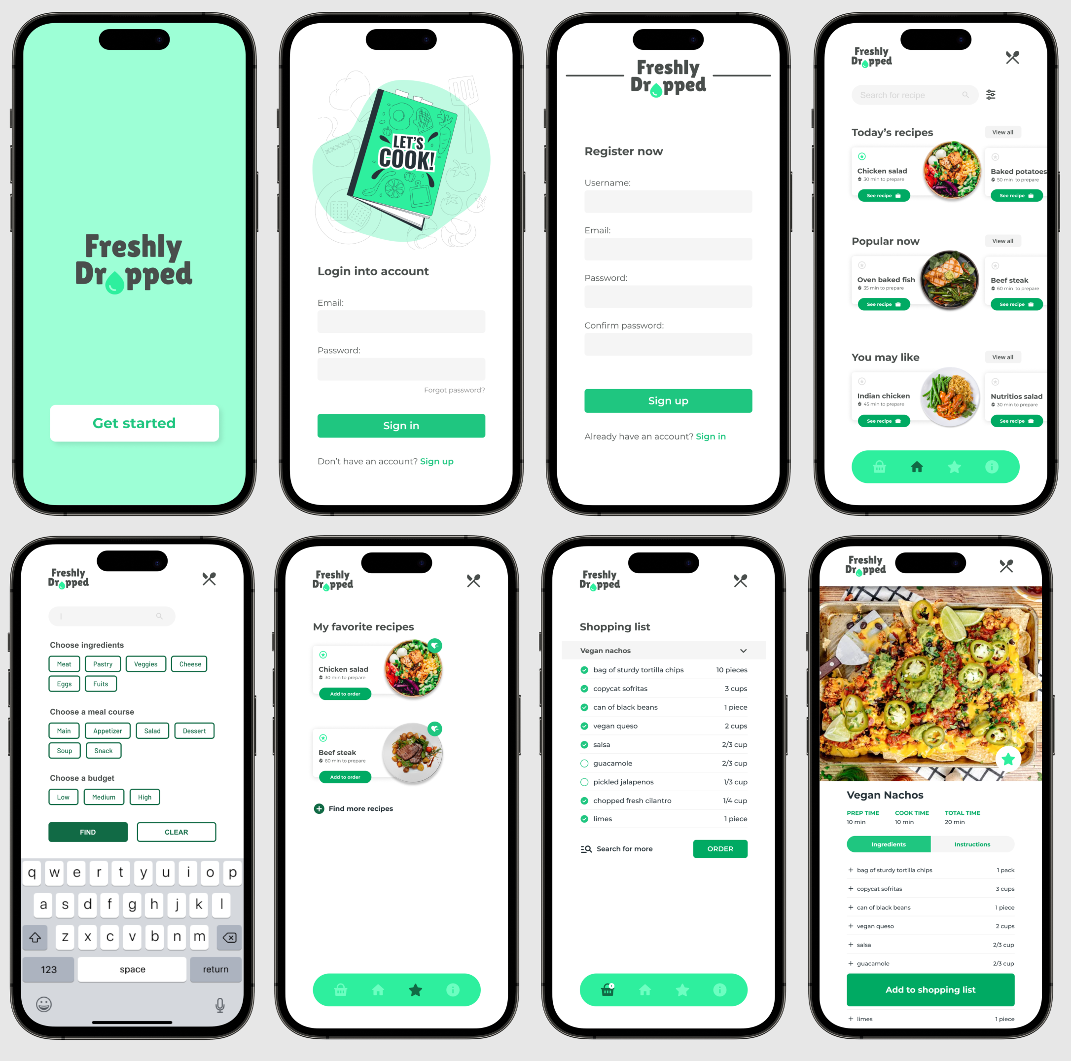
Freshly Dropped UI App
- Report
Diana • 1 year ago


Can you add a little bit of background in the signup/loginpage
1 year ago by Lorrie J. Strand - Reply
.
1 year ago by Ryan - Reply

book station logo 2
- Report
Diana • 3 years ago
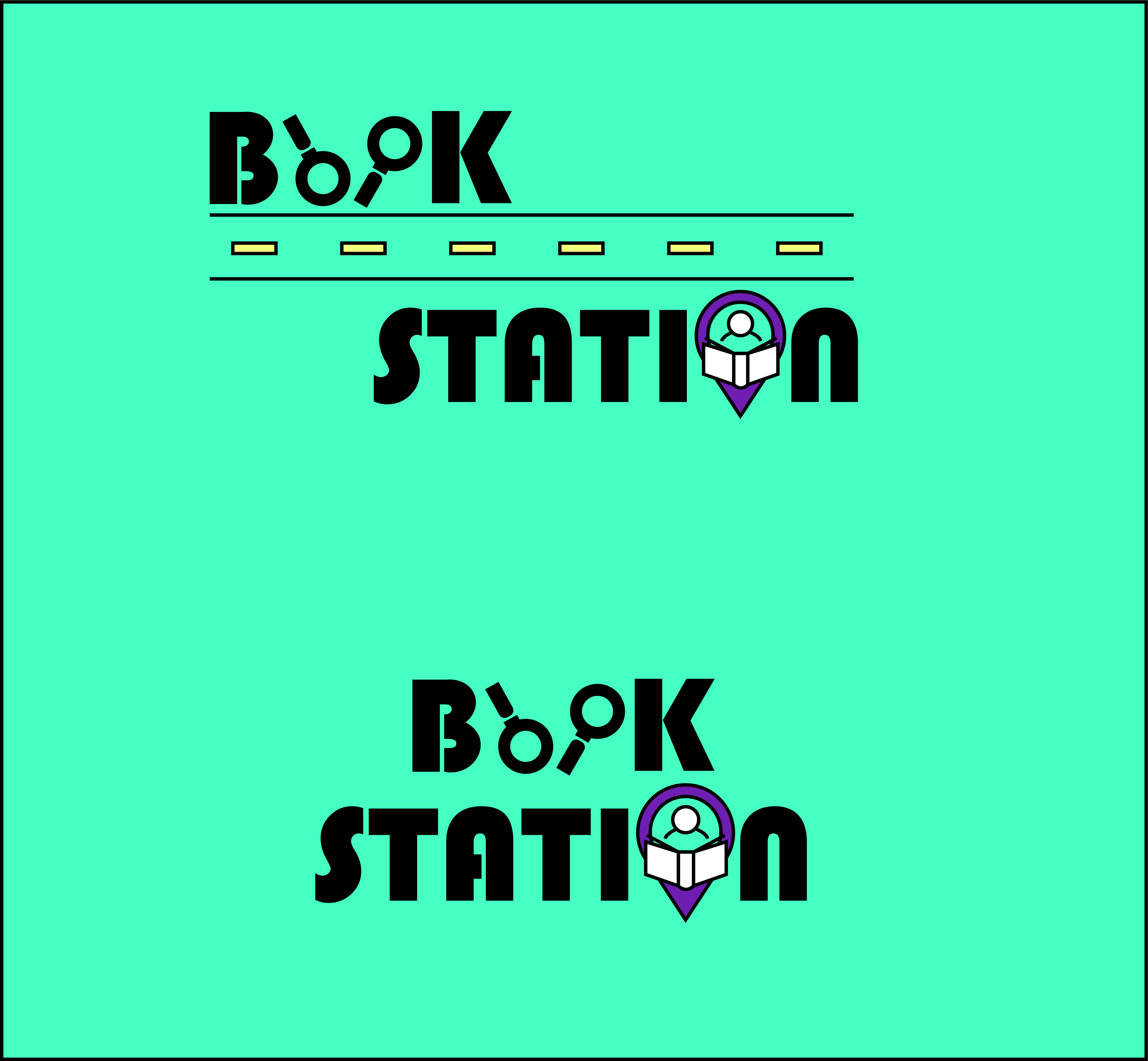

that magnified glass is looking nice in book word.
5 months ago by dk - Reply

Jolanda's pancake house
- Report
Diana • 3 years ago
Client: Jolanda
Design: Logo for Jolanda's pancake house
Logotype: combination mark
Design: Logo for Jolanda's pancake house
Logotype: combination mark
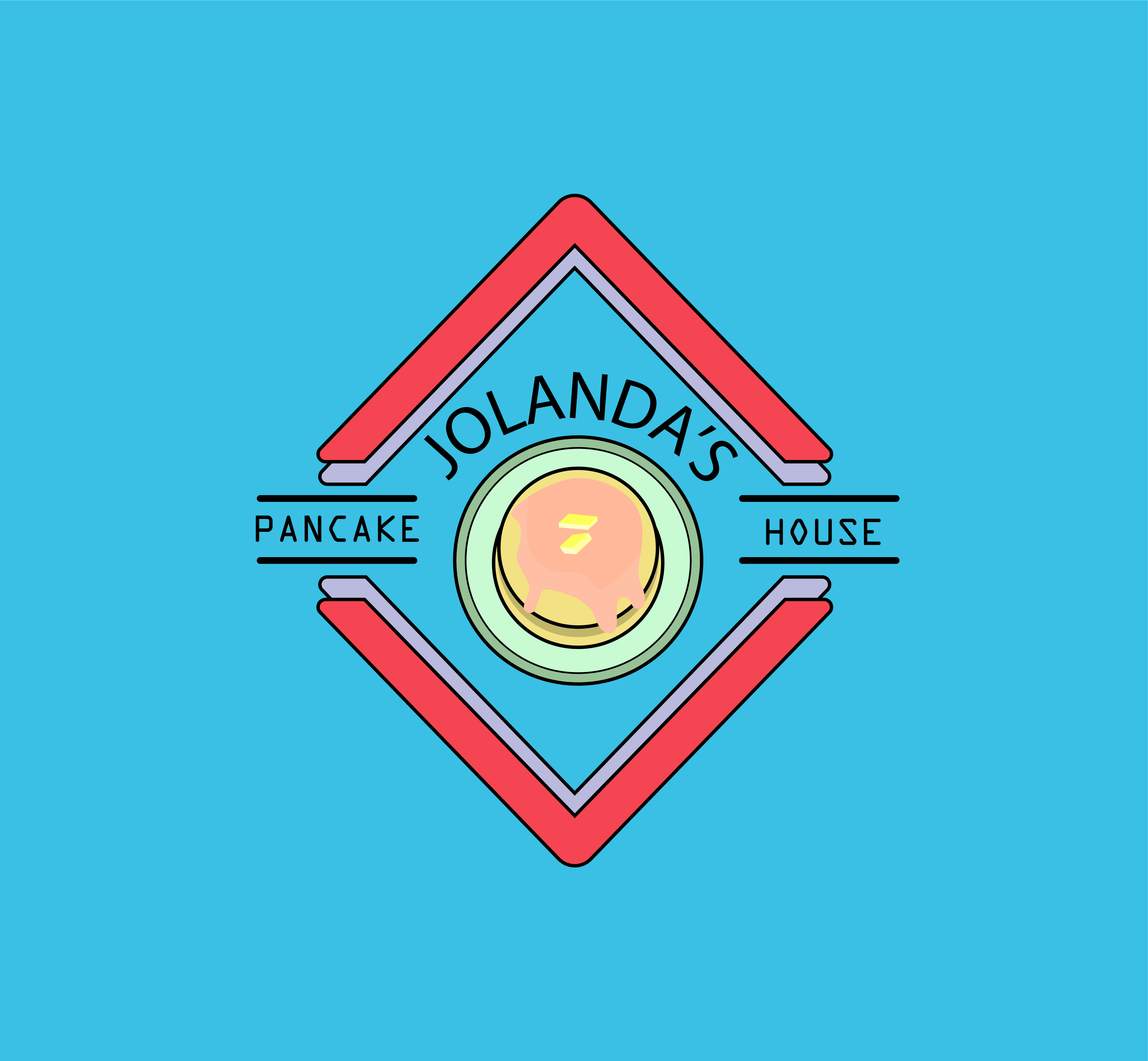

me gusta , a lo mejor la combinación de colores podría ser otra.
3 years ago by ash - Reply