Nicole
Posts
4
Likes
2
Liked Posts
3
Given Feedback
3
Feedback
Looks great, Love the design
7 months ago by Nicole
Looks great

7 months ago by Nicole
Looks really great
7 months ago by Nicole
Posts
SC Ice Cream
- Report
Nicole • 7 months ago
Designed a pictorial logo for SC Ice Cream.
Hey,
I am Marcelina, I just founded a new business called SC Ice creams. I'm looking for someone that can create a simple logo for my Ice creams. I like pictorial marks. Would you be interested?
I am Marcelina, I just founded a new business called SC Ice creams. I'm looking for someone that can create a simple logo for my Ice creams. I like pictorial marks. Would you be interested?
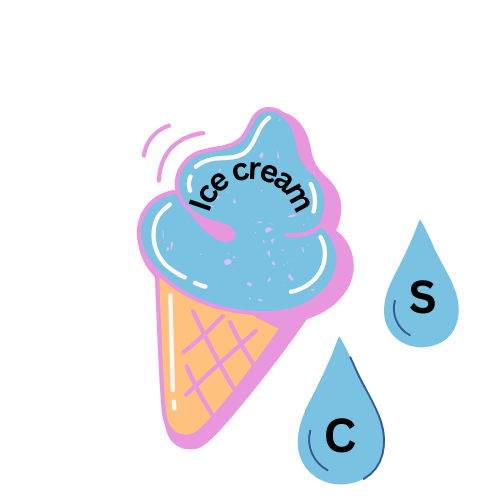


I like the general design of it but i think the drops being on the cone would fit much better than the drops just next to it, good concept with the S and the C in a drop tho
7 months ago by Redox - Reply
I agree and for me i think it would be more intresting if it was dripping from the ice cream cone with S beginning to drip and C below it
7 months ago by Gary - Reply
Authentic San Diego Tours
- Report
Nicole • 7 months ago
Decided to use beach related colours and ad a map/location icon


It looks nice, however it's not scalable and wouldn't work in b&w
7 months ago by mahd shahzad - Reply
Mose's Cafeteria
- Report
Nicole • 7 months ago
I Created a circle design because it gives the impression of a pictorial design and I descided to design it in red because modt food businesses use red or yellow The name of the business is inclided by making use of the first letter "m" and "c"
Hey,
I am Mose, owner of Mose's Cafeteria. For a while now, we've been looking for a good logo for our business. I like pictorial marks. Can you do that?
I am Mose, owner of Mose's Cafeteria. For a while now, we've been looking for a good logo for our business. I like pictorial marks. Can you do that?


Cool
7 months ago by hanif - Reply
SiteSpace
- Report
Nicole • 7 months ago
Was instructed to create a Wordmark logo for SiteSpace and I decided on this simple design because it looks very tech-like for "site" and the spacing in the middle adds to the "SiteSpace
Hi!
I am Eilene, creator of SiteSpace. I am looking for someone that can design a professional logo for my business. I think a wordmark would look cool. Can you help me out?
I am Eilene, creator of SiteSpace. I am looking for someone that can design a professional logo for my business. I think a wordmark would look cool. Can you help me out?


discrepancy between "site" and "space". the gap is too wide for it to look like one name. rather it looks like Site is the main company and Space is a department of that company. Red-black gradient looks murky. Black border is meaningless.
7 months ago by mahd shahzad - Reply