Aryan Biswakarma
Posts
1
Likes
2
Liked Posts
2
Given Feedback
2
Feedback
Thanks, Ayush. for feedback😊
6 months ago by Aryan Biswakarma
looks good. You have to work on your mockup and font.😁
6 months ago by Aryan Biswakarma
Posts
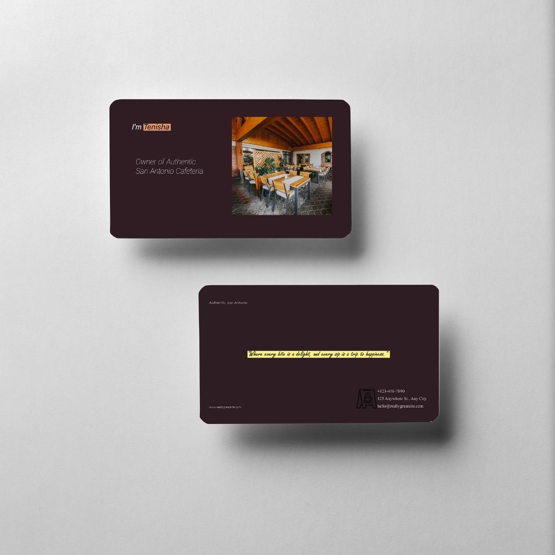
Authentic San Antonio Cafeteria [Business card]
- Report
6 months ago by Aryan Biswakarma
I really enjoyed it when I was creating it.[how its look]
Hi,
I'm Tenisha, owner of Authentic San Antonio Cafeteria. I'm looking for someone that can design something for my Cafeteria. I want to have a business card for myself. We would love to work with you!
I'm Tenisha, owner of Authentic San Antonio Cafeteria. I'm looking for someone that can design something for my Cafeteria. I want to have a business card for myself. We would love to work with you!
 2 Likes
 2
2
it actually does look good... front looks amazing... i m not a fan of images of biz cards but it stil looks descent here... Back side, the font in yellow box is not readable as its decorative font. I would prefer you use the same font that was used on the front side. Secondly the vector that is used before phone number, address can be white to make it stand out on the bg and increase the gap between the vector and the text a little bit, maybe by 20 px. Rest is really good.
6 months ago by Ayush - Reply
Thanks, Ayush. for feedback😊
6 months ago by Aryan Biswakarma - Reply