Lance Brightmire
Posts
1
Likes
2
Liked Posts
1
Given Feedback
4
Feedback
I really love the design, the one thing I would maybe change is the crystal pattern on the back, its a little distracting and that many colors, even being monochromatic don't look good together.

5 years ago by Lance Brightmire
I really like the logo, but I don't know if the car works very well. It doesn't seem to fit with the modern looks that your have going in the rest of the design.
5 years ago by Lance Brightmire
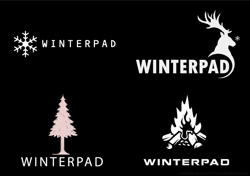
These look great. I think the snow flake and deer are the best for a gaming company, and my favorite is the deer. The snowflake may need a bigger font size. I'd be interested to see the designs with color as well.
5 years ago by Lance Brightmire
The word CruisePad looks really good. The CP doesn't seem to fit with with the whole name though. Doing a CP is kind of hard in that style, you may want instead of the initials try a symbol?

5 years ago by Lance Brightmire
Posts
Som-Num Logo and App Icon
- Report
Lance Brightmire • 5 years ago
Som-Numlogo


Great work! The S is a little hard to read. Maybe open up that upper curve a little.
5 years ago by Joanne Ike - Reply
Awesome work dude!
5 years ago by Vinycius - Reply