Allen Jude
Posts
2
Likes
4
Liked Posts
1
Given Feedback
3
Feedback
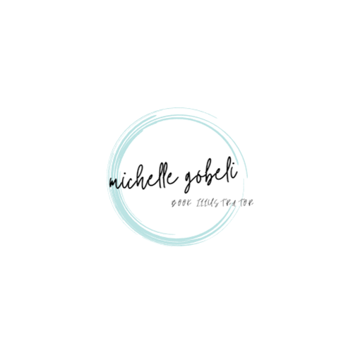
Different font for "Book Illustrator" would be great, but this idea is so eye catching *thumbs up*
1 year ago by Allen Jude
Everything is good, I just think the name needs to be more emphasize, maybe darker?
1 year ago by Allen Jude
I think the line below could have the same length as the radius of the circle. But I also think this is already good, maybe there's a reason for its length.

1 year ago by Allen Jude
Posts
Wade's Sandwich Bar
- Report
Allen Jude • 1 year ago
Need your opinion please, thank youu
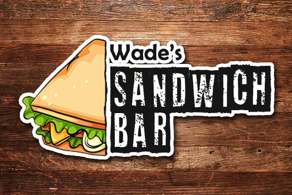


like it's out of a cartoon...Nice work
1 year ago by Mawuli - Reply
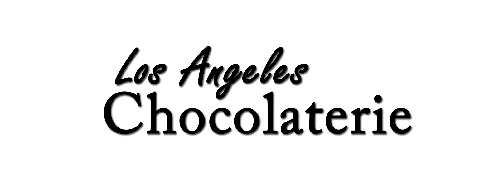
Los Angeles Chocolaterie
- Report
Allen Jude • 1 year ago
I used two simple Font Style and dropped a little bit Shadow.
Hello!
I am Nickie, I recently started a new business called Los Angeles Chocolaterie. I'm looking for someone that can create a simple logo for my Chocolaterie. I think a wordmark would look cool. Can you help us out?
I am Nickie, I recently started a new business called Los Angeles Chocolaterie. I'm looking for someone that can create a simple logo for my Chocolaterie. I think a wordmark would look cool. Can you help us out?