.
Posts
0
Likes
0
Liked Posts
2
Given Feedback
3
Feedback
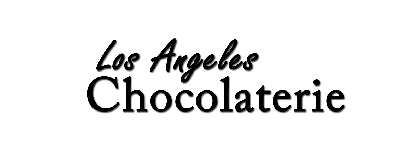
I'd suggest having two similar fonts for the logo and dropping the shadow, great starting idea though!
1 year ago by .
Looks nice!
1 year ago by .
Looks really nice!
1 year ago by .