Haraez
Posts
6
Likes
8
Liked Posts
1
Given Feedback
2
Feedback
Love it. Except I think the graphic at the back will conflict with the text when it is made with a single colour scheme. Maybe you can have some form of separation for them.
4 years ago by Haraez
Thank you. Yes. I think the 'P' looks a bit weird too.

4 years ago by Haraez
Posts
HIL Cakery
- Report
Haraez • 4 years ago
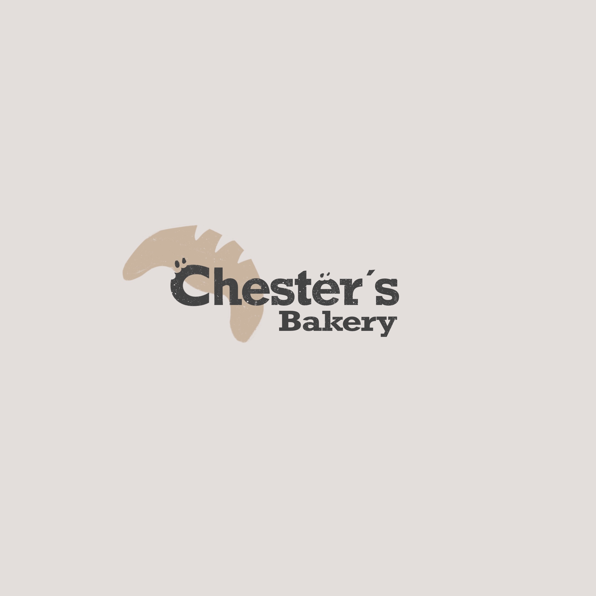
A logo I made for a bakery sort of brand. Decided to include some imagery of a hilltop to emphasize on the word "HIL" as it is close to the word "hill". The wordmark logo is seen under the imagery.
Hey!
I am Lisandra, I recently started a new business called HIL Cakery. I'm looking for someone that can make a good logo for my Cakery. I think a wordmark would look cool. We would love to work with you!
I am Lisandra, I recently started a new business called HIL Cakery. I'm looking for someone that can make a good logo for my Cakery. I think a wordmark would look cool. We would love to work with you!


Jonathan's Pizzas
- Report
Haraez • 4 years ago
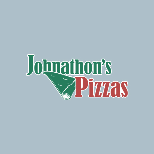
Came up with this logo with a colour scheme with close links with pizzas. I wanted it to look traditional and at the same time have a simplistic cut to it.
Hey,
I am Johnathon, I recently started a new business called Johnathon's Pizzas. I'm looking for someone that can create a simple logo for my business. I think a wordmark would look cool. We would love to work with you!
I am Johnathon, I recently started a new business called Johnathon's Pizzas. I'm looking for someone that can create a simple logo for my business. I think a wordmark would look cool. We would love to work with you!

KAF Logo Design
- Report
Haraez • 4 years ago
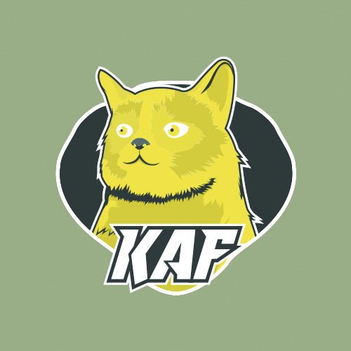
A mascot logo design I did for a random logo design practice. Chose a cat for and icon as the name is close to a 'cat'. Was a little puzzled on what to use as not much detail was given for a mascot logo. I decided to use thick strokes-styled-illustration for this as I think it fits a mascot logo. Spent some time to illustrating this and I felt it's a character design I could further develop in the future. One I took inspiration from the Pokemon "Zeraora" as an electric cat.
Hello!
I'm Vincent, owner of kaf.com. We're looking for someone that can create a simple logo for our business. I love mascot logos. Can you help us out?
I'm Vincent, owner of kaf.com. We're looking for someone that can create a simple logo for our business. I love mascot logos. Can you help us out?

dabe.net
- Report
Haraez • 4 years ago
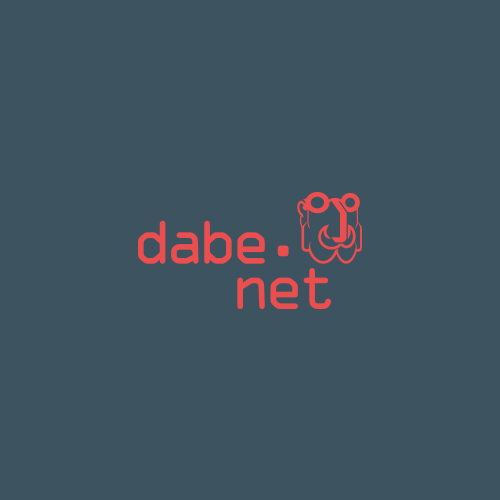
Based on the meaning of the business' name, 'dabe' refers to a 'chief' or 'boss'. I used this to create a logo of the brand in the form of a bearded man. I feel this reflects the idea of a chief well. I also used a traditional typewriter styled font to match this mood.
Hello,
I am Britta, I recently started a new business called dabe.net. I'm looking for someone that can create a simple logo for my business. I like pictorial marks. We would love to work with you!
I am Britta, I recently started a new business called dabe.net. I'm looking for someone that can create a simple logo for my business. I like pictorial marks. We would love to work with you!

Phoenix Coffeehouse
- Report
Haraez • 4 years ago
A design I did incorporating a lettermark to a coffee brand. It was hard trying to use an abbreviation for the main focal point of the logo to make it look interesting as I would prefer a pictorial mark for it. I used some elements of a phoenix to give some taste to it's name with a fiery frame representing wings to form the logo.
Hi!
I'm Parker, owner of Phoenix Coffeehouse. We're looking for someone that can make a good logo for our Coffeehouse. I think a lettermark will fit best. We would love to work with you!
I'm Parker, owner of Phoenix Coffeehouse. We're looking for someone that can make a good logo for our Coffeehouse. I think a lettermark will fit best. We would love to work with you!

Thank you. Yes. I think the 'P' looks a bit weird too.
4 years ago by Haraez - Reply
I love the colours they really spell coffee for me, the form is quite good, But I don't like the P, and I think the rotated (i) is unnecessary. Overall it's really good. Just expressing my thoughts, really nice job and keep up the good work :)
4 years ago by Kristian - Reply