Myra Creary
Posts
1
Likes
0
Liked Posts
0
Given Feedback
2
Feedback
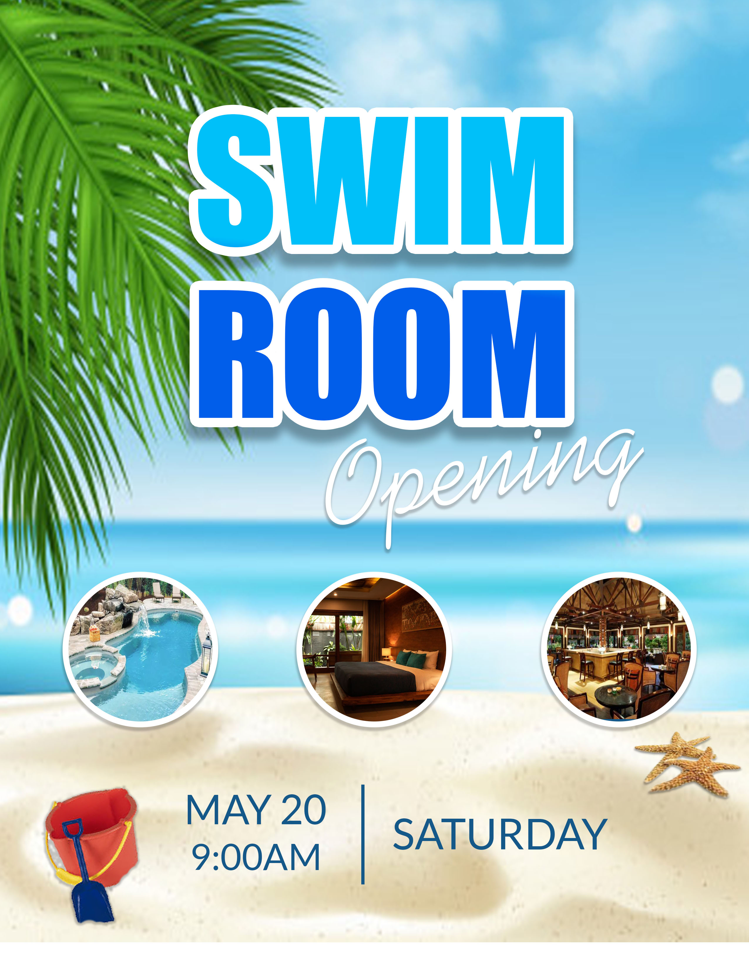
I like this flyer. The only thing I would change is the pail and shovel which represents young children and the color makes it a focal point. If one of the photos was a picture of children or a family then it would make sense.
2 years ago by Myra Creary
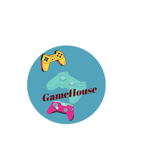
I like the round design but the name is to small and not centered. Also a different font would probably work better. Something more fun and exciting to represent gaming.
2 years ago by Myra Creary
Posts
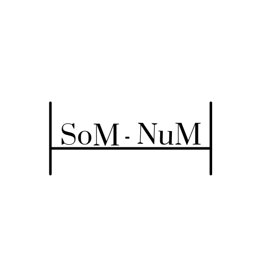
Som-Num Logo
- Report
2 years ago by Myra Creary
Client wanted a clean and simple design. I created a bed with clean lines and enlarged the letter “M” for height, interest and “mattress” Simple and a little fun.
Som-Numlogo
 Like
Like
 1
1
You concentrated too much on "M", in the end the text you created is not much readable. The bed did not identify much as a bed, and is more related with enlarged "H". You need to reconsider the design, and by doing it you need to feel cozy and that you like it. It's about matress after all (if i understood correctly).
2 years ago by Aurel - Reply