Celeste V. Sarabia
Posts
2
Likes
2
Liked Posts
0
Given Feedback
1
Feedback
I like the flower design and font choice! I would maybe add more space between the company name, design, and contact information.

2 years ago by Celeste V. Sarabia
Posts
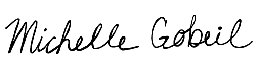
Michelle Gobeil's Logo
- Report
2 years ago by Celeste V. Sarabia
I hand wrote the name and uploaded it to my computer. Then, I converted it to digital using the image trace tool and edited it to make it look smoother/natural.
Michelle Gobeillogo
 Like
Like
 1
1
Nice work, but could do with some refining and addition to style features on the handwriting.
5 months ago by Dunia Sinclair Julio - Reply
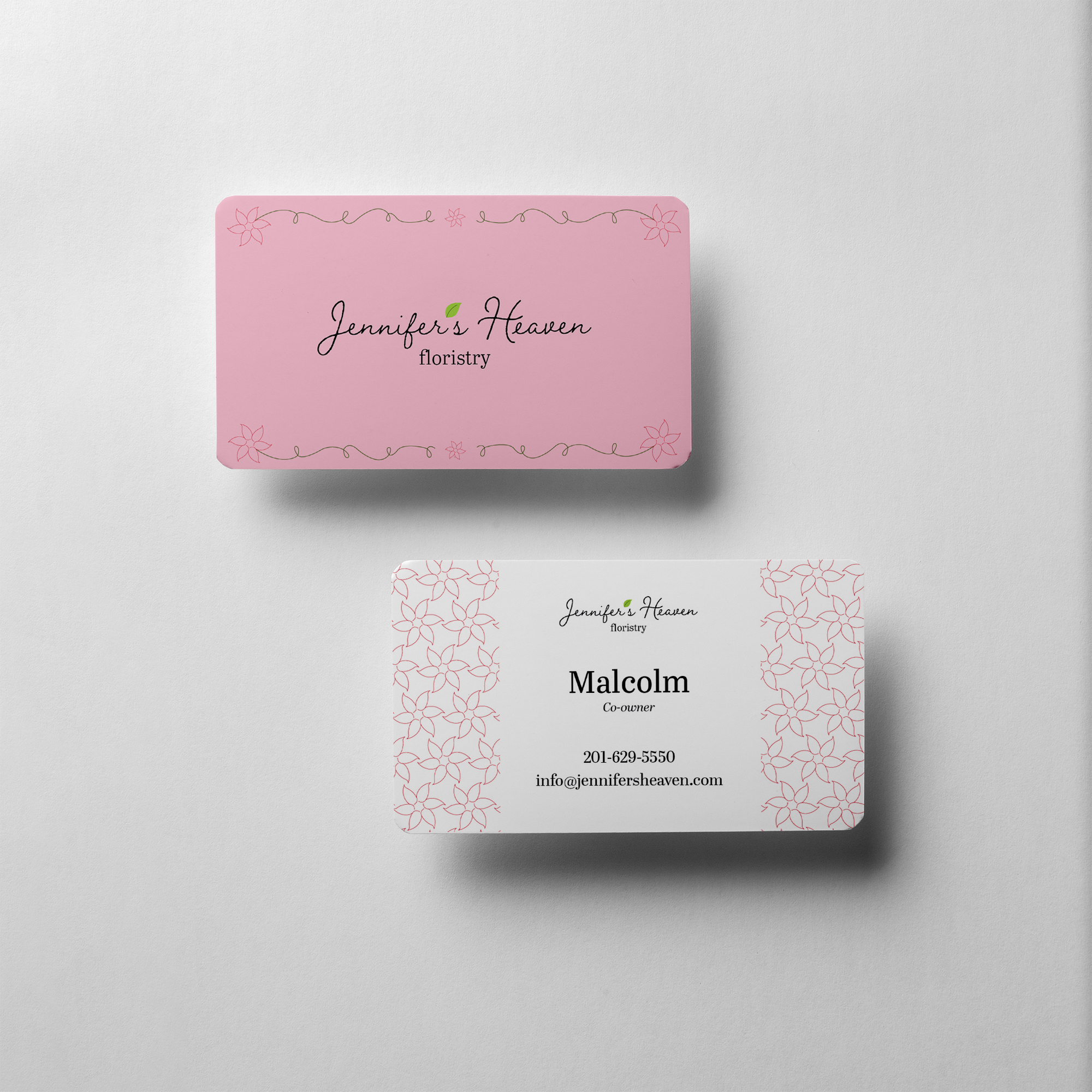
Jennifer's Heaven BC Mock-up
- Report
2 years ago by Celeste V. Sarabia
I used a minimum color palette and design to make sure the business card was not too busy. I used a soft pink color to give the card a heavenly, lighter feel with a small hint of a brighter green to emphasize plant life and nature. I made sure to create typeface hierarchy on the back with the name of the owner being the biggest and most central text and then the rest of the information following in other of importance. For the front, I wanted to give the feeling of luxury by adding a border, but keeping it on the simpler side so I don't over crowd the name of the company.
Jennifer's Heavengraphic
 2 Likes
1
2 Likes
1
Nice work!
5 months ago by Dunia Sinclair Julio - Reply