Mery David
Posts
2
Likes
1
Liked Posts
1
Given Feedback
1
Feedback
i think the subtitle is very close to the name, but I really like it
3 years ago by Mery David
Posts
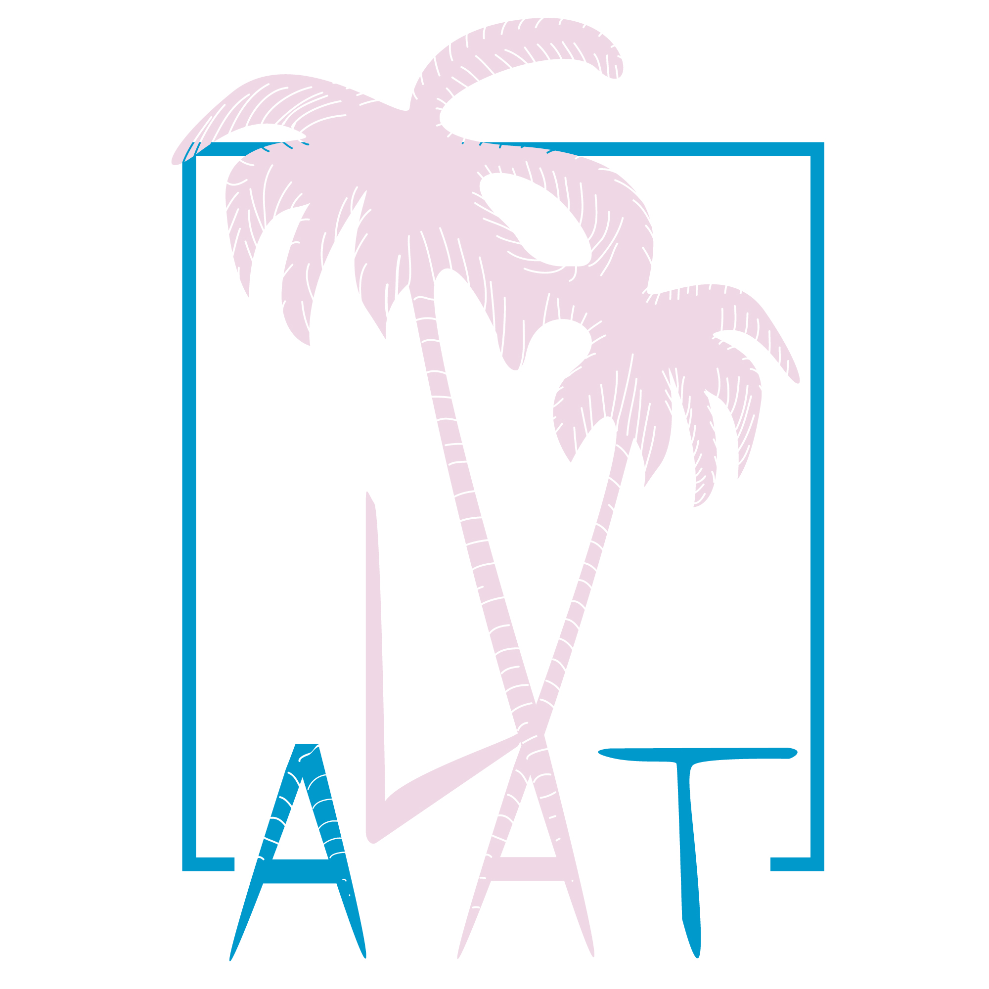
Authentic Los Angeles Tours
- Report
3 years ago by Mery David
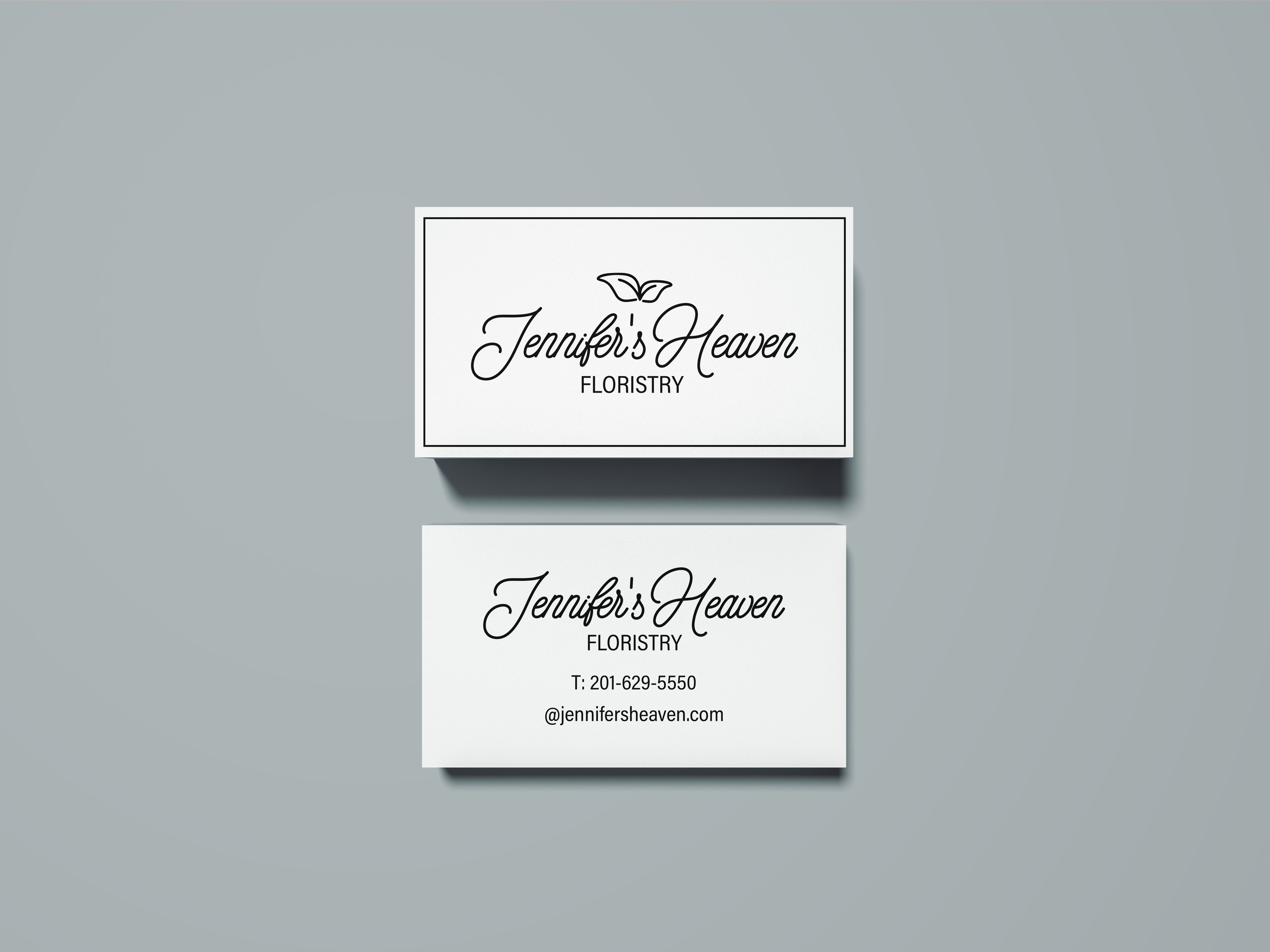
Pictorial marks are not my strong but I tried to integrate it with the company name abbreviation to support it.
Hey,
I am Kai, owner of Authentic Los Angeles Tours. We're looking for someone that can make a good logo for our Tours. I like pictorial marks. Can you help us out?
I am Kai, owner of Authentic Los Angeles Tours. We're looking for someone that can make a good logo for our Tours. I like pictorial marks. Can you help us out?
 1 Like
 1
1
Almost. But the L looks out of place and I think it should be the same as the first A. So the font for the ALAT should be different and all one font but I like the idea of the palm trees. Well drawn. They can be in the background.
3 months ago by Edward Syrett - Reply
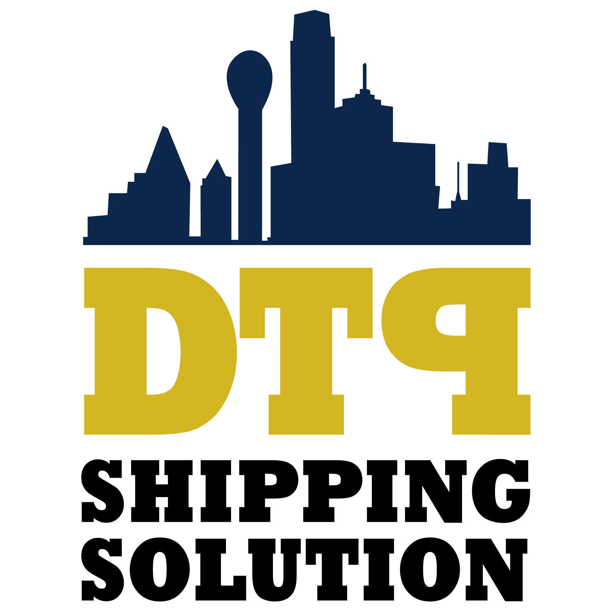
DTP logo design
- Report
3 years ago by Mery David
 Like
1
Like
1
P should be right way around. Where's the Ship? With a title like Shipping Solutions there should be a ship in there somewhere...
3 months ago by Edward Syrett - Reply