Activity Feed
Feedback Leaderboard (Past 30 days)
Remove Ads: Upgrade to Pro
Get feedback on your work
Give feedback to other users!
Give FeedbackMichelle Gobeil - Name Logo
- Report
Delfina Jurado • 4 years ago
Michelle Gobeillogo
How can I post my design?
1 week ago by Abdul - Reply
Amazing work
2 months ago by Anushka Pundge - Reply
amazing
5 months ago by Shifa Fadillah Azzahra - Reply
All Comments
Michelle Gobeil - Logo Design
- Report
Aniket Chauhan • 2 years ago
Here is my exploration about letter logo.
Michelle Gobeillogo
Amazing work
1 month ago by Bella Ghazaryan - Reply
Cool
1 year ago by Antara Anisha - Reply
This is the best design from the description. Perfect!
1 year ago by Victor - Reply
All Comments
Practice logo for Michelle Gobeil
- Report
Michele T Morehouse • 3 years ago
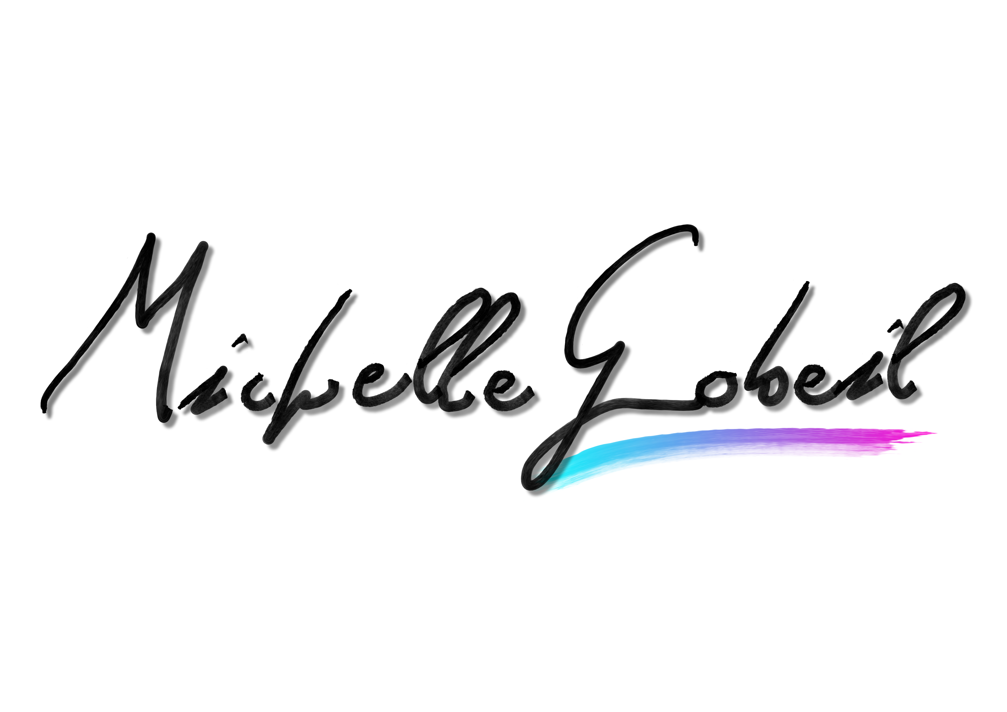
Kept it simple. This is a hand mockup of a sample signature of what could the logo. It is simple with not over loading detail. Makes it versatile for any media.
Michelle Gobeillogo
My fav! Great job.
4 months ago by Lizi - Reply
I love that one
10 months ago by Lyna - Reply
Nice one
1 year ago by Yash - Reply
All Comments
Branding/Logo Design Project
- Report
Erin Boerema • 4 years ago
Michelle Gobeillogo
good job , the colours you put behind the font thats a very good idea. *would you like to like to give me feedback ? check my works.
4 years ago by kunal das - Reply
MICHELLE GOBEIL LOGO
- Report
AnhdeArbre • 3 years ago
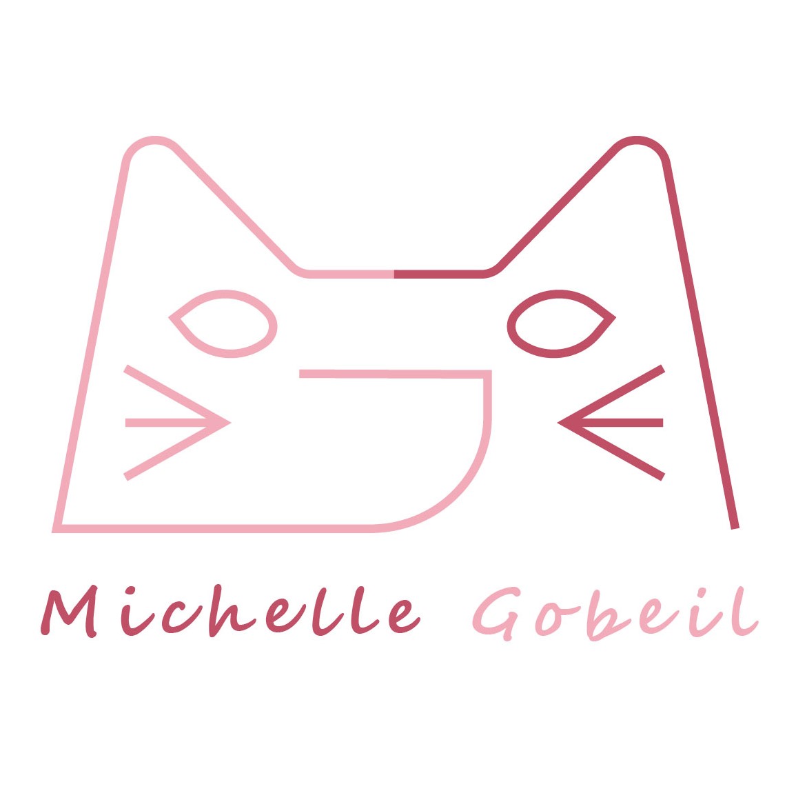
I combined two letters "M" and "G" and the logo has a cat shape as a result (it looks lovely, right?).
This is my first time for designing logo so I hope I could get a lot of feedback from you guys.
Thank you so much.
This is my first time for designing logo so I hope I could get a lot of feedback from you guys.
Thank you so much.
Michelle Gobeillogo
this is the best one according to me . This is so creative and just perfectly fits the requirements the font, the name. Also considering he writes children's books. This is perfect.
1 year ago by riddhima jain - Reply
Load more
