Koushik
Posts
1
Likes
6
Liked Posts
6
Given Feedback
7
Feedback
that's really creative

3 years ago by Koushik
cute logo, it looks really nice
3 years ago by Koushik
both logos look great
3 years ago by Koushik
this logo looks so minimal and modern

3 years ago by Koushik
great work
3 years ago by Koushik
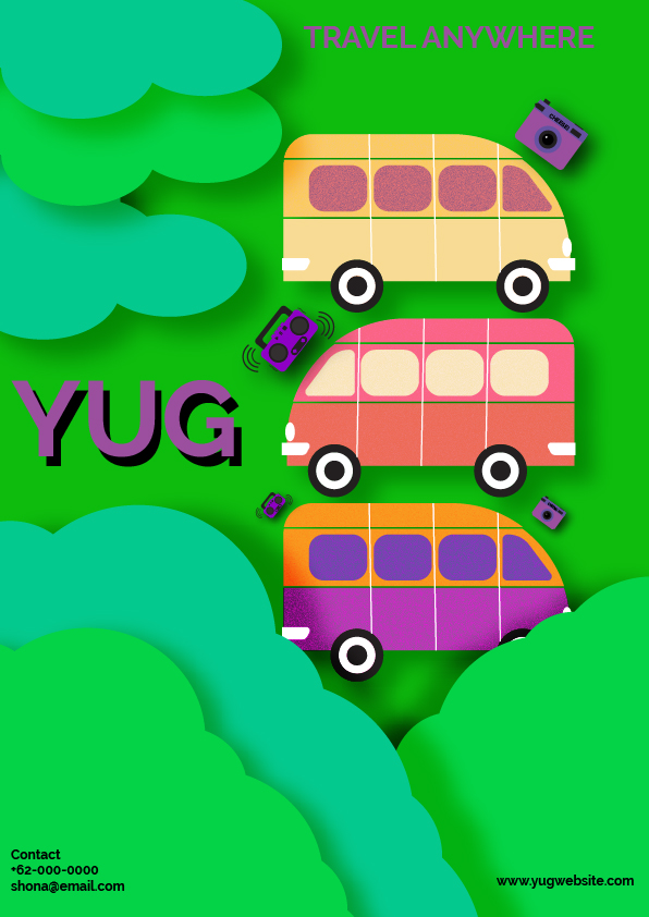
Cute design, smart way to use the primary colour. only suggestion is to remove the shadow from "YUG" it's too sharp
3 years ago by Koushik
suitable font for signature but adding the shadow makes it lose its quality
3 years ago by Koushik
Posts
Mocking By Jay
- Report
Koushik • 3 years ago
Hi,
My name is Jay, I am the owner and face behind Mocking by Jay, a major record label that is mostly focussed on rap music. We manage loads of different artists and therefore are quite a large company whose image is changing constantly. Each new artist adds something new to the label and we always try and encourage our musicians to really push forward with whatever makes them stand out. With our constantly changing label's image, often also comes an update within the look of the label's website. Since it has been quite some time since the last time that the Mocking by Jay website has had a redesign, we figured it was about time for one. For that reason, we would like you to design a simple landing page. We want the site to come off as very independent, very urban, and chill. Because that is also how we work here at Mocking by Jay. We always like our stars to be comfortable and proud of the work that they put out. The site will mainly be used for people to book our artists through, so that should be the main focus. Next to that, there should be something you can click if you want to see more about our artists or about the label and somewhere you can go within the site if you want to book a studio session. We want the landing page to be clean though, so do not make it too crowded with buttons and images and such. It would be best is you primarily used the colors red and black. I hope these instructions are clear and I am looking forward to what you come up with.
Best,
Jay


Nice work.
3 years ago by Kriss - Reply