Fredrik
Posts
1
Likes
1
Liked Posts
3
Given Feedback
4
Feedback
I think the font is fine and illustration good but yes depending on size/usage the text could be harder to read
4 years ago by Fredrik
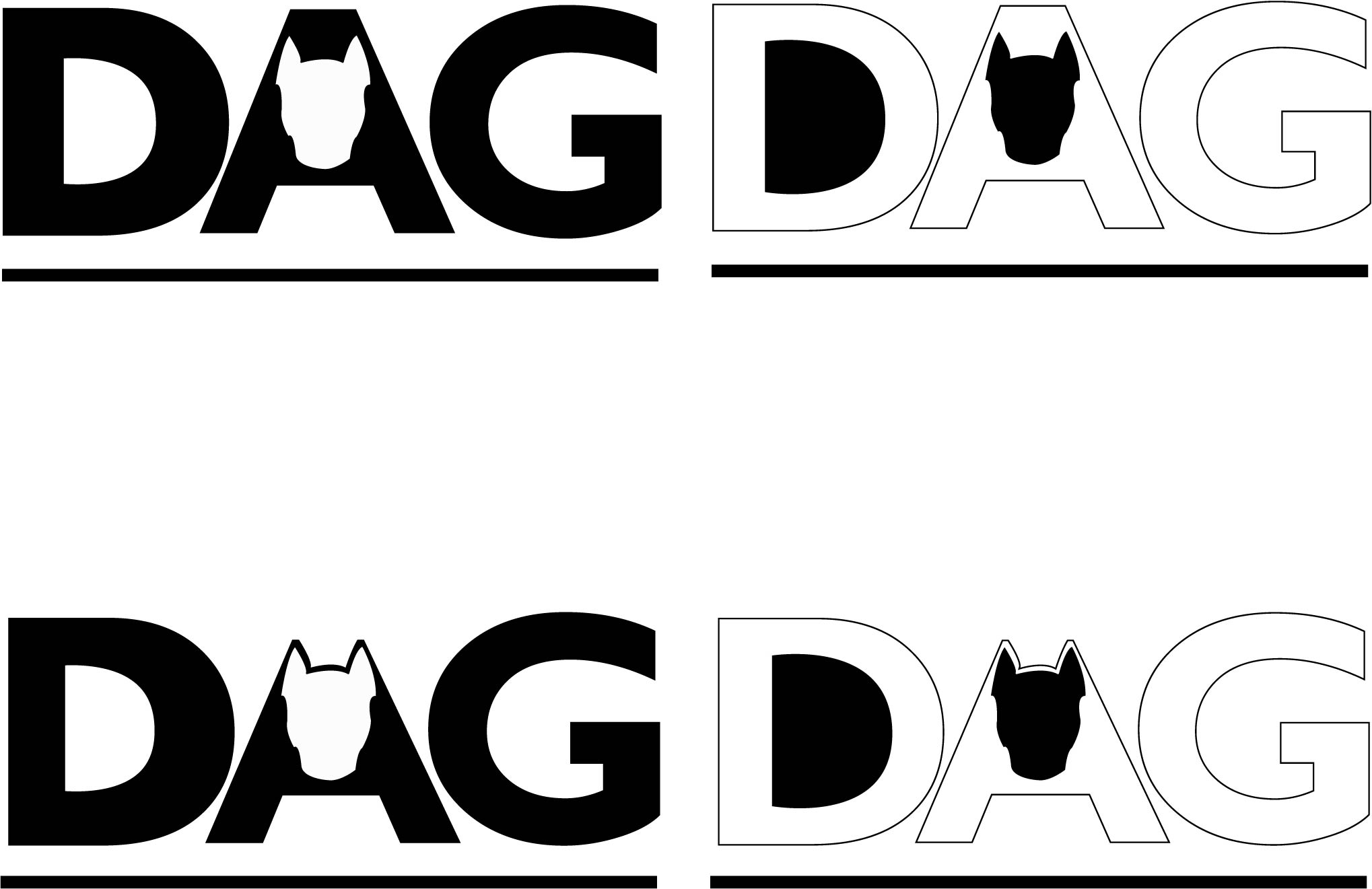
I like the ears being part of the letter, but could the top piece be thicker somehow?
4 years ago by Fredrik
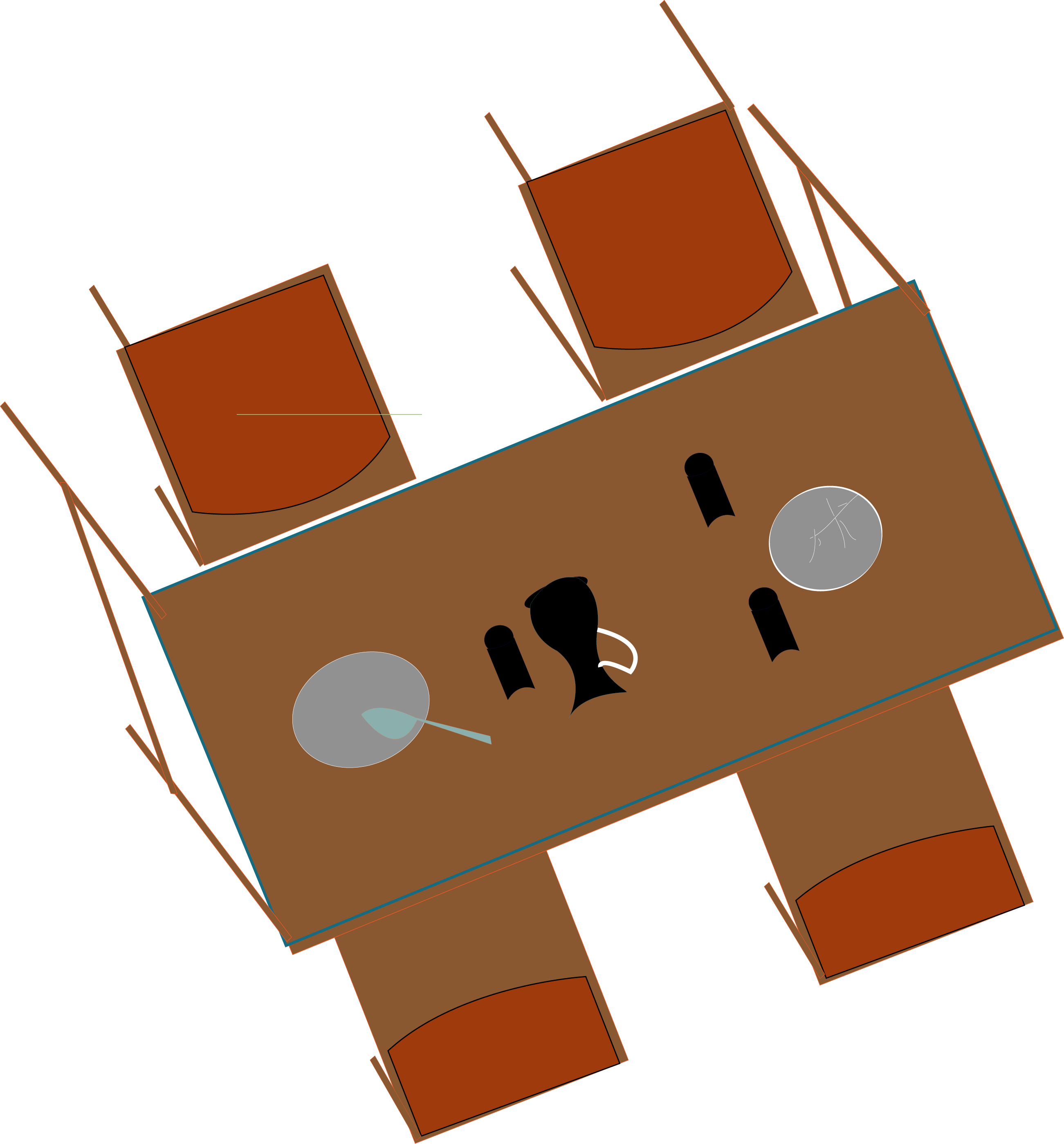
Interesting, it feels like something is being told here but I�m not sure what. Perhaps highlighting one item with size, light or more obvious silhouettes would hint at the answer
4 years ago by Fredrik
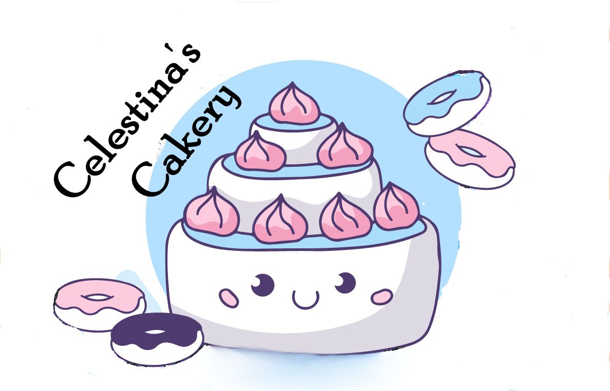
Just realized food in logos are rare, possibly because its a challenge to capture texture in smaller illustrations?
4 years ago by Fredrik